
css:两栏三栏布局
CSS 布局
2023-09-27 14:27:10 时间
两栏布局左边固定右边自适应
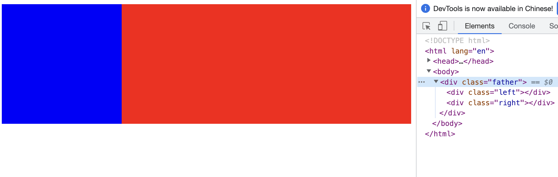
1、浮动方式
<!DOCTYPE html>
<html lang="en">
<head>
    <style>
        .left {
            width: 200px;
            height: 200px;
            float: left;
            background-color: blue;
        }
        .right {
            margin-left: 200px;
            height: 200px;
            background-color: red;
        }
    </style>
</head>
<body>
    <div class="father">
        <div class="left"></div>
        <div class="right"></div>
    </div>
</body>
</html>
2、定位方式
<!DOCTYPE html>
<html lang="en">
<head>
    <style>
        .father {
            position: relative;
            height: 200px;
        }

        .left {
            position:absolute;
            width: 200px;
            height: 100%;
            background-color: blue;
        }

        .right {
            position:absolute;
            height: 100%;
            left:200px;
            right: 0;
            background-color: red;
        }
    </style>
</head>
<body>
    <div class="father">
        <div class="left"></div>
        <div class="right"></div>
    </div>
</body>
</html>
3、flex方式
<!DOCTYPE html>
<html lang="en">
<head>
    <style>
        .father {
            height: 300px;
            width: 100%;
            display: flex;
        }

        .left {
            width: 300px;
            height: 100%;
            background-color: blue;
        }

        .right {
            flex: 1;
            height: 100%;
            background-color: red;
        }
    </style>
</head>
<body>
    <div class="father">
        <div class="left"></div>
        <div class="right"></div>
    </div>
</body>
</html>
三栏布局左右固定中自适应
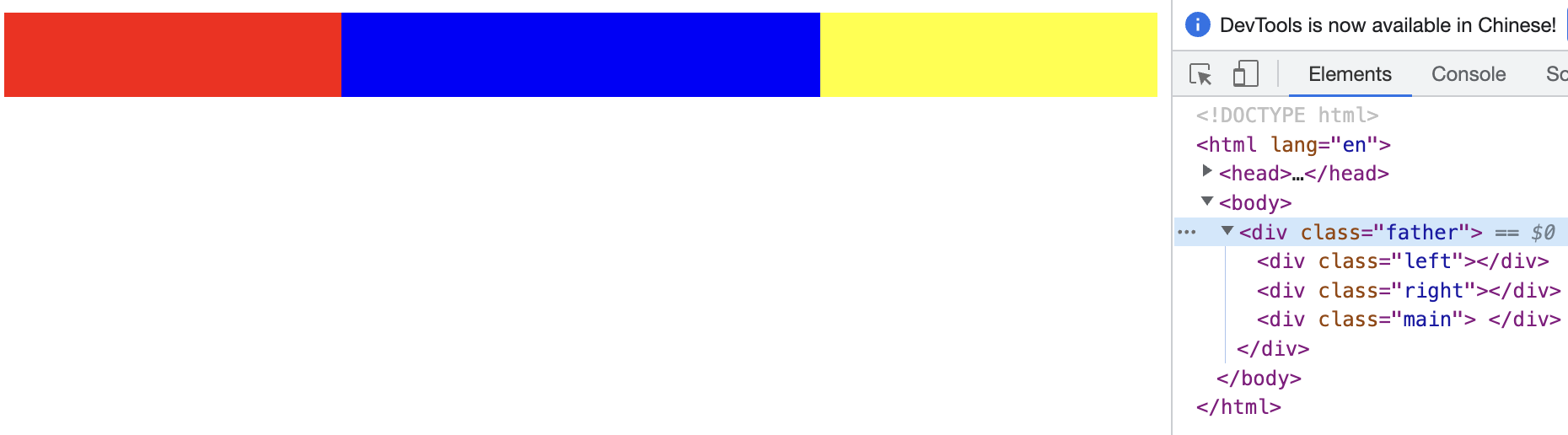
1、浮动方式
<!DOCTYPE html>
<html lang="en">
<head>
    <style>
        .father{
            height: 50px;
        }
        .left,.right,.main {
            height: 100%;
        }

        .left {
            width: 200px;
            float: left;
            background-color: red;
        }

        .main {
            margin-left: 200px;
            margin-right: 200px;
            background-color: blue;
        }

        .right {
            float: right;
            width: 200px;
            background-color: yellow;
        }
    </style>
</head>
<body>
    <div class="father">
        <div class="left"></div>
        <div class="right"></div>
        <div class="main"> </div>
    </div>
</body>
</html>
2、定位方式
<!DOCTYPE html>
<html lang="en">
<head>
    <style>
        .father{
            position: relative;
            height: 50px;
        }
        .left,.right,.main {
            position: absolute;
            height: 100%;
        }

        .left {
            left: 0;
            width: 200px;
            background-color: red
        }

        .main {
            left: 200px;
            right: 200px;
            background-color: blue
        }

        .right {
            right: 0;
            width: 200px;
            background-color: yellow
        }
    </style>
</head>
<body>
    <div class="father">
        <div class="left"></div>
        <div class="right"></div>
        <div class="main"> </div>
    </div>
</body>
</html>
3、flex方式
<!DOCTYPE html>
<html lang="en">
<head>
    <style>
        .father {
            display: flex;
            height: 50px;
        }

        .left,.right,.main {
            height: 100%;
        }

        .left {
            width: 200px;
            background-color: red
        }

        .main {
            flex: 1;
            background-color: blue
        }

        .right {
            width: 200px;
            background-color: yellow
        }
    </style>
</head>
<body>
    <div class="father">
        <div class="left"></div>
        <div class="main"> </div>
        <div class="right"></div>
    </div>
</body>
</html>
```
相关文章
- html,css 知识汇总
- CSS 布局 ,文档流,定位,中划线,表格属性,line-height居中对齐,z-index,display
- css - font-size
- HTML5 移动端如何使用css让百分比布局的弹窗水平和垂直方向上居中
- 【CSS进阶】CSS 颜色体系详解
- 【Cssflex】css中关于弹性布局flex的综合用法(示例展示)
- ul和li简单语句实现DIV+CSS分两列(多列)布局显示(转)
- CSS简介
- CSS基本布局——flex布局
- 让交互更加生动!巧用CSS实现鼠标跟随 3D 旋转效果
- 【前端学习之HTML&CSS进阶篇】-- CSS第三篇 -- 基本布局概念
- 【前端学习之HTML&CSS】-- CSS第三篇 -- 选择器(上)
- 最全CSS各种布局详解
- 《HTML、CSS、JavaScript 网页制作从入门到精通》——6.8 练习题
- 《网页设计与前端开发 Dreamweaver+Flash+Photoshop+HTML+CSS+JavaScript 从入门到精通》—— 第2章 HTML基础
- 《Web前端开发精品课 HTML与CSS进阶教程》——2.5 表单语义化
- 《Web前端开发精品课 HTML与CSS进阶教程》——2.8 HTML5舍弃的标签
- 【JavaEE】进入Web开发的世界-CSS
- html响应式布局,css响应式布局,响应式布局入门
- css布局中的垂直水平居中对齐
- css页面布局总结
- css/js 实现单行/多行省略
- 小白都能做到的使用css如何让一个盒子沾满剩余的空间
- Sublime text3 插件HTML/CSS/JS prettify 格式化代码
- 浅析使用css实现可拉伸调整尺寸的分栏布局:基本实现原理、自定义resize容器范围、实际应用
- css overflow和flex布局搭配使用,页面块可以滑动
- css 弹性盒子(flex布局)的起边和终边详解
- CSS魔法堂:Flex布局
- CSS魔法堂:Reset CSS
- CSS学习知识整理(一)Css 布局
- css中4种居中div的方法