
【Css\flex】css中关于弹性布局flex的综合用法(示例展示)
| flex-shrink:0; 或width:0; flex-grow:0; | 将子div自动伸缩取消 flex-grow;此属性为是否自动增长空间, flex-shrink;此属性为是否自动缩小空间
| 子div |
| flex-direction:row; | row:子div横向排列 column:子div纵向排列 | 父div |
| justify-content:
(主轴的对齐方式) | flex-start:元素从左到右排列,最后空白 flex-end 元素从右向左排列 center 元素居中排列 space-around 平分空间 space-between 两头固定,中间一部分 space-evenly 把空白分布到元素的单侧 | 父div |
| align-items (侧轴的对齐方式) (单行) | stretch:默认值:将元素的长度设置为相同的值 flex-start 元素不会拉伸,从上到下对齐 flex-end:从下向上对齐 center:居中对齐 | 父div |
| flex-wrap:wrap; | wrap:超出宽度,自动换行 nowrap:默认值,元素不自动换行 wrap-reverse:元素沿着辅轴反方向换行 -------------------------------------- 注意:父容器加入align-content:flex-start 防止换行后,多一个空白行 | 父div |
| align-content: (侧轴,多行) | flex-start:元素侧轴从上到下排列,最后空白 flex-end 元素从下向上排列 center 元素居中排列 space-around 侧轴平分空间 space-between 两头固定,中间平分 stretch 子元素高度一部分父元素高度 | 父DIV |
| flex-flow | 复合属性,相当于同时设置了Flex-direction和flex-wrap | 父div |
| align-self (控制某个子DIV) | flex-start:元素从左到右排列,最后空白 flex-end 元素从右向左排列 center 元素居中排列 space-around 平分空间 space-between 两头固定,中间一部分 space-evenly 把空白分布到元素的单侧 | 子DIV |
【Css】移动端用flex实现DIV高度自适应屏幕和带滚动条效果(代码示例)_敦厚的曹操的博客-CSDN博客一、手机移动端的默认设置像素,宽度为980px也可以利用meta来设置像素<meta name="viewport" content="width=device-width, initial-scale=1.0" /><meta name="viewport" content="width=200px“ />二、设计图的宽度一般 是750px 或 1125px... https://blog.csdn.net/dxnn520/article/details/122405070
一、justify-content属性(对齐方式)
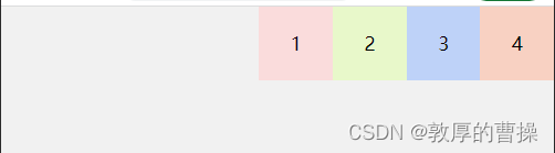
1、从左向右对齐排列
justify-content:flex-start; /* 从左向右对齐排列 */
<head>
    <meta charset="UTF-8">
    <meta http-equiv="X-UA-Compatible" content="IE=edge">
    <meta name="viewport" content="width=device-width, initial-scale=1.0">
    <title>轮播图案例</title>
    <script src="js/vue/vue.js"></script>
</head>
<style>
    * {
        margin: 0;
        padding: 0;
    }

    .box {
        width: 100%;
        height: 200px;
        background-color: rgb(241, 241, 241);
        display: flex;  // 默认左对齐
    }

    .box div{
        height: 100px;
        text-align: center;
        line-height: 100px;
        font-size: 25px;
    }

    .box_1{
        width: 100px;
        background-color: rgb(250, 220, 220);
    }
    .box_2{
        width: 100px;
        background-color: rgb(232, 248, 202);
    }
    .box_3{
        width: 100px;
        background-color: rgb(190, 210, 248);
    }
    .box_4{
        width: 100px;
        background-color: rgb(248, 209, 194);
    }
</style>

<body>

    <div class="box">
        <div class="box_1">1</div>
        <div class="box_2">2</div>
        <div class="box_3">3</div>
        <div class="box_4">4</div>
    </div>
</body>
2、从右向左对齐
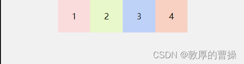
justify-content:end; /* 从右向左排 */3、居中对齐
        display: flex;
        justify-content:center; /* 居中对齐 */
4、平均分配每个空白空间
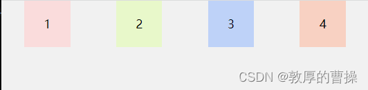
        display: flex;
        justify-content:space-around; /* 平均分配剩余空间 */
5、两边固定贴边,中间再一部分剩余空间

        display: flex;
        justify-content:space-between; /* 两边贴固定,中间再均分配空白空间 */
6、两边固定贴边,中间两个自动平均填充


<head>
    <meta charset="UTF-8">
    <meta http-equiv="X-UA-Compatible" content="IE=edge">
    <meta name="viewport" content="width=device-width, initial-scale=1.0">
    <title>轮播图案例</title>
    <script src="js/vue/vue.js"></script>
</head>
<style>
    * {
        margin: 0;
        padding: 0;
    }

    .box {
        width: 100%;
        height: 200px;
        background-color: rgb(241, 241, 241);
        display: flex;
        justify-content:space-between; /* 两边贴固定,中间再均分配空白空间 */
    }

    .box div{
        height: 100px;
        text-align: center;
        line-height: 100px;
        font-size: 25px;
    }

    .box_1{
        width: 100px;
        background-color: rgb(250, 220, 220);
    }
    .box_2{
        width: 50%;
        background-color: rgb(192, 248, 185);
    }
    .box_3{
        width: 50%;
        background-color: rgb(190, 210, 248);
    }
    .box_4{
        width: 100px;
        background-color: rgb(248, 209, 194);
    }
</style>

<body>

    <div class="box">

        <div class="box_1">1</div>
        <div class="box_2">2</div>
        <div class="box_3">3</div>
        <div class="box_4">4</div>


    </div>
</body>
二、align-items属性(对侧轴的对齐方式)
如果:
flex-direction: row; 那么align-items就是操作【侧轴】上下垂直的对齐
flex-direction: column; 那么align-items就是操作【侧轴】水平的对齐
1、比如:垂直和水平(上下左右)居中
        display: flex;
        justify-content:center;  /* 水平居中  */
align-items: center; /* 垂直居中 */三、align-content属性(对侧轴的对齐方式,垂直多行)
1、flex-start:元素侧轴从上到下排列,最后空白

        display: flex;
        flex-wrap: wrap;   /*  换行  */
        justify-content:space-between;  /* 水平居中  */
        align-content: flex-start; /*垂直从上到下*/
2、flex-end 元素从下向上排列

        display: flex;
        flex-wrap: wrap;   /*  换行  */
        justify-content:space-between;  /* 水平居中  */
        align-content: flex-end; /*垂直从下到上*/
3、center 元素居中排列
        display: flex;
        flex-wrap: wrap;   /*  换行  */
        justify-content:space-between;  /* 水平居中  */
        align-content: center; /*垂直居中 */
4、 space-around 侧轴平分空间

        display: flex;
        flex-wrap: wrap;   /*  换行  */
        justify-content:space-between;  /* 水平居中  */
        align-content: space-around; /*垂直平分 */
5、space-between 下下两头固定,中间平分
        display: flex;
        flex-wrap: wrap;   /*  换行  */
        justify-content:space-between;  /* 水平居中  */
        align-content: space-between; /*垂直两头固定,中间平分 */
6、stretch 子元素高度一部分父元素高度
暂时还不太懂!
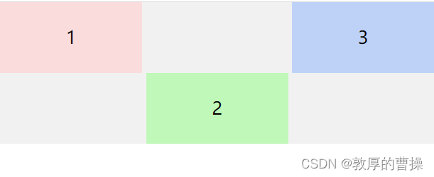
四、align-self属性(控制某个子div对齐方式 )
flex-start:元素从左到右排列,最后空白
flex-end 元素从右向左排列
center 元素居中排列
space-around 平分空间
space-between 两头固定,中间一部分
space-evenly 把空白分布到元素的单侧
比如: align-self:flex-end
<head>
<meta charset="UTF-8">
<meta http-equiv="X-UA-Compatible" content="IE=edge">
<meta name="viewport" content="width=device-width, initial-scale=1.0">
<title>轮播图案例</title>
<script src="js/vue/vue.js"></script>
</head>
<style>
* {
margin: 0;
padding: 0;
}
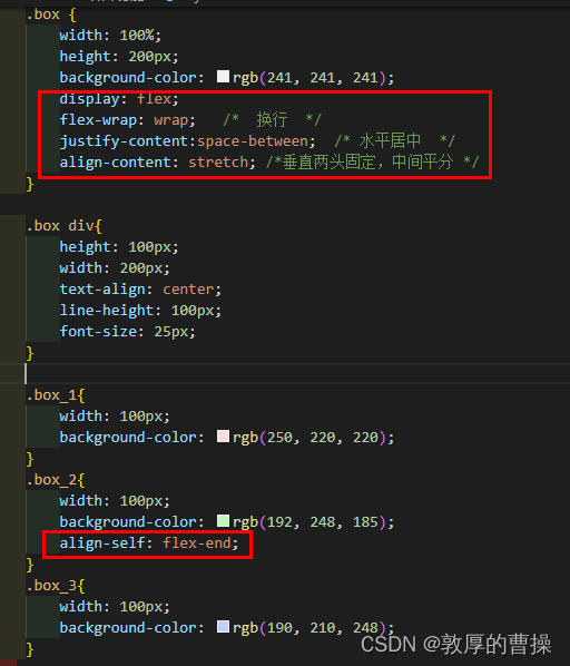
.box {
width: 100%;
height: 200px;
background-color: rgb(241, 241, 241);
display: flex;
flex-wrap: wrap; /* 换行 */
justify-content:space-between; /* 水平居中 */
align-content: stretch; /*垂直两头固定,中间平分 */
}
.box div{
height: 100px;
width: 200px;
text-align: center;
line-height: 100px;
font-size: 25px;
}
.box_1{
width: 100px;
background-color: rgb(250, 220, 220);
}
.box_2{
width: 100px;
background-color: rgb(192, 248, 185);
align-self: flex-end;
}
.box_3{
width: 100px;
background-color: rgb(190, 210, 248);
}
</style>
<body>
<div class="box">
<div class="box_1">1</div>
<div class="box_2">2</div>
<div class="box_3">3</div>
</div>
</body>五、按比例实现flex分布

<!DOCTYPE html>
<html lang="en">
<head>
<meta charset="UTF-8">
<meta http-equiv="X-UA-Compatible" content="IE=edge">
<meta name="viewport" content="width=device-width, initial-scale=1.0">
<title>flex - 弹性盒</title>
</head>
<style>
body {
background-color: rgb(255, 255, 255);
margin: 0;
padding: 0;
}
.box_1 {
height: 50px;
display: flex;
flex-direction: row;
}
.box_1 div:nth-child(1) {
width: 0;
flex-grow: 2;
height: 50px;
line-height: 50px;
text-align: center;
background-color: rgb(199, 247, 199);
}
.box_1 div:nth-child(2) {
width: 0;
flex-grow: 4;
height: 50px;
line-height: 50px;
text-align: center;
background-color: rgb(243, 201, 252);
}
.box_1 div:nth-child(3) {
width: 0;
flex-grow: 2;
height: 50px;
line-height: 50px;
text-align: center;
background-color: rgb(168, 200, 248);
}
</style>
<body>
<h2> 1.标准,注意:加上width:0</h2>
<div class="box_1">
<div>我是flex_1</div>
<div>我是flex_2</div>
<div>我是flex_3</div>
</div>
</body>
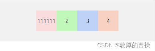
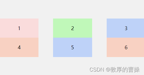
</html>注意:虽然flex设定了平均分配,但如果没有平均分配,格子会随着内容撑开,记得输入:width:0;就强制平均分配了,如下图:

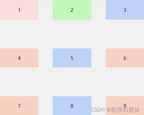
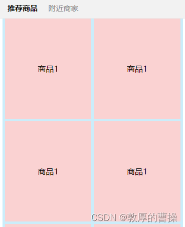
六、多行类似瀑布流flex样式的示例
七、通过flex弹性盒实现头像区的多行、多列效果

四、用flex制作商城双排导航图标

<!DOCTYPE html>
<html lang="en">
  <head>
    <meta charset="UTF-8" />
    <meta http-equiv="X-UA-Compatible" content="IE=edge" />
    <meta name="viewport" content="width=device-width, initial-scale=1.0" />
    <title>Document</title>
  </head>

  <style>
    .item {
      margin: 0 auto;
      width: 100%;
      /* background-color: burlywood; */
    }

    .item-1 {
      width: 100%;
      display: flex;
      justify-content: space-around;
      /* background-color: rgb(112, 169, 243); */
    }
    .tb {
      width: 10%;text-align: center;
      /* height: 100px; */

    }
    .tb img {
      width: 100%;

    }
    span{font-size: 35px;text-align: center;}


  </style>
  <body>
    <div class="item">
      <div class="item-1">
        <div class="tb">
          <img src="images/tb1.jpg" />
        <span>名称</span>


        </div>
        <div class="tb">
          <img src="images/tb2.jpg" />
          <span>名称</span>

        </div>
        <div class="tb"><img src="images/tb3.jpg" />
          <span>名称</span>

        </div>
        <div class="tb"><img src="images/tb4.jpg" />
          <span>名称</span>
        </div>
        <div class="tb"><img src="images/tb5.jpg" />
          <span>名称</span>
        </div>
      </div>

      <div class="item-1">
        <div class="tb"><img src="images/tb6.jpg" />
          <span>名称</span>
        </div>
        <div class="tb"><img src="images/tb7.jpg" />
          <span>名称</span>
        </div>
        <div class="tb"><img src="images/tb8.jpg" />
          <span>名称</span>
        </div>
        <div class="tb"><img src="images/tb9.jpg" />
          <span>名称</span>
        </div>
        <div class="tb"><img src="images/tb10.jpg" />
          <span>名称</span>
        </div>
      </div>
    </div>
  </body>
</html>
十、两边固定,中间可以自动伸缩的实现方法

<!DOCTYPE html>
<html lang="en">

<head>
    <meta charset="UTF-8">
    <meta http-equiv="X-UA-Compatible" content="IE=edge">
    <meta name="viewport"
        content="width=device-width, initial-scale=1.0,maximum-scale=1.0,minimum-scale=1.0,user-scalable=no">
    <title>flex - 弹性盒 - 两边固定,中间伸缩</title>

</head>
<style>
    body {
        margin: 0 0;
    }

    .box {
        height: 100px;
        background-color: antiquewhite;
        display: flex;
        justify-content: space-between;
    }

    .box_left {
        width: 150px;
        max-width: 150px;
        height: 100px;
        line-height: 100px;
        text-align: center;
        background-color: rgb(176, 240, 163);
    }

    .box_right {

        width: 150px;
        max-width: 150px;
        height: 100px;
        line-height: 100px;
        text-align: center;
        background-color: rgb(175, 202, 238);
    }

    .box_center {
        width: 100%;
        height: 100px;
        text-align: center;
        background-color: rgb(248, 248, 248);
        font-size: 22px;
        border-radius: 10px;
        border: 1px red solid;

    }

</style>

<body>

    <div class="box">

        <div class="box_left">
            左边固定
        </div>

        <div class="box_center">
            中间随着窗口大小自动伸缩
        </div>

        <div class="box_right">
            右边固定
        </div>
    </div>

</body>

</html>
相关文章
- vue—你必须知道的 js数据类型 前端学习 CSS 居中 事件委托和this 让js调试更简单—console AMD && CMD 模式识别课程笔记(一) web攻击 web安全之XSS JSONP && CORS css 定位 react小结
- css实现文本缩略显示
- 【Html/Css】关于超链接锚点的示例
- 【CSS】 Css背景图片及背景渐变综合知识和技巧大全(代码实例)
- CSS Modules 解决 react 项目 css 样式互相影响的问题
- CSS - 利用 vertical-align:middle 垂直居中元素容器
- css垂直对齐
- 【前端学习之HTML&CSS】-- 第二篇 -- HTML&CSS概述及开发环境准备
- nodejs遍历文件夹下并操作HTML/CSS/JS/PNG/JPG
- css CSS常见布局解决方案
- 复习CSS
- webpack4+(打包后的文件分析+脚本打包+HTML插件+样式处理CSS+Less+css抽离压缩)
- css层次选择器(详解)
- 关于vue中-js使用-css的变量,和css使用js定义的变量
- CSS学习知识整理(五)Css display(显示)
- CSS学习知识整理(三)Css 文本
- CSS学习知识整理(一)Css 布局
- css样式—字体垂直、水平居中
- CSS 加粗(css font-weight)
- 挖掘css背景模糊的三种表现形式(背景整体模糊,背景局部模糊,背景局部清晰)