
小程序:自定义tabbar
程序 自定义 tabBar
2023-09-27 14:27:09 时间
背景
当小程序原生的 tabbar 不能满足需求的时候,比如要加小红点,这时我们可以使用自定义 tabbar
使用步骤
1、新建一个tabbar组件
在根目录新建一个文件夹 custom-tab-bar(注意文件夹必须是这个命名,否则不生效),并加上以下代码:
注意:如果是框架(wepy等)则写在 src 下,并在全局进行引入,这样做是为了打包后的文件中能生成该组件,否则因为没有依赖关系打包器不会进行打包该组件
index.wxml
<!--miniprogram/custom-tab-bar/index.wxml-->
<cover-view class="tab-bar">
  <cover-view class="tab-bar-border"></cover-view>
  <cover-view wx:for="{{list}}" wx:key="index" class="tab-bar-item" data-path="{{item.pagePath}}" data-index="{{index}}" bindtap="switchTab">
    <cover-image src="{{selected === index ? item.selectedIconPath : item.iconPath}}"></cover-image>
    <cover-view style="color: {{selected === index ? selectedColor : color}}">{{item.text}}</cover-view>
  </cover-view>
</cover-view>
index.js
Component({
  data: {
    selected: 0,
    color: '#7A7E83',
    selectedColor: '#3cc51f',
    list: [{
      pagePath: '/index/index',
      iconPath: '/image/icon_component.png',
      selectedIconPath: '/image/icon_component_HL.png',
      text: '组件'
    }, {
      pagePath: '/index/index2',
      iconPath: '/image/icon_API.png',
      selectedIconPath: '/image/icon_API_HL.png',
      text: '接口'
    }]
  },
  attached() {
  },
  methods: {
    switchTab(e) {
      const data = e.currentTarget.dataset
      const url = data.path
      wx.switchTab({url})
      this.setData({
        selected: data.index
      })
    }
  }
})
index.json
{
 "component": true
}
index.wxss
.tab-bar {
  position: fixed;
  bottom: 0;
  left: 0;
  right: 0;
  height: 48px;
  background: white;
  display: flex;
  padding-bottom: env(safe-area-inset-bottom);
}

.tab-bar-border {
  background-color: rgba(0, 0, 0, 0.33);
  position: absolute;
  left: 0;
  top: 0;
  width: 100%;
  height: 1px;
  transform: scaleY(0.5);
}

.tab-bar-item {
  flex: 1;
  text-align: center;
  display: flex;
  justify-content: center;
  align-items: center;
  flex-direction: column;
}

.tab-bar-item cover-image {
  width: 27px;
  height: 27px;
}

.tab-bar-item cover-view {
  font-size: 10px;
}
2、在 app.json 中增加定义
这里主要是加了 "custom": true,其他的字段也要正常配置完整。
{
  "tabBar": {
    "custom": true,
    "color": "#000000",
    "selectedColor": "#000000",
    "backgroundColor": "#000000",
    "list": [{
      "pagePath": "page/component/index",
      "text": "组件"
    }, {
      "pagePath": "page/API/index",
      "text": "接口"
    }]
  },
  "usingComponents": {}
}
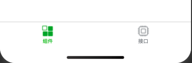
效果
遇到的坑
- 自定义组件要用 cover-view + cover-image,不要用 view
- tabBar 的相关配置只是为了兼容低版本,但这些字段不会作用于自定义 tabBar 的渲染。所以相当于要在自定义组件和配置json里写两遍。
- 可以通过
this.getTabBar()获取当前页面的自定义 tabBar 组件实例。 - 文件夹命名必须为 custom-tab-bar,并且不用在页面中引入,系统会自动识别。
相关文章
- C#中的AssemblyInfo 程序集信息
- 微信小程序 - 自定义导航栏(提示)
- 微信小程序 - 自定义swiper(dot)指示点
- 微信小程序 - 自定义components组件详解A篇
- 微信小程序 - 表单验证插件WxValidate(自定义警告信息形式)
- 并发编程概述 委托(delegate) 事件(event) .net core 2.0 event bus 一个简单的基于内存事件总线实现 .net core 基于NPOI 的excel导出类,支持自定义导出哪些字段 基于Ace Admin 的菜单栏实现 第五节:SignalR大杂烩(与MVC融合、全局的几个配置、跨域的应用、C/S程序充当Client和Server)
- 【微信小程序】-- 自定义组件 -- 创建与引用 &样式(三十二)
- CSDN日报20170711——《离开校园,入职阿里,开启新的程序人生》
- mapreduce程序调用各个类的功能
- 微信小程序组件 自定义多选
- 《C++ 开发从入门到精通》——1.4 第一个C++程序
- 《趣学Python编程》—— 1.4 保存Python程序
- 微信小程序之自定义模态弹窗(带动画)实例
- 微信小程序自定义tabbar底部导航栏
- 微信聊天小程序——(四、聊天页面)
- 【小程序】微信小程序自定义组件Component详细总结
- 小程序map地图上显示多个marker
- 微信小程序之圆形进度条(自定义组件)
- 微信小程序 自定义单选复选按钮组的实现(用于实现购物车产品列表功能)
- Shiro框架:授权流程、授权方式、Shiro授权入门程序、自定义Realm进行授权
- 程序猿应该读什么非编程书籍?
- 在微信小程序上做一个「博客园年度总结」:后端部分