
当前栏目
HarmonyOS 基础之 UI组件 (二)

概述
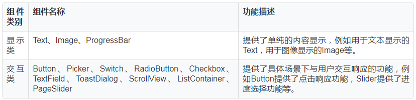
上一篇【HarmonyOS 基础之 UI 布局(一)】我们一起学习了HarmonyOS的常用 UI 布局和一些基础属性,一个界面除了UI布局,组件也是非常重要的组成部分。HarmonyOS的 UI 常见组件分为显示类和交互类。显示类负责文本图像显示,交互类负责交互响应功能。组件的具体使用场景,需要根据业务需求来选择使用。今天这篇文章我将跟大家分享一下常见组件的使用场景和特性。
常见组件
根据组件的功能,可以将组件分为显示类、交互类:
1. Text
Text是用来显示字符串的组件,在界面上显示为一块文本区域。
在layout目录下的xml文件中创建Text。
- <Text
- ohos:id="$+id:text"
- ohos:width="match_content"
- ohos:height="match_content"
- ohos:text="Text"
- />
可以根据不同需要,给Text添加各种属性值。常用的背景如常见的文本背景、按钮背景,可以采用XML格式放置在graphic目录下。如:创建“background_text.xml”,在“background_text.xml”中定义文本的背景。
- <?xml version="1.0" encoding="utf-8"?>
- <shape xmlns:ohos="http://schemas.huawei.com/res/ohos"
- //背景形状,oval椭圆,rectangle方形...
- ohos:shape="rectangle">
- <corners
- //背景圆角程度
- ohos:radius="20"/>
- <solid
- //背景颜色
- ohos:color="#878787"/>
- </shape>
2. Image
Image 是用来显示图片的组件。
2.1 创建 Image
在 src -> main -> resources -> base -> media,添加一个图片至media文件夹下,既可以在XML中创建 Image,也可以在代码中创建 Image。
- <Image
- ohos:id="$+id:image"
- ohos:width="match_content"
- ohos:height="match_content"
- ohos:layout_alignment="center"
- ohos:image_src="$media:plant"
- //设置透明度
- ohos:alpha="0.5"
- />
- Image image = new Image(getContext());
- image.setPixelMap(ResourceTable.Media_plant);
2.2 缩放 Image
- ohos:image_src="$media:plant"
- //设置缩放方式
- ohos:scale_mode="zoom_center"
- //设置缩放系数
- ohos:scale_x="0.5"
- ohos:scale_y="0.5"
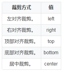
2.3 裁剪 Image
当 Image 尺寸小于图片尺寸时,可以对图片进行裁剪,仍以 Image 的宽高为 200 vp 为例,小于图片尺寸。以左对齐裁剪为例,设置 clip_alignment = “256”。
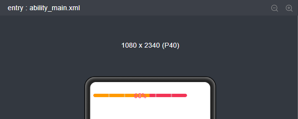
3. ProgressBar
ProgressBar 用于显示内容或操作的进度。
- <ProgressBar
- ohos:progress_width="10vp"
- ohos:height="80vp"
- ohos:width="280vp"
- //设置进度条方向为水平,( vertical 为水平)
- ohos:orientation="horizontal"
- //设置最大值最小值
- ohos:max="100"
- ohos:min="0"
- //设置当前进度
- ohos:progress="60"
- //设置进度条颜色
- ohos:progress_element="#FF9900"
- //设置进度条组件底色
- ohos:background_instruct_element="#F23456"
- //设置分割线
- ohos:divider_lines_enabled="true"
- ohos:divider_lines_number="5"
- //设置提示文字以及提示文字颜色
- ohos:progress_hint_text="60%"
- ohos:progress_hint_text_color="#FF4989"
- />
如上图,进度条展示效果如下:
4. Button
Button是一种常见的组件,点击可以触发对应的操作,通常由文本或图标组成,也可以由图标和文本共同组成。
- <Button
- ohos:id="$+id:button"
- ohos:width="match_content"
- ohos:height="match_content"
- ohos:text_size="27fp"
- ohos:text="button"
- ohos:background_element="$graphic:background_button"
- ohos:left_margin="15vp"
- ohos:bottom_margin="15vp"
- ohos:right_padding="8vp"
- ohos:left_padding="8vp"
- />
4.1 背景样式
如上布局xml文件中可以设置 Button 字体大小,文字内容,文字格式,背景等。其中背景可以在 graphic 文件夹下自定义需要的背景风格。
例如:background_button.xml;
- <?xml version="1.0" encoding="utf-8"?>
- <shape xmlns:ohos="http://schemas.huawei.com/res/ohos"
- //设置控件形状为方形
- ohos:shape="rectangle">
- <corners
- //背景圆角程度
- ohos:radius="10"/>
- <solid
- //背景背景颜色
- ohos:color="#007CFD"/>
- </shape>
- ohos:background_element="$graphic:oval_button_element"
复制通过在 graphic 文件夹下自定义 Button 样式文件,可以自定义不同类型的 Button,按照 Button 的形状,按钮可以分为:普通,椭圆,胶囊,圆形等。
4.2 点击事件
用户点击Button时,Button对象将收到一个点击事件,然后自定义响应点击事件的方法。如:通过创建一个 Component.ClickedListener 对象,然后通过调用 setClickedListener 将其分配给按钮,再收到该点击事件后,执行相应操作对该事件做出响应。
- Button button = (Button) findComponentById(ResourceTable.Id_button);
- // 为按钮设置点击事件回调
- button.setClickedListener(new Component.ClickedListener() {
- public void onClick(Component v) {
- // 此处添加点击按钮后的事件处理逻辑
- }
- });
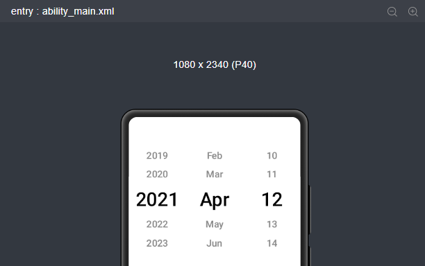
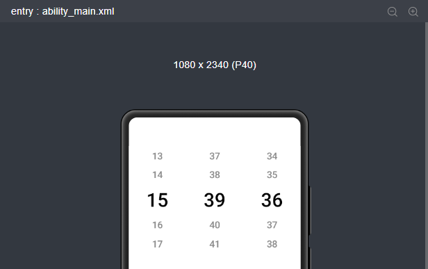
5. Picker
Picker 提供了滑动选择器,允许用户从预定义范围中进行选择。常见的 Picker 有 DatePicker ( 选择日期 ) 和 TimePicker ( 选择时间 )。
- <Picker
- ohos:height="match_content"
- ohos:width="160vp"
- ohos:top_margin="60vp"
- ohos:selected_text_size="40vp"
- ohos:normal_text_size="20vp"
- ohos:layout_alignment="center"
- />
根据 xml 布局文件配置自己需要的 Picker 种类,显示效果如下:
Picker
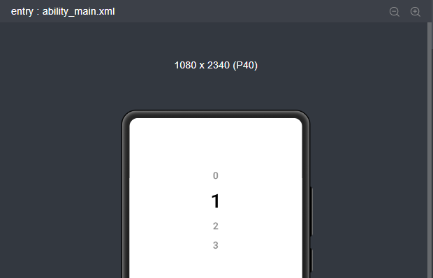
DatePicker
TimePicker
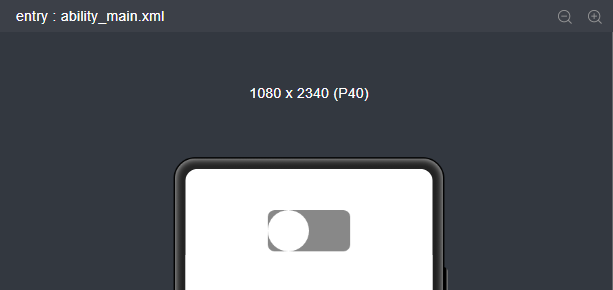
6. Switch
Switch是切换单个设置开/关两种状态的组件。
- <Switch
- ohos:height="60vp"
- ohos:width="120vp"
- ohos:layout_alignment="center"
- ohos:top_margin="60vp"
- />
Switch相当于一个双相开关,点击开关的时候会进行切换,效果如下:
7. RadioButton
RadioButton 是用于多选一操作的组件,需要搭配 RadioContainer 使用,实现单选效果,RadioContainer 是 RadioButton 的容器,在其包裹下的 RadioButton 保证只有一个被选项。
- <RadioButton
- ohos:id="$+id:harmony_UI"
- ohos:top_margin="60vp"
- ohos:height="40vp"
- ohos:width="match_content"
- ohos:text="Hello Harmony"
- ohos:layout_alignment="center"
- ohos:text_size="20fp"
- //字体颜色,text_color_onon 为选中状态,text_color_off 为未选中状态
- ohos:text_color_on="#00BFFF"
- ohos:text_color_off="#808080"
- />
选中状态
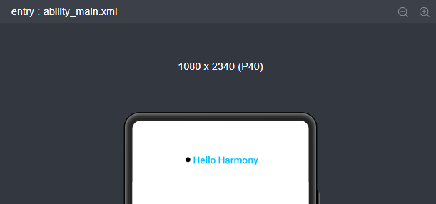
未选中状态
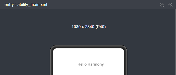
以上两张图为 RadioButton 的选中与未选中的状态对比。
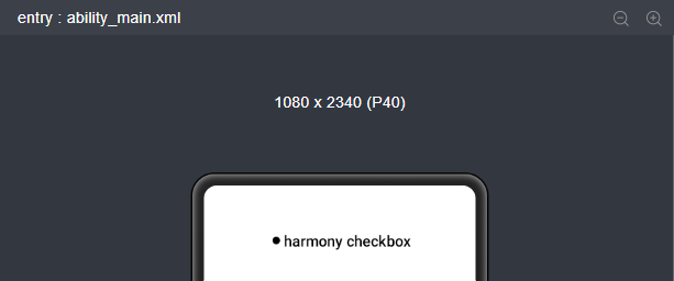
8. Checkbox
Checkbox可以实现选中和取消选中的功能。
- <Checkbox
- ohos:top_margin="60vp"
- ohos:layout_alignment="center"
- ohos:id="$+id:check_box"
- ohos:height="match_content"
- ohos:width="match_content"
- ohos:text="harmony checkbox"
- ohos:text_color_on="#00AAEE"
- ohos:text_color_off="#000000"
- ohos:text_size="20fp" />
xml 布局文件中创建 Checkbox 组件,显示效果如下:
9. TextField
TextField 是一种文本输入框。
- <TextField
- ohos:height="40vp"
- ohos:width="200vp"
- //设置提示语
- ohos:hint="Please enter......"
- //设置内边距
- ohos:left_padding="24vp"
- ohos:right_padding="24vp"
- ohos:top_padding="8vp"
- ohos:bottom_padding="8vp"
- //设置可多行显示
- ohos:multiple_lines="true"
- />
在代码中,我们也可以对文本输入框设置响应事件。
- textField.setFocusChangedListener(((component, isFocused) -> {
- if (isFocused) {
- // 获取到焦点
- ...
- }else {
- // 失去焦点
- ...
- }
- }));
10. ToastDialog
ToastDialog 是在窗口上方弹出的对话框,是通知操作的简单反馈。ToastDialog 会在一段时间后消失,在此期间,用户还可以操作当前窗口的其他组件。
在代码中创建 ToastDialog。
自定义布局 Resource 文件 Layout_layout_toast.xml 内容如下:
- <?xml version="1.0" encoding="utf-8"?>
- <DirectionalLayout
- xmlns:ohos="http://schemas.huawei.com/res/ohos"
- ohos:height="match_content"
- ohos:width="match_content"
- ohos:orientation="vertical">
- <Text
- ohos:id="$+id:msg_toast"
- ohos:height="match_content"
- ohos:width="match_content"
- ohos:left_padding="16vp"
- ohos:right_padding="16vp"
- ohos:top_padding="4vp"
- ohos:bottom_padding="4vp"
- ohos:layout_alignment="center"
- ohos:text_size="16fp"
- ohos:text="This is a ToastDialog for the customized component"
- ohos:background_element="$graphic:background_toast_element"/>
- </DirectionalLayout>
11. ScrollView
ScrollView 是一种带滚动功能的组件,它采用滑动的方式在有限的区域内显示更多的内容。
- <ScrollView
- ohos:id="$+id:scrollview"
- ohos:height="300vp"
- ohos:width="300vp"
- ohos:background_element="#FFDEAD"
- ohos:top_margin="32vp"
- ohos:bottom_padding="16vp"
- ohos:layout_alignment="horizontal_center">
- <DirectionalLayout
- ohos:height="match_content"
- ohos:width="match_content">
- <Image
- ohos:id="$+id:img_1"
- ohos:width="300vp"
- ohos:height="match_content"
- ohos:top_margin="16vp"
- ohos:image_src="$media:dog.png"/>
- <!--放置任意需要展示的组件-->
- </DirectionalLayout>
- </ScrollView>
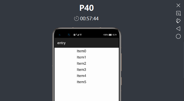
12. ListContainer
ListContainer 是用来呈现连续、多行数据的组件,包含一系列相同类型的列表项。
首先需要在 layout 目录下的 xml 布局文件中创建 ListContainer。
- <?xml version="1.0" encoding="utf-8"?>
- <ListContainer
- xmlns:ohos="http://schemas.huawei.com/res/ohos"
- ohos:id="$+id:list_container"
- ohos:height="200vp"
- ohos:width="300vp"
- ohos:layout_alignment="horizontal_center"/>
然后在 layout 目录下新建 xml 文件(例:item_listContainer.xml),作为 ListContainer 的子布局。
- <?xml version="1.0" encoding="utf-8"?>
- <DirectionalLayout
- xmlns:ohos="http://schemas.huawei.com/res/ohos"
- ohos:height="match_content"
- ohos:width="match_parent"
- ohos:left_margin="16vp"
- ohos:right_margin="16vp"
- ohos:orientation="vertical">
- <Text
- ohos:id="$+id:item_index"
- ohos:height="match_content"
- ohos:width="match_content"
- ohos:padding="4vp"
- ohos:text="Item0"
- ohos:text_size="20fp"
- ohos:layout_alignment="center"/>
- </DirectionalLayout>
ListContainer 每一行可以为不同的数据,因此需要适配不同的数据结构,使其都能添加到 ListContainer 上。
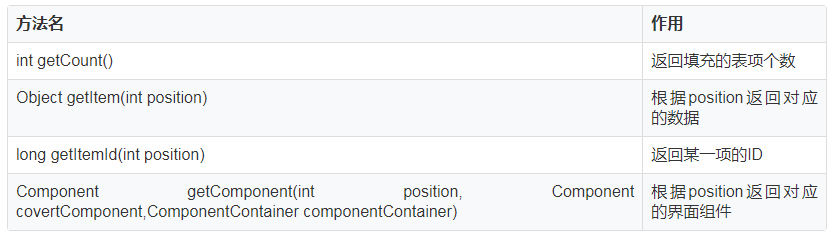
创建 ListcontainerItemProvider.java,继承自RecycleItemProvider。
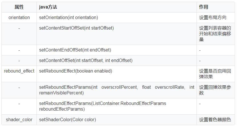
ListContainer 的样式设置
看看效果:
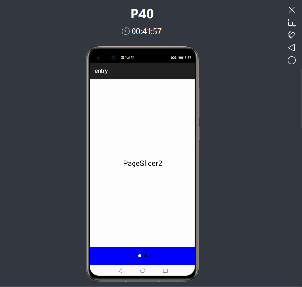
13. PageSlider
PageSlider 是一个交互类组件。
main_pageSlider.xml
- <?xml version="1.0" encoding="UTF-8"?>
- <DirectionalLayout
- xmlns:ohos="http://schemas.huawei.com/res/ohos"
- ohos:height="match_parent"
- ohos:width="match_parent"
- ohos:background_element="blue"
- ohos:orientation="vertical">
- <PageSlider
- ohos:id="$+id:pager_slider"
- ohos:height="0vp"
- ohos:width="match_parent"
- ohos:background_element="#ffffff"
- ohos:weight="1"/>
- <RadioContainer
- ohos:id="$+id:radio_container"
- ohos:height="60vp"
- ohos:width="match_parent"
- ohos:alignment="horizontal_center"
- ohos:orientation="horizontal">
- <RadioButton
- ohos:height="match_parent"
- ohos:width="match_content"
- ohos:text_size="20fp"
- />
- <RadioButton
- ohos:height="match_parent"
- ohos:width="match_content"
- ohos:text_size="20fp"
- />
- </RadioContainer>
- </DirectionalLayout>
pageSlider1.xml
- <?xml version="1.0" encoding="utf-8"?>
- <DependentLayout
- xmlns:ohos="http://schemas.huawei.com/res/ohos"
- ohos:height="match_parent"
- ohos:width="match_parent">
- <Text
- ohos:height="match_content"
- ohos:width="match_content"
- ohos:center_in_parent="true"
- ohos:text="PageSlider1"
- ohos:text_size="25fp"/>
- </DependentLayout>
pageSlider2.xml
- <?xml version="1.0" encoding="utf-8"?>
- <DependentLayout
- xmlns:ohos="http://schemas.huawei.com/res/ohos"
- ohos:height="match_parent"
- ohos:width="match_parent">
- <Text
- ohos:height="match_content"
- ohos:width="match_content"
- ohos:center_in_parent="true"
- ohos:text="PageSlider2"
- ohos:text_size="25fp"/>
- </DependentLayout>
然后启动程序看一下控件效果:


相关文章
- 电商网站使用哪种证书比较好?
- 开源炫酷css轮播图 可直接引入html文件使用 含注释 jQuery插件
- 学习JavaScript笔记
- HTML DOM(一)——简介,元素,表单
- 【蜻蜓点水】了解一下 vite 下一代前端开发与构建工具
- 1 分钟学会 30 种编程语言
- 【蜻蜓点水】了解一下 vite 下一代前端开发与构建工具2
- 13 个关于删除/过滤 JS 数组的方法
- 如何从 0 到 1 实现一个支持排序、查找、分页的表格组件(React版)
- 分享 42 个面向前端开发的 JS 库和框架
- 分享 16 个适合做拖拽练习的前端案例
- 使用CSS这个小技巧,可以让长列表网页的渲染性能提升几倍以上!
- 分享 19 个有用的 JS 代码片段
- web系统中的结构化数据标记
- BurpSuite2021 -- 目标模块(Target)
- Vite 2.x + React + Zarm + Less + React Router v6 + Axios + flexible.js 搭建前端 H5 开发环境
- Eclipse MyBatis1.4.2 generatorConfig 默认不生成XML文件,加了type="XMLMAPPER"也不起作用,解决方法
- Vite 2.x + React + Zarm + Less + React Router v6 + Axios + flexible.js 搭建前端 H5 开发环境2
- Node.js 分享:require 加载器实现原理
- 恶意软件DanaBot借供应链攻击回归