
css3动画水波纹、波浪
2023-09-14 08:58:23 时间
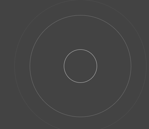
<!DOCTYPE html>
<html lang="en">

<head>
    <meta charset="UTF-8">
    <title>Document</title>
    <style type="text/css">
    html{
        font-size: 20px;
    }
      body{
          background:#444;
      }
    @-webkit-keyframes opac{
        from {
            opacity: 1;
            width:0;
            height:0;
            top:50%;
            left:50%;
        }
        to {
            opacity : 0;
            width:100%;
            height:100%;
            top:0;
            left:0;
        }
    }
    .animate .w2{
        /*延迟1s*/
        -webkit-animation-delay:1s;
    }
    .animate .w3{
        -webkit-animation-delay:2s;
    }
    .animate .w4{
        -webkit-animation-delay:3s;
    }
    .wave{
        width: 22.7rem;
        height: 22.7rem;
        position: absolute;
        top: 0;
        left: 0;
        right: 0;
        margin: 0 auto;
    }
    .wave *{
        border:1px solid #fff;
        position:absolute;
        border-radius:50%;
        -webkit-animation:opac 4s infinite;
    }
    </style>
</head>

<body>
    <div class="animate wave">
        <div class="w1"></div>
        <div class="w2"></div>
        <div class="w3"></div>
        <div class="w4"></div>
    </div>
</body>

</html>
效果图:
2.波浪
<!DOCTYPE html>
<html lang="en">

<head>
    <meta charset="UTF-8">
    <title>Document</title>
    <style>
    *{margin:0;padding:0;}
    body{ background-color: #522350 }
    .water {
        position: relative;
        width: 200px;
        height: 200px;
        background-color: rgb(118, 218, 255);
        border-radius: 50%;
        margin:200px auto 0;
        overflow: hidden;
    }
    .water:before,.water:after{
           content: "";
           position: absolute;
           width: 400px;
           height: 400px;
           top: 0;
           left: 50%;
           background-color: rgba(255, 255, 255, .4);
           border-radius: 45%;
           transform: translate(-50%, -70%) rotate(0);
           animation: rotate 6s linear infinite;
           z-index: 10;
    }

    .water:after {
           border-radius: 47%;
           background-color: rgba(255, 255, 255, .9);
           transform: translate(-50%, -70%) rotate(0);
           animation: rotate 10s linear -5s infinite;
           z-index: 20;
    }

    @keyframes rotate {
        50% {
            transform: translate(-50%, -70%) rotate(180deg);
        } 100% {
            transform: translate(-50%, -70%) rotate(360deg);
        }
    }

    </style>
</head>

<body>
    <div class="water"></div>
</body>

</html>
效果:

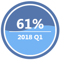
3.波浪
<!DOCTYPE html> <html lang="en"> <head> <meta charset="UTF-8"> <title>Document</title> <style type="text/css"> * { padding: 0px; margin: 0px; font-family: "微软雅黑"; font-size: 100%; font-style: normal } dd, dl, dt, em, i, p, textarea, a, div { padding: 0px; margin: 0px; } a { text-decoration: none; } img { border: 0px; } ul, li { padding: 0px; margin: 0px; list-style: none; } .fl { float: left } .fr { float: right } body { margin: 0px; padding: 0px; color: #000; background: #fff; } a { -webkit-tap-highlight-color: rgba(0, 0, 0, 0); -webkit-tap-highlight-color: transparent; } .none { display: none } .fensug { width: 168px; height: 168px; background: #fff; border: 9px #5576ac solid; margin: 100px auto; padding: 5px; -webkit-border-radius: 25em; -moz-border-radius: 25em; border-radius: 25em; overflow: hidden; position: relative } .fensug .wavenum { width: 168px; height: 168px; overflow: hidden; -webkit-border-radius: 50%; border-radius: 50%; text-align: center; display: table-cell; vertical-align: middle; position: absolute; left: 5px; top: 5px; z-index: 5; display: flex; align-items: center; justify-content: center; flex-direction: column; } .fensug .wavenum b { color: #fff; font-size: 43px; text-align: center; display: block; position: relative; z-index: 2; line-height: 45px; } .fensug .wavenum tt { color: #fff; font-size: 20px; text-align: center; display: block; position: relative; z-index: 2; font-weight: bold; width: 140px; border-top: 2px #fff solid; margin: 3px auto; line-height: 35px; } .waven { width: 168px; height: 168px; webkit-border-radius: 25em; -moz-border-radius: 25em; border-radius: 25em; background: #5576ac; overflow: hidden; position: relative } .wave { width: 408px; height: 80%; position: absolute; left: 0px; bottom: 0; background: url(http://www.17sucai.com/preview/5730/2018-09-20/images/images/wave.png) no-repeat; animation: move_wave 1s linear infinite; -webkit-animation: move_wave 1s linear infinite; } @-webkit-keyframes move_wave { 0% { -webkit-transform: translateX(0) } 50% { -webkit-transform: translateX(-25%) } 100% { -webkit-transform: translateX(-50%) } } @keyframes move_wave { 0% { transform: translateX(0) } 50% { transform: translateX(-25%) } 100% { transform: translateX(-50%) } } </style> </head> <body> <div class="fensug"> <div class="wavenum "><b id="denfenjs">61%</b><tt>2018 Q1</tt></div> <div class="waven"> <div class="wave" style="height: 60%;"> </div> </div> </div> <script src="http://apps.bdimg.com/libs/jquery/1.9.1/jquery.min.js" type="text/javascript"></script> <script type="text/javascript"> var waveHeight = 0; var waveNum = 61; function waves() { if (waveHeight < waveNum) { $(".wave").css("height", waveHeight + "%"); waveHeight++; } setTimeout(function() { waves() }, 15); } $(function() { $("#denfenjs").html(waveNum + "%"); waves(); }) </script> </body> </html>
效果图:
相关文章
- JS框架_(JQuery.js)纯css3进度条动画
- CALayer动画的暂停,恢复,以及结束时候的回调
- 根据UIScrollView的contentOffset值精确控制动画
- 原创:CSS3技术-雪碧图自适应缩放与精灵动画方案
- [Aaronyang] 写给自己的WPF4.5 笔记22 [3d交互与动画 3/4]
- 简易动画制作
- css3动画(animation)效果2-旋转的星球
- 如何用 Keynote 制作动画演示(转)
- css3 Transition动画执行时有可能会出现闪烁的bug
- css3动画制作工具
- 动画 -- ListView列表item逐个出来(从无到有)
- [Android1.5]Android2.0版本以下Activity切换动画效果
- MFC Windows 程序设计[194]之动画滑动框(附源码)
- 前端常见面试题:CSS3动画知道吗?怎么实现的?
- 前端扫描效果CSS3 animation 属性实现“扫一扫”动画效果
- Android kotlin实现Recyclerview酷炫动画
- 【图文动画详解原理系列】9.分布式系统架构设计
- CSS3与动画有关的属性transition、animation、transform对比
- CSS3 3D旋转动画代码实例
- css3 animation动画事件
- 英语动画字母积木 Alphablocks 4季91集 自然拼读phonics 带字幕
- 深入浅出matplotlib(39):动画显示与MP4视频输出二
- js+css3简易实现2023新年快乐全屏满天星动画特效