
css——translate/rotate 空间坐标轴
CSS 空间 rotate 坐标轴 translate
2023-09-27 14:29:10 时间
参考:https://www.cnblogs.com/zhangnan35/p/10709876.html
https://www.cnblogs.com/zyrblog/p/11142624.html
translate三维坐标图:
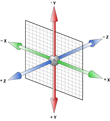
rotate判断:
正向轴对着眼睛,顺时针则旋转角度为正,逆时针则旋转角度为负。
或者用左手法则也行:伸出左手,大拇指指向正轴方向,四个手指的指向即是旋转正向,但务必记住是左手!
注:rotate后三维坐标轴也会跟着改变
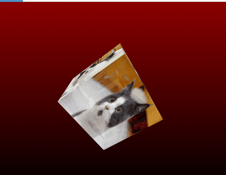
例——正方体相册
效果:
html:
<!DOCTYPE html>
<html>
    <head lang="en">
        <meta charset="UTF-8">
        <link type="text/css" href="css/1.css" rel="stylesheet ">
        <title>旋转立方体相册</title>
    </head>
    <body>
        <div id="react">
            <div class="out_front">
                <img src="img/1.jpg" class="out_pic">
            </div>
            <div class="out_back">
                <img src="img/2.jpg" class="out_pic">
            </div>
            <div class="out_left">
                <img src="img/3.jpg" class="out_pic">
            </div>
            <div class="out_right">
                <img src="img/4.jpg" class="out_pic">
            </div>
            <div class="out_top">
                <img src="img/5.jpg" class="out_pic">
            </div>
            <div class="out_bottom">
                <img src="img/1.jpg" class="out_pic">
            </div>
            <span class="in_front">
                <img src="img/2.jpg" class="in_pic">
            </span>
            <span class="in_back">
                <img src="img/3.jpg" class="in_pic">
            </span>
            <span class="in_left">
                <img src="img/4.jpg" class="in_pic">
            </span>
            <span class="in_right">
                <img src="img/5.jpg" class="in_pic">
            </span>
            <span class="in_top">
                <img src="img/1.jpg" class="in_pic">
            </span>
            <span class="in_bottom">
                <img src="img/2.jpg" class="in_pic">
            </span>
        </div>
    </body>
</html>
1.css:
* {
    padding: 0;
    margin: 0;
}

body {
    width: 100%;
    height: 100%;
    perspective: 500px;//元素被查看位置的视图,值越大,代表“眼睛离观察物越远”,值越小,代表“眼睛越靠近观察物”
    background: linear-gradient(darkred 0%, black 100%);
}

#react {
    width: 200px;
    height: 200px;
    margin: 200px auto;
    transform-style: preserve-3d;//支持3d图像显示
    animation: rotate 20s infinite;
    animation-timing-function: linear;
}

#react div {
    position: absolute;
    transition: all .4s;
}

div .out_pic {
    width: 200px;
    height: 200px;
    opacity: 0.9;
}

div .in_pic {
    width: 100px;
    height: 100px;
}

#react span {
    display: block;
    position: absolute;
    width: 100px;
    height: 100px;
    top: 50px;
    left: 50px;
}

@keyframes rotate {
    from {
        transform: rotateX(0deg) rotateY(0deg);
    }

    to {
        transform: rotateX(360deg) rotateY(360deg);
    }
}


.out_front {
    transform: translateZ(100px);
}

.out_back {
    transform: translateZ(-100px);
}

.out_left {
    transform: rotateY(90deg) translateZ(100px);
}

.out_right {
    transform: rotateY(-90deg) translateZ(100px);
}

.out_top {
    transform: rotateX(90deg) translateZ(100px);
}

.out_bottom {
    transform: rotateX(-90deg) translateZ(100px);
}

.in_front {
    transform: translateZ(50px);
}

.in_back {
    transform: translateZ(-50px);
}

.in_left {
    transform: rotateY(90deg) translateZ(50px);
}

.in_right {
    transform: rotateY(-90deg) translateZ(50px);
}

.in_top {
    transform: rotateX(90deg) translateZ(50px);
}

.in_bottom {
    transform: rotateX(-90deg) translateZ(50px);
}

/*外面的图片散开*/
#react:hover .out_front {
    transform: translateZ(200px);
}

#react:hover .out_back {
    transform: translateZ(-200px);
}

#react:hover .out_left {
    transform: rotateY(90deg) translateZ(200px);
}

#react:hover .out_right {
    transform: rotateY(-90deg) translateZ(200px);
}

#react:hover .out_top {
    transform: rotateX(90deg) translateZ(200px);
}

#react:hover .out_bottom {
    transform: rotateX(-90deg) translateZ(200px);
}


/*里面的图片散开*/
#react:hover .in_front {
    transform: translateZ(100px);
}

#react:hover .in_back {
    transform: translateZ(-100px);
}

#react:hover .in_left {
    transform: rotateY(90deg) translateZ(100px);
}

#react:hover .in_right {
    transform: rotateY(-90deg) translateZ(100px);
}

#react:hover .in_top {
    transform: rotateX(90deg) translateZ(100px);
}

#react:hover .in_bottom {
    transform: rotateX(-90deg) translateZ(100px);
}
相关文章
- 【Css/小程序】如何实现div或view中的文字左右居中和垂直居中?(已解决:多行和单行自适应)
- 【转】HTML <!--...--> 注释 、CSS/JS //注释 和 /*.....*/ 注释
- CSS利用background设计彩虹导航栏&与hover的用法
- html添加css样式的两种方法
- 《HTML与CSS入门经典(第8版)》——1.2 创建Web内容
- css选择器里的不同的符号(+,>,~,*)
- CSS选择器大全(上)
- CSS中的重绘和重排(回流)是什么?(面试常问)
- 小白都能做到的使用css如何让一个盒子沾满剩余的空间
- CSS cursor 属性
- html/css 图片展示效果
- css解决display:inline-block;产生的缝隙(间隙)
- CSS:实现动态旋转效果/椭圆渐变圆环旋转/椭圆轨迹旋转