
css:animation@keyframes 实现 CD播放旋转动画效果
2023-09-27 14:24:14 时间
文档
示例一

@keyframes 设置动画帧
1、from to 用于简单动画,只有起始帧和结束帧
2、百分比 用于复杂动画,动画不止两帧
<style>
        html,
        body {
            margin: 0;
            padding: 0;
        }

        body {
            height: 100%;
            display: flex;
            flex-direction: column;
            align-items: center;
            justify-content: center;
        }

        .cover-wrap {
            width: 200px;
            height: 200px;
            border: 40px solid #000000;
            border-radius: 50%;
            overflow: hidden;
        }

        @keyframes playmusic {

            /* 起始位置 */
            from {
                transform: rotate(0deg);
            }

            /* 结束位置 */
            to {
                transform: rotate(360deg);
            }
        }

        .cover {
            width: 100%;
            height: 100%;
            object-fit: cover;

            /* 动画属性 */
            animation-name: playmusic;
            animation-duration: 4s;
            animation-timing-function: linear;
            animation-iteration-count: infinite;
        }
    </style>

    <div>animation@keyframes 实现 CD播放效果</div>
    <div class="cover-wrap">
        <img class="cover"
             src="https://api.isoyu.com/bing_images.php">
    </div>
在线Demo: animation-keyframes.html
示例二
<style>
html,
body {
height: 100%;
}
body {
display: flex;
flex-direction: column;
align-items: center;
justify-content: center;
}
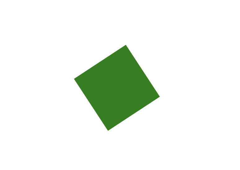
.box {
width: 100px;
height: 100px;
background-color: green;
}
</style>
<style>
@keyframes rotate-infinite {
/* 起始位置 */
0% {
transform: rotate(0deg);
}
/* 结束位置 */
100% {
transform: rotate(360deg);
}
}
.animation-rotate {
/* linear 匀速运动 */
animation: 10s rotate-infinite infinite linear;
}
</style>
<div class="box animation-rotate"></div>
示例:https://mouday.github.io/front-end-demo/animation/index.html
参考
相关文章
- css盒子布局,浮动布局以及显影与简单的动画
- 可以添加动画的Css属性
- css3动画简介以及动画库animate.css的使用
- css实现图片动画效果
- 添加CSS动画
- css 动画 div顺时针方向移动,
- css动画京东小布hover放大
- 弄懂css动画知识点
- CSS中动画——Z轴平移,旋转,缩放
- <图形图像,动画,多媒体> 读书笔记 --- AirPlay
- 好消息!Html5游戏和动画的福音
- css 动画 div顺时针方向移动,
- 带给你灵感:30个超棒的 SVG 动画展示【上篇】
- 15个来自 CodePen 的酷炫 CSS 动画效果【下篇】
- 赞!15个来自 CodePen 的酷炫 CSS 动画效果
- 为网格布局图片打造的超炫 CSS 加载动画
- Magic CSS3 – 创建各种神奇的交互动画效果
- Animo.js :一款管理 CSS 动画的强大的小工具
- 如何用 CSS 和 D3 创作旋臂粒子动画
- 如何用 CSS 和 D3 创作火焰动画
- 如何用纯 CSS 创作一个记事本翻页动画
- CSS+JS实现流星雨动画
- ScrollView滚动到指定位置 (平滑 慢速 动画)
- 谈谈一些有趣的CSS题目(十三)-- 巧妙地制作背景色渐变动画!
- 流畅的自行车动画 纯CSS编写
- 《Flutter 动画系列》组合动画
- 适合练习听力的动画排名