
CSS3 花屏文字
css3 文字
2023-09-11 14:22:55 时间
原理图
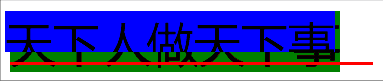
想要看原理图的话,仅需要加上如下样式
.scanline {
	background-color: red;
}
.blurtext:before {
	background-color: green;
}
.blurtext:after {
	background-color: blue;
}
可以看出
- 扫码线基本都在文字下方,然后瞬间弹跳两次,最终又回到文字下方
- 偏移的蓝色矩形也是从上向下弹跳
- 背后的绿色矩形只有在蓝色矩形回收的时候,才会偶尔短暂显示
偏移文字不加背景情况的透视图
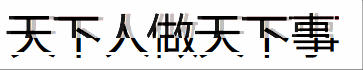
该图是把 “偏移文字” 的图层背景的透明度置为 0.5,即50%透明度
- 可以看出底部遮罩层露了出来
- 红色阴影偶尔才显示,是因为偏移量比较小,又是右侧(在同层级的 文字下层)所以仅会显示一丢丢
.blurtext:after {
	background-color: rgba(255,255,255,0.5);
}
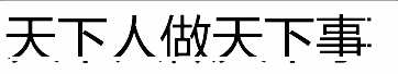
最终效果图
代码如下:
<!DOCTYPE html>
<html>
<head>
<meta charset="utf8">
<title>Blur Text</title>
<style>
/**
:root选择器用匹配文档的根元素
CSS3变量定义:--*,变量使用:var(--*)
*/
:root {
	--fontSize: 3vw;
}
/**
花屏文字,最底层
*/
.blurtext {
	font-size: var(--fontSize);

	/**
	relative会构造一个相对定位的元素,其内部absolute的元素都相对其进行定位
	*/
	position: relative;

	/**
	block是整行,加上inline可以限制它仅在内容区域
	*/
	display: inline-block;
}
/**
扫描线(最上层)
*/
.scanline {
	position: absolute;
	width: 110%;
	height: calc(var(--fontSize) / 15);
	background-color: white;
	animation: scanAnim 9s ease infinite;
	z-index: 4;
}
.blurtext:before, .blurtext:after {
	content: attr(data-text);
	position: absolute;
	top: 0;

	/** 超出限制框的文字隐藏 */
	overflow: hidden;
	white-space: nowrap;

	/**
	contrast指的是图像的对比度。
	值是0%的话,图像会全黑。
	值是100%,图像不变。
	值可以超过100%,意味着会运用更低的对比。
	若没有设置值,默认是1,即100%。
	*/
	filter:contrast(200%);
}
/**
红色边框阴影层(文字上层)
*/
.blurtext:before {
	left: calc(var(--fontSize) / 100);
	color:rgba(0,0,0,.9);
	text-shadow: calc(var(--fontSize) / 200) 0 0 red;
	animation: redAnim 1s ease-in infinite;
	z-index: 2;
}
/**
偏移文字(层级仅次于扫描线)
*/
.blurtext:after {
	left: calc(var(--fontSize) / -10);
	color:rgba(0,0,0,.8);
	background-color: rgba(255,255,255,.9);
	animation: whiteAnim 1.5s ease-out infinite;
	z-index: 3;
}
/** 扫描线突变动画 */
@keyframes scanAnim {
	 0% { top: 40% }
	 8% { top: 85% }
	10% { top: 15% }
	12% { top: 90% }
	99% { top: 75% }
}
/** 红色阴影露出动画 */
@keyframes redAnim {
	0%	 { height:   0% }
	20%  { height:  75% }
	60%  { height:   6% }
	100% { height: 100% }
}
/** 向左偏移的字体显示动画 */
@keyframes whiteAnim {
	  0% { height:  80% }
	 20% { height: 100% }
	 35% { height:  30% }
	 50% { height:  95% }
	 60% { height:  50% }
	 70% { height:  70% }
	 80% { height:  55% }
	100% { height:   0% }
}
</style>
</head>
<body>
	<div class="blurtext" data-text="天下人做天下事">天下人做天下事
		<div class="scanline"></div>
	</div>
</body>
</html>
相关文章
- 《图解CSS3:核心技术与案例实战》
- css3实现摇动效果的下拉菜单(1+X Web前端开发初级 例题)
- css3 calc不生效 及 解决方案
- css3的选择器有哪几种?
- CSS3选择器示例大全(元素选择符、关系选择符、属性选择符、伪类选择符、伪对象选择符)
- 图解css3:核心技术与案例实战. 3.2 CSS3边框颜色属性
- 图解css3:核心技术与案例实战. 3.4 CSS3圆角边框属性
- 《HTML5+CSS3网页设计入门必读》——第6章 处理字体6.1 处理特殊字符
- 《iOS应用开发指南——使用HTML5、CSS3和JavaScript》——1.4 法宝就是转变
- 《响应式Web设计:HTML5和CSS3实践指南》——1.3节基于cookie及JavaScript的响应式图像
- 《响应式Web设计:HTML5和CSS3实践指南》——2.11节基于相对字体大小的按钮
- CSS3中的transition使用
- html5+Css3+JavaScript+jQuery:HTML5篇
- CSS3选择器 :read-only选择器 CSS3选择器 :read-write选择器
- CSS3 结构性伪类选择器(1)
- CSS3 文本修饰(两种方案实现 波浪线)
- CSS3 弹簧