
CSS3 文本修饰(两种方案实现 波浪线)
css3 实现 方案 文本 两种 修饰 波浪
2023-09-11 14:22:55 时间
<!DOCTYPE html>
<html>
<head>
<meta charset="utf8">
<style>
/*
text-transform
Capitalize 英文单词的首字母大写
Uppercase 英文拼音字母全大写
Lowercase 英文拼音字母全小写
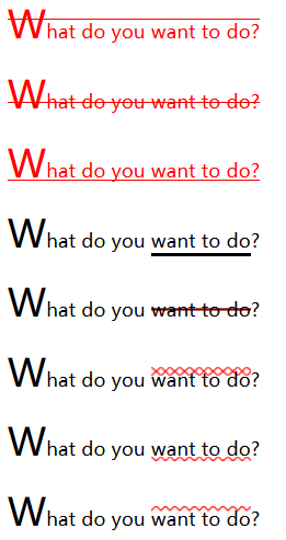
text-decoration 修饰的颜色由 "color" 属性设置(仅有该种方式在选中之后能显示修饰后的样式)
overline 定义文本上的一条线
line-through 定义穿过文本下的一条线
underline 定义文本下的一条线
*/
/*
"first-letter" 选择器仅适用于在块级元素中
如果div/p文本中存在::before,first-letter不会生效
*/
p:first-letter {
text-transform: capitalize;
font-size: 200%;
}
p:nth-child(1) {
color: red;
text-decoration: overline;
}
p:nth-child(2) {
color: red;
text-decoration: line-through;
}
p:nth-child(3) {
color: red;
text-decoration: underline;
}
/* 既可以用边框做下划线 */
p:nth-child(4)>span {
border-bottom: 3px solid black;
}
/* 也可以用背景做下划线,背景的划线位置更好控制 */
p:nth-child(5)>span {
background-image: linear-gradient(transparent 45%, black 45%, red 55%, transparent 55%);
}
/* 如果要增大波浪线的宽度,就增加中间颜色的百分比 */
p:nth-child(6)>span {
background-image: linear-gradient(135deg, transparent 40%, red, transparent 60%),
linear-gradient(45deg, transparent 40%, red, transparent 60%);
background-size: 0.5rem 0.5rem;
background-repeat: repeat-x;
}
/* 既可以使用x,然后通过移动它的位置让下半部分隐藏实现波浪 */
p:nth-child(7)>span {
background-image: linear-gradient(135deg, transparent 40%, red, transparent 60%),
linear-gradient(45deg, transparent 40%, red, transparent 60%);
background-size: 0.5rem 0.5rem;
background-repeat: repeat-x;
background-position: 0 1.05rem;
}
/* 也可以在渐变的时候直接就做出波浪 */
p:nth-child(8)>span {
background-image: linear-gradient(135deg, transparent 15%, red, transparent 35%),
linear-gradient(45deg, transparent 65%, red, transparent 85%);
background-size: 0.5rem 0.5rem;
background-repeat: repeat-x;
}
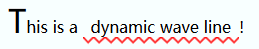
p:nth-child(9)>span {
background-image: linear-gradient(135deg, transparent 15%, red, transparent 35%),
linear-gradient(45deg, transparent 65%, red, transparent 85%);
background-size: .7rem .7rem;
background-repeat: repeat-x;
background-position: 0 1.8rem;
display: inline-block;
padding: .5rem;
animation: backgroundPositionAnim 1s linear infinite;
}
@keyframes backgroundPositionAnim {
from { background-position-x: 0;}
to { background-position-x: 15%;}
}
</style>
</head>
<body>
<p>what do you <span>want to do</span>?</p>
<p>what do you <span>want to do</span>?</p>
<p>what do you <span>want to do</span>?</p>
<p>what do you <span>want to do</span>?</p>
<p>what do you <span>want to do</span>?</p>
<p>what do you <span>want to do</span>?</p>
<p>what do you <span>want to do</span>?</p>
<p>what do you <span>want to do</span>?</p>
<p>This is a <span>dynamic wave line</span>!</p>
</body>
</html>
相关文章
- CSS3 transition实现超酷图片墙动画效果
- HTML5 CSS3专题 诱人的实例 CSS3打造百度贴吧的3D翻牌效果
- 图解css5:核心技术与案例实战. 1.2 浏览器对CSS3的支持状况
- 图解css3:核心技术与案例实战. 1.4 CSS3的现状及未来
- 图解css3:核心技术与案例实战. 3.1 CSS3边框简介
- 图解css3:核心技术与案例实战. 3.3 CSS3图片边框属性
- [WPF] 抄一个 CSS3 实现的按钮
- CSS3彩色进度条加载动画 带进度百分比
- 《移动网页设计与开发 HTML5+CSS3+JavaScript》—— 1.7 测试,再测试,进行更多的测试
- 《HTML5+CSS3网页设计入门必读》——1.4 选择Web托管提供商
- 《HTML5+CSS3网页设计入门必读》——6.4 使用Web字体
- 《iOS应用开发指南——使用HTML5、CSS3和JavaScript》——导读
- 《响应式Web设计:HTML5和CSS3实践指南》——2.2节创建自适应的响应式字体
- CSS3实现文字过渡移动
- css3+svg实现波浪图
- css3实现jquery mobile的页面过度原理
- css3实现3d显示效果
- CSS3:RGBA的使用方法
- CSS3实现的苹果网站搜索框效果
- css3中关于伪类的使用