
CSS实现四种loading动画效果
2023-09-11 14:19:55 时间
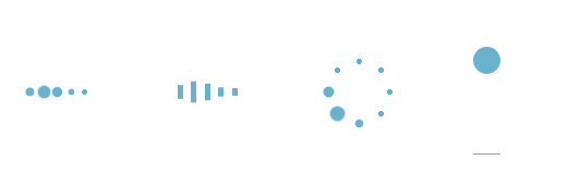
四种loading加载效果:
<!DOCTYPE html>
<html lang="en">
<head>
    <meta charset="utf-8">
    <title>四种加载效果</title>
<style>
/*第一种*/
.demo1 {
    width: 4px;
    height: 4px;
    border-radius: 2px;
    background: #68b2ce;
    float: left;
    margin: 0 3px;
    animation: demo1 linear 1s infinite;
    -webkit-animation: demo1 linear 1s infinite;
}
.demo1:nth-child(1){
    animation-delay:0s;
}
.demo1:nth-child(2){
    animation-delay:0.15s;
}
.demo1:nth-child(3){
    animation-delay:0.3s;
}
.demo1:nth-child(4){
    animation-delay:0.45s;
}
.demo1:nth-child(5){
    animation-delay:0.6s;
}
@keyframes demo1{
    0%,60%,100% {transform: scale(1);}
    30% {transform: scale(2.5);}
}
@-webkit-keyframes demo1{
    0%,60%,100% {transform: scale(1);}
    30% {transform: scale(2.5);}
}
/*第二种*/
.demo2 {
    width: 4px;
    height: 6px;
    background: #68b2ce;
    float: left;
    margin: 0 3px;
    animation: demo2 linear 1s infinite;
    -webkit-animation: demo2 linear 1s infinite;
}
.demo2:nth-child(1){
    animation-delay:0s;
}
.demo2:nth-child(2){
    animation-delay:0.15s;
}
.demo2:nth-child(3){
    animation-delay:0.3s;
}
.demo2:nth-child(4){
    animation-delay:0.45s;
}
.demo2:nth-child(5){
    animation-delay:0.6s;
}
@keyframes demo2{
    0%,60%,100% {transform: scale(1);}
    30% {transform: scaleY(3);}
}
@-webkit-keyframes demo2{
    0%,60%,100% {transform: scale(1);}
    30% {transform: scaleY(3);}
}
/*第三种*/
#loading3 {
    position: relative;
    width: 50px;
    height: 50px;
}
.demo3 {
    width: 4px;
    height: 4px;
    border-radius: 2px;
    background: #68b2ce;
    position: absolute;
    animation: demo3 linear 0.8s infinite;
    -webkit-animation: demo3 linear 0.8s infinite;
}
.demo3:nth-child(1){
    left: 24px;
    top: 2px;
    animation-delay:0s;
}
.demo3:nth-child(2){
    left: 40px;
    top: 8px;
    animation-delay:0.1s;
}
.demo3:nth-child(3){
    left: 47px;
    top: 24px;
    animation-delay:0.1s;
}
.demo3:nth-child(4){
    left: 40px;
    top: 40px;
    animation-delay:0.2s;
}
.demo3:nth-child(5){
    left: 24px;
    top: 47px;
    animation-delay:0.4s;
}
.demo3:nth-child(6){
    left: 8px;
    top: 40px;
    animation-delay:0.5s;
}
.demo3:nth-child(7){
    left: 2px;
    top: 24px;
    animation-delay:0.6s;
}
.demo3:nth-child(8){
    left: 8px;
    top: 8px;
    animation-delay:0.7s;
}
@keyframes demo3{
    0%,40%,100% {transform: scale(1);}
    20% {transform: scale(3);}
}
@-webkit-keyframes demo3{
    0%,40%,100% {transform: scale(1);}
    20% {transform: scale(3);}
}
/*第四种*/
#loading5 {
    width: 20px;
    height: 100px;
    border-bottom: 1px solid #68b2ce;
}
.demo5 {
    width: 20px;
    height: 20px;
    border-radius: 10px;
    background: #68b2ce;
    animation: demo5 cubic-bezier(0.5,0.01,0.9,1) 0.6s infinite alternate;
    -webkit-animation: demo5 cubic-bezier(0.5,0.01,0.9,1) 0.6s infinite alternate;
}
@keyframes demo5{
    0%{
        transform:translateY(0px);
        -webkit-transform:translateY(0px);
    }
    100%{
        transform:translateY(80px);
        -webkit-transform:translateY(80px);
    }
}
@-webkit-keyframes demo5{
    0%{
        transform:translateY(0px);
        -webkit-transform:translateY(0px);
    }
    100% {
        transform:translateY(80px);
        -webkit-transform:translateY(80px);
    }
}
</style>
<body>
    <div id="loading1">
        <div class="demo1"></div>
        <div class="demo1"></div>
        <div class="demo1"></div>
        <div class="demo1"></div>
        <div class="demo1"></div>
    </div>
    <div id="loading2">
        <div class="demo2"></div>
        <div class="demo2"></div>
        <div class="demo2"></div>
        <div class="demo2"></div>
        <div class="demo2"></div>
    </div>
    <div id="loading3">
        <div class="demo3"></div>
        <div class="demo3"></div>
        <div class="demo3"></div>
        <div class="demo3"></div>
        <div class="demo3"></div>
        <div class="demo3"></div>
        <div class="demo3"></div>
        <div class="demo3"></div>
    </div>
    <div id="loading5">
        <div class="demo5"></div>
    </div>
</body>
</html>
相关文章
- CSS动画基础:常用动画效果的设置
- fullpage.js结合animate.css实现滚屏动画,详细讲解,附下载地址
- 【Vue】通过Animate.css实现第三方动画效果示例(图文+实例)
- Atitit.css 规范 bem 项目中 CSS 的组织和管理
- 巧用 CSS 实现酷炫的充电动画
- 你所不知道的 CSS 动画技巧与细节
- 【css】css中实现DIV动画缩放效果(示例)
- CSS - 音乐盒 360° 无限循环旋转动画(元素转圈)
- css CSS常见布局解决方案
- 《HTML5+JavaScript动画基础》——1.3 动态动画与静态动画
- Android5.0之Activity的转场动画
- SwiftUI 联合size和postion设置动画 matchGeometryEffect使用教程
- 绘画与动画 (SwiftUI 中文文档手册)
- 高仿小米加载动画效果
- CSS动画(一)快速入门掌握
- 看动画学算法之:双向队列dequeue
- CSS阻塞渲染、怎么防止css阻塞
- [一位菜鸟的COCOS-2D编程之路]COCOS2D中得动作,特效和动画
- 如何使用纯 CSS 创建翻牌动画
- 【Harmony OS】【ARK UI】【Demo】加载动画实现
- Vue使用第三方库实现动画效果:animate.css使用方法和教程案例
- css3动画-加载中...
- iOS CGAffineTransform 动画