
动态水滴页面
动态 页面
2023-09-14 09:14:24 时间
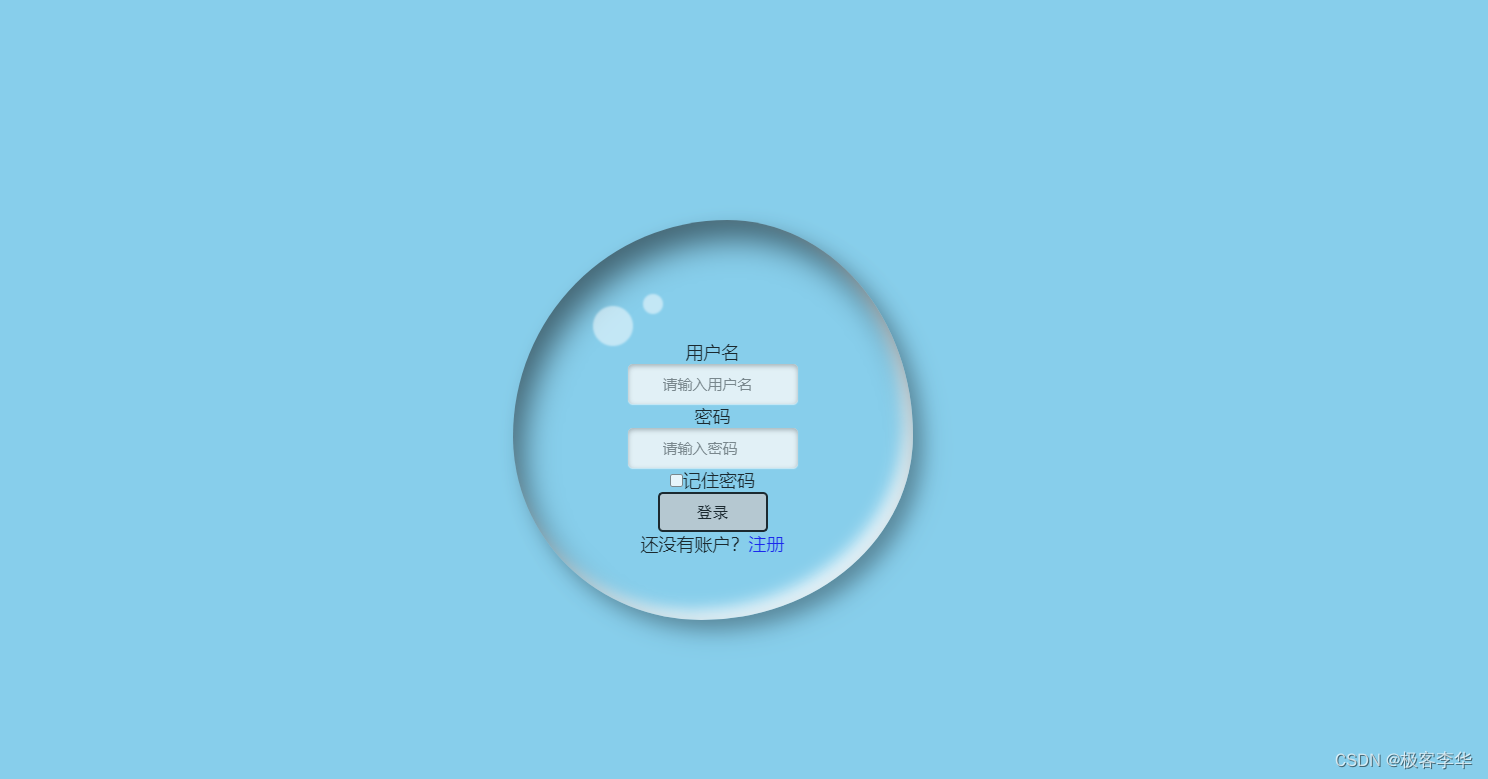
HTML+CSS实现动态水滴的登录页面
参考素材
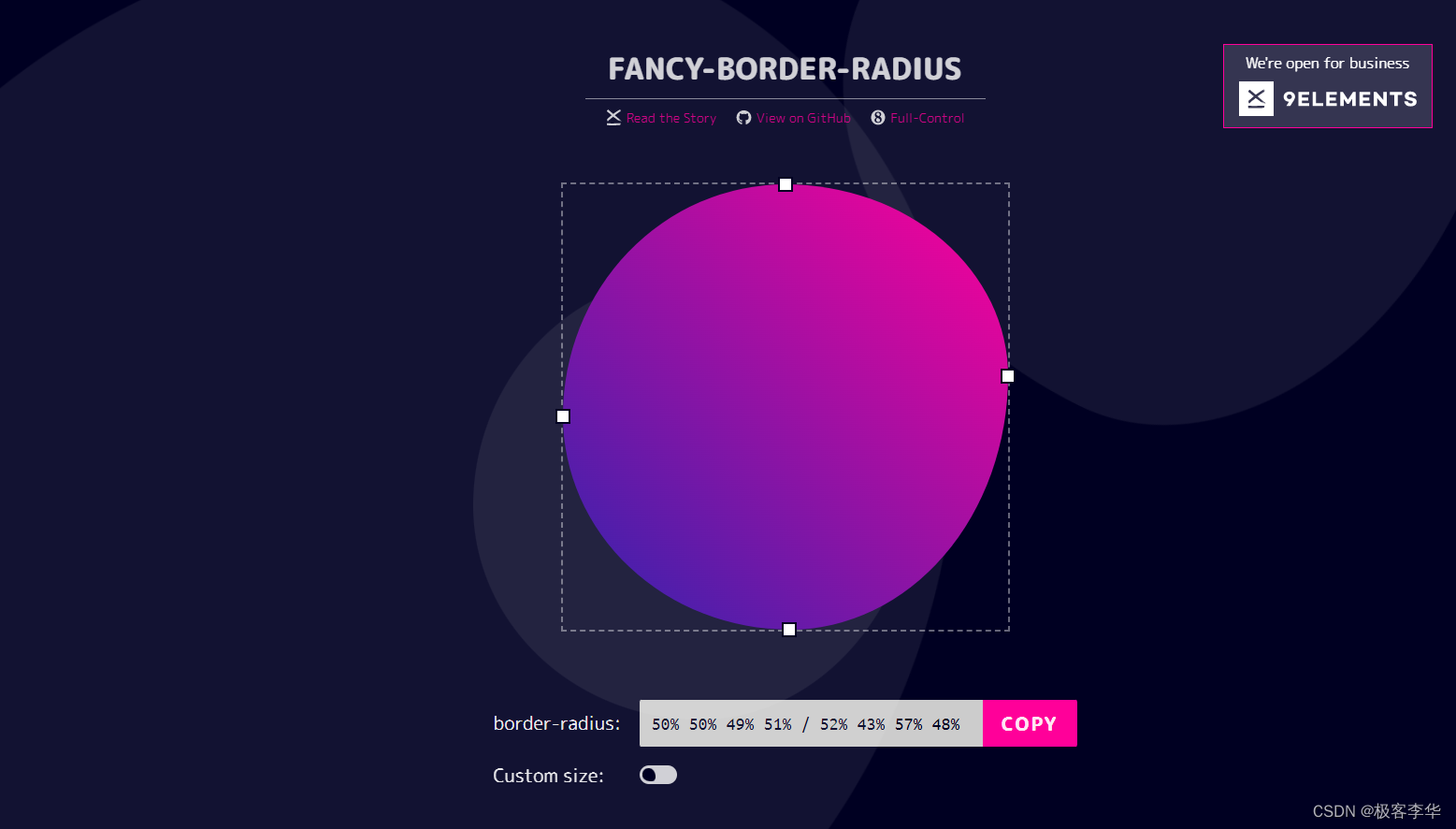
获取盒子形状通过这个网站可以执行设置@keyframes move 中的属性。
效果展示
HTML骨架
<!DOCTYPE html>
<html lang="en">
<head>
    <meta charset="UTF-8">
    <meta http-equiv="X-UA-Compatible" content="IE=edge">
    <meta name="viewport" content="width=device-width, initial-scale=1.0">
    <title>Document</title>
    <link rel="stylesheet" href="water.css">
    <link rel="stylesheet" href="form.css">
</head>

<body>
    <div class="main">
        <form>
            <p>用户名<br />
                <input type="text" class="textinput" placeholder="请输入用户名" />
            </p>
            <p>密码<br />
                <input type="password" class="textinput" placeholder="请输入密码" />
            </p>
            <p>
                <input id="remember" type="checkbox" /><label for="smtxt">记住密码</label>
            </p>
            <p>
                <input type="submit" value="登录" />
            </p>
            <p class="smtxt">还没有账户?<a href="注册界面.html">注册</a></a>
        </form>
    </div>
</body>
</html>
CSS渲染
form.css
form{

    /* 设置透明度 */
    opacity: 80%;

    text-align: center;
    /* 再设置内边距 使得内容更偏向于中央位置 */
    /* 上方,下方内边距为120px 与 左边与右边均为100px 按照逆时针 */
    /* 但是会撑大盒子 */
    padding: 0px 100px;

    /* 设置文本文字的大小 */
    font-size: 18px;

    /* 添加圆角边框 */
    border-radius: 10px;

    /* 增加外边距 */
    /* 上下120px 然后左右居中 */
    margin: 120px auto;
}

.textinput{
    /* 设置宽高 */
    height: 40px;
    width: 100px;

    /* 设置内边距 */
    padding: 0 35px;

    /* 去除边框 */
    border: none;

    /* 设置背景颜色 */
    background: #F8F9F9;

    /* 设置字体大小 */
    font-size: 15px;

    /* 给文本框加上阴影 */
    box-shadow: 0px 1px 1px rgba(255, 255, 255, 0.7), inset 0px 2px 5px #aaaaaa;

    /* 给文本框加上圆角边框 */
    border-radius: 5px;

    /* 给文本框中输入文字加上颜色 */
    color: saddlebrown;
}

/* 筛选input标签中 type为"submit"的 进行渲染*/
input[type="submit"]{
    /* 设置宽高 */
    width: 110px;
    height: 40px;

    /* 内部文本居中 */
    text-align: center;

    /* 圆角边框 */
    border-radius: 5px;

    /* 设置字体 */
    font:16px "黑体";

    /* 设置背景颜色 */
    background-color: #C0C6CB;
}
a {
    /* 去除下划线 */
    text-decoration: none;
}

a:hover {
    /* 悬空的时候有被选中的样子 出现下划线*/
    text-decoration: underline;
}
water.css
* {
    margin: 0;
    padding: 0;
}

body {
    background: skyblue;
}

.main {
    /* 设置为绝对定位 */
    position: absolute;
    /* 设置盒子放在中间的位置 */
    left: 50%;
    top: 50%;
    /* 设置动态效果 */
    transform: translate(-50%, -50%);
    /* 设置盒子大小 */
    width: 400px;
    height: 400px;
    /* 把边框算入盒子大小 */
    box-sizing: border-box;
    border-radius: 50%;
    /* 背景透明 */
    background: transparent;
    /* 设置阴影边框 */
    box-shadow: inset 10px 20px 30px rgba(0, 0, 0, 0.5), 10px 10px 20px rgba(0, 0, 0, 0.3), 15px 15px 30px rgba(0, 0, 0, 0.05), inset -10px -10px 15px rgba(255, 255, 255, 0.8);
    /* 设置动画效果 */
    animation: move 6s linear infinite;
}

.main::after {
    position: absolute;
    content: "";
    width: 40px;
    height: 40px;
    background: rgba(255, 255, 255, 0.5);
    left: 80px;
    top: 80px;
    border-radius: 50%;
    animation: move2 6s linear infinite;
    filter:blur(1px);
}

.main::before {
    position: absolute;
    content: "";
    width: 20px;
    height: 20px;
    background: rgba(255, 255, 255, 0.5);
    left: 130px;
    top: 70px;
    border-radius: 50%;
    animation: move3 6s linear infinite;
    filter:blur(1px);
}

/* 设置移动方位 */
@keyframes move {
    50% {
        border-radius: 50% 50% 66% 34% / 26% 62% 38% 74% ;
    }
    75% {
        border-radius: 750% 50% 49% 51% / 26% 62% 38% 74% ;
    }
    25% {
        border-radius: 50% 50% 49% 51% / 52% 62% 38% 48% ;
    }
}

@keyframes move2 {
    50% {
        left: 60px;
        top: 80px;
    }
    75% {
        left: 80px;
        top: 120px;
    }
    25% {
        left: 50px;
        top: 120px;
    }
}

@keyframes move3 {
    50% {
        left: 110px;
        top: 75px;
    }
    75% {
        left: 130px;
        top: 100px;
    }
    25% {
        left: 100px;
        top: 90px;
    }
}
相关文章
- java实现动态验证码源代码——jsp页面
- Mybatis+mysql动态分页查询数据案例——分页工具类(Page.java)
- js 动态修改页面文本字体
- 9-crm项目-kingadmin,修改和添加页面---动态modelform生成和filter_horizontal的实现
- RF--执行案例时动态传入参数方法
- EasyNVR摄像机网页无插件直播方案H5前端构建之:bootstrap-datepicker日历插件的实时动态展现
- 前端-jQuery-事件操作-select下拉选绑定change动态隐藏与显示
- 【RL-TCPnet网络教程】第25章 DHCP动态主机配置协议基础知识
- 动态方法拦截(AOP)的N种解决方案
- SAP UI5 应用开发教程之七十七 - SAP UI5 动态页面路由的高级用法:路由记录 routes 和 target 的一对多关系试读版
- Angular页面里元素class的动态绑定的实现源代码调试
- Angular页面里元素class的动态绑定的实现源代码调试
- iOS:runtime 消息转发 Method_Swizzling 动态添加方法 动态方法解析
- Py:Python实现好莱坞《黑客》影视中珠帘似吊炸天的华丽动态加密页面
- 第21篇 QML动态视图 之 链表视图(ListView)
- 《一切皆是映射:代码的本质》Java 动态读取源代码,并编译 & 加载执行
- HDU 4044 GeoDefense(动态规划)
- 刚新建好的动态网站项目,创建jsp页面就报错
- Docker----DockerSwarm集群环境弹性服务动态扩缩容
- 登录页面(动态背景)
- 动态规划——背包问题