
纯css3实现的动画加载条
2023-09-27 14:28:19 时间
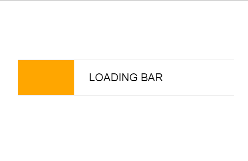
之前大大家分享了很多款加载条。今天给大家带来一款纯css3实现的动画加载条。 这款加载条适用浏览器:360、FireFox、Chrome、Safari、Opera、傲游、搜狗、世界之窗. 不支持IE8及以下浏览器。效果图如下:
实现的代码。
html代码:
 <div class="wrapper">
        <div class="bar">
            <p class="text">
                Loading bar</p>
        </div>
    </div>
css3代码:
body {
  font-family: "HelveticaNeue-Light", "Helvetica Neue Light", "Helvetica Neue", Helvetica, Arial, "Lucida Grande", sans-serif;
}

.wrapper {
  position: relative;
  overflow: hidden;
  width: 500px;
  margin: 0 auto;
}

.bar {
  border: solid 1px #e3e3e3;
  margin: 40px 30px;
  padding: 8px 0;
  height: 55px;
}

.text {
  font-size: 22px;
  margin: 15px 0;
  text-align: center;
  text-transform: uppercase;
}

.text-gradient {
  width: 100%;
  font-size: 22px;
  font-weight: bold;
  text-align: center;
  color: #ffa600;
  background: -webkit-linear-gradient(left, #000, #ffa600);
  -webkit-background-clip: text;
  -webkit-text-fill-color: transparent;
}

.bar {
  background: #ffa600;
  background: -webkit-linear-gradient(left, #ffa600 0%, #ffa600 50%, #fff 50%, #fff 100%);
  background: -moz-linear-gradient(left, #ffa600 0%, #ffa600 50%, #fff 50%, #fff 100%);
  background: -o-linear-gradient(left, #ffa600 0%, #ffa600 50%, #fff 50%, #fff 100%);
  background: -ms-linear-gradient(left, #ffa600 0%, #ffa600 50%, #fff 50%, #fff 100%);
  background: linear-gradient(left, #ffa600 0%, #ffa600 50%, #fff 50%, #fff 100%);
  background-size: 200% 200%;
  -webkit-animation: AnimationName 10s ease infinite;
}
@-webkit-keyframes AnimationName {
  0% {
    background-position: 100% 0%;
  }
  100% {
    background-position: 0% 0%;
  }
}
.bar .text {
  background: #ffa600;
  background: -webkit-linear-gradient(left, #fff 0%, #fff 50%, #000 50%, #000 100%);
  background: -moz-linear-gradient(left, #fff 0%, #fff 50%, #000 50%, #000 100%);
  background: -o-linear-gradient(left, #fff 0%, #fff 50%, #000 50%, #000 100%);
  background: -ms-linear-gradient(left, #fff 0%, #fff 50%, #000 50%, #000 100%);
  background: linear-gradient(left, #fff 0%, #fff 50%, #000 50%, #000 100%);
  background-size: 200% 200%;
  -webkit-animation: AnimationName 10s ease infinite;
  -webkit-background-clip: text;
  -webkit-text-fill-color: transparent;
}
@-webkit-keyframes AnimationName {
  0% {
    background-position: 100% 0%;
  }
  100% {
    background-position: 0% 0%;
  }
}
相关文章
- Android RecyclerVIew 列表实现 编辑、单选、全选、删除、动画效果(附源码)
- css3 动画 -- 旋转线条 rotate_line
- CSS - 音乐盒 360° 无限循环旋转动画(元素转圈)
- css3实现颤动的动画
- 新手引导动画的4种实现方式
- CSS3鼠标滑过图片3D旋转动画
- 纯CSS3文字Loading动画特效
- Swift - 使用CABasicAnimation实现动画效果
- Android Animation学习(五) ApiDemos解析:容器布局动画 LayoutTransition
- 【Android动画】之Tween动画 (渐变、缩放、位移、旋转)
- SwiftUI iOS 精品工具条组件之 09 支持字体动画滚动工具条(教程含源码)
- Python 教程之使用 Python 和 Graphviz 动画正则表达式 窥探正则表达式引擎的内部
- svg--动画-进度条
- CSS3 动画animation 过渡 transition 2D转换transform:translate (互相可以搭配使用-效果更炫酷)
- SVG的路径动画效果
- 35个让人惊讶的CSS3动画效果
- WPF 有趣的动画效果
- Unity 动画系统—动画片段设置
- 如何使用jquery在页面动画显示 加载中效果
- css3 动画 Transition