
纯css3实现的创意图片放大镜
css3 实现 图片 创意 放大镜
2023-09-27 14:28:19 时间
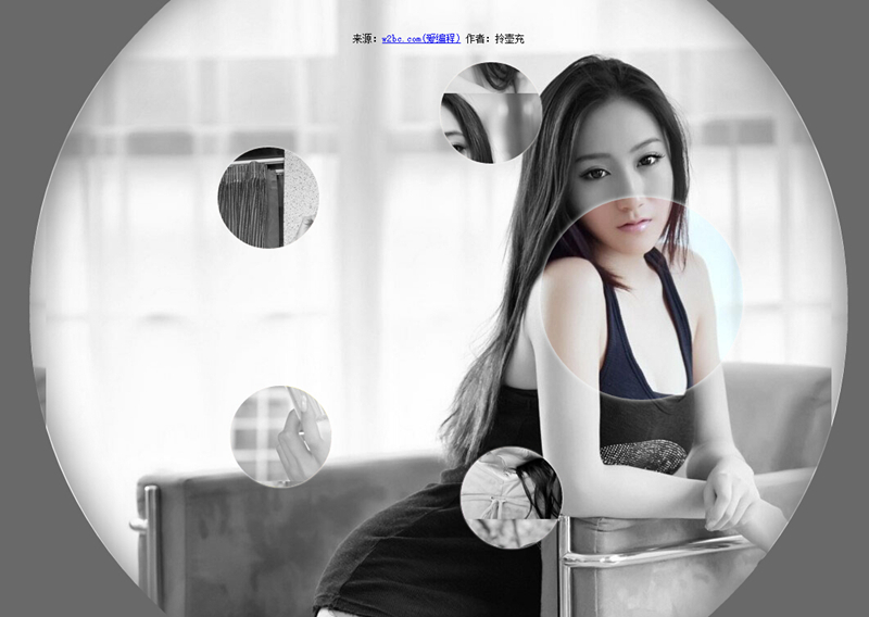
今天要给大家分享的的一款用纯css3实现的图片放大镜特效。页面打开五个小图显示于页面。当鼠标经过图片时,当前图片以灰色背景图的形式展示。效果非常不错。
实现的代码:
html代码:
 <ul class="gallery">
        <li class="gallery__item"></li>
        <li class="gallery__item"></li>
        <li class="gallery__item"></li>
        <li class="gallery__item"></li>
        <li class="gallery__item"></li>
        <li class="gallery__item"></li>
</ul>
css代码:
.gallery
        {
            list-style: none;
        }
        .gallery:before, .gallery__item:last-child
        {
            position: fixed;
            top: 50%;
            left: 50%;
            margin: -31.25em;
            width: 62.5em;
            height: 62.5em;
        }
        .gallery:before
        {
            z-index: -1;
            border-radius: 50%;
            content: '';
            box-shadow: inset 0 0 5em dimgrey, 0 0 0 50vw dimgrey;
        }
        .gallery__item
        {
            background-blend-mode: luminosity;
            transition: -webkit-transform 0.5s cubic-bezier(0.175, 0.885, 0.32, 1.275), background-image 0.5s;
        }
        .gallery__item:not(:last-child)
        {
            position: absolute;
            top: 50%;
            left: 50%;
            width: 32vmin;
            height: 32vmin;
            border-radius: 50%;
            box-shadow: 0 0 .5em white;
        }
        .gallery__item:nth-child(1)
        {
            margin: 13.87457vmin -4.53223vmin;
            -webkit-transform: scale(0.5);
            background: url("imgs/1.jpg") 50% 50% fixed whitesmoke;
        }
        .gallery__item:nth-child(1):hover
        {
            -webkit-transform: scale(1);
            background-blend-mode: normal;
            cursor: pointer;
        }
        .gallery__item:nth-child(1):hover ~ :last-child
        {
            background: url("imgs/1.jpg") 50% 50% fixed dimgray;
        }
        .gallery__item:nth-child(1):hover ~ :last-child:after
        {
            opacity: .001;
        }
        .gallery__item:nth-child(2)
        {
            margin: 4.13825vmin -40.86867vmin;
            -webkit-transform: scale(0.5);
            background: url("imgs/2.jpg") 50% 50% fixed whitesmoke;
        }
        .gallery__item:nth-child(2):hover
        {
            -webkit-transform: scale(1);
            background-blend-mode: normal;
            cursor: pointer;
        }
        .gallery__item:nth-child(2):hover ~ :last-child
        {
            background: url("imgs/2.jpg") 50% 50% fixed dimgray;
        }
        .gallery__item:nth-child(2):hover ~ :last-child:after
        {
            opacity: .001;
        }
        .gallery__item:nth-child(3)
        {
            margin: -33.42845vmin -42.83746vmin;
            -webkit-transform: scale(0.5);
            background: url("imgs/3.jpg") 50% 50% fixed whitesmoke;
        }
        .gallery__item:nth-child(3):hover
        {
            -webkit-transform: scale(1);
            background-blend-mode: normal;
            cursor: pointer;
        }
        .gallery__item:nth-child(3):hover ~ :last-child
        {
            background: url("imgs/3.jpg") 50% 50% fixed dimgray;
        }
        .gallery__item:nth-child(3):hover ~ :last-child:after
        {
            opacity: .001;
        }
        .gallery__item:nth-child(4)
        {
            margin: -46.90963vmin -7.71779vmin;
            -webkit-transform: scale(0.5);
            background: url("imgs/4.jpg") 50% 50% fixed whitesmoke;
        }
        .gallery__item:nth-child(4):hover
        {
            -webkit-transform: scale(1);
            background-blend-mode: normal;
            cursor: pointer;
        }
        .gallery__item:nth-child(4):hover ~ :last-child
        {
            background: url("imgs/4.jpg") 50% 50% fixed dimgray;
        }
        .gallery__item:nth-child(4):hover ~ :last-child:after
        {
            opacity: .001;
        }
        .gallery__item:nth-child(5)
        {
            margin: -17.67475vmin 15.95615vmin;
            -webkit-transform: scale(0.5);
            background: url("imgs/5.jpg") 50% 50% fixed whitesmoke;
        }
        .gallery__item:nth-child(5):hover
        {
            -webkit-transform: scale(1);
            background-blend-mode: normal;
            cursor: pointer;
        }
        .gallery__item:nth-child(5):hover ~ :last-child
        {
            background: url("imgs/5.jpg") 50% 50% fixed dimgray;
        }
        .gallery__item:nth-child(5):hover ~ :last-child:after
        {
            opacity: .001;
        }
        .gallery__item:last-child
        {
            z-index: -2;
        }
        .gallery__item:last-child:after
        {
            position: absolute;
            top: 0;
            right: 0;
            bottom: 0;
            left: 0;
            opacity: .999;
            background: dimgrey;
            transition: opacity 2s;
            content: '';
        }
注:本文爱编程原创文章,转载请注明原文地址:http://www.w2bc.com/Article/5002
相关文章
- CSS3 transition实现超酷图片墙动画效果
- 网页基础:网页设计(我所知道的所有的html和css代码(含H5和CSS3)),如有错误请批评指正 wpf Listbox 实现按住ctrl键来取消选中 详解C#的协变和逆变 C#效率优化(1)-- 使用泛型时避免装箱
- css3实现左侧固宽,右侧随着屏幕,右侧随着屏幕变化而变化
- 图解css7:核心技术与案例实战. 1.4 CSS3的现状及未来
- [WPF] 抄一个 CSS3 实现的按钮
- 【JavaScript】HTML5/CSS3实现五彩进度条应用
- css3实现颤动的动画
- 《iOS应用开发指南——使用HTML5、CSS3和JavaScript》——1.4 法宝就是转变
- 用css3做一个求婚小动画
- CSS3如何实现div闪烁效果
- CSS3弹性盒模型flex box小结
- css3 animation 中的 steps
- CSS3 linear-gradient实现三角形
- css3实现jquery mobile的页面过度原理
- 推荐9款使用CSS3实现的超酷动画效果
- CSS3实现各种格子纹理效果
- CSS3选择器 :read-only选择器 CSS3选择器 :read-write选择器
- css3-css3属性选择器
- CSS3 加载中对话框
- CSS3 object-fit 和 object-postion 实现图片居中缩放