
9款基于CSS3 Transitions实现的鼠标经过图标悬停特效
css3 实现 基于 鼠标 图标 特效 经过
2023-09-27 14:28:19 时间
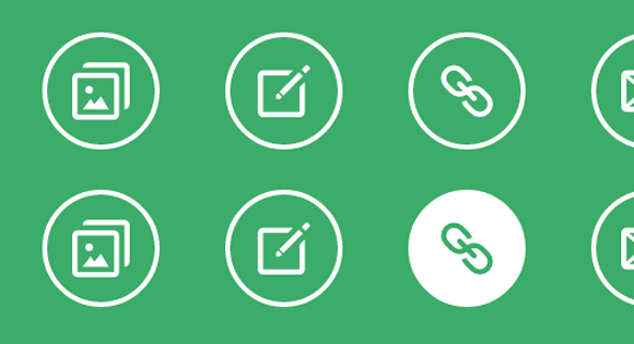
之前给大家分享了很多css3实现的按钮特效。今天给大家分享9款基于CSS3 Transitions实现的鼠标经过图标悬停特效。这款特效适用浏览器:360、FireFox、Chrome、Safari、Opera、傲游、搜狗、世界之窗. 不支持IE8及以下浏览器。效果图如下:
实现的代码。
html代码:
<div class="hi-icon-wrap hi-icon-effect-1 hi-icon-effect-1a">
    <a href="#" class="hi-icon hi-icon-mobile">Mobile</a>
    <a href="#" class="hi-icon hi-icon-screen">Desktop</a>
    <a href="#" class="hi-icon hi-icon-earth">Partners</a>
    <a href="#" class="hi-icon hi-icon-support">Support</a>
    <a href="#" class="hi-icon hi-icon-locked">Security</a>
</div>
css3代码:
.hi-icon-effect-6 .hi-icon {
    box-shadow: 0 0 0 4px rgba(255,255,255,1);
    transition: background 0.2s, color 0.2s;
}

.no-touch .hi-icon-effect-6 .hi-icon:hover {
    background: rgba(255,255,255,1);
    color: #64bb5d;
}

.no-touch .hi-icon-effect-6 .hi-icon:hover:before {
    animation: spinAround 2s linear infinite;
}

@keyframes spinAround {
    from {
        transform: rotate(0deg)
    }
    to {
        transform: rotate(360deg);
    }
}
相关文章
- CSS3在hover下的几种效果
- CSS3 animation(动画) 属性
- CSS3 选择器
- 图解css4:核心技术与案例实战. 1.1 什么是CSS3
- [转]CSS3 使用 calc() 计算高度 vh px
- css3 animation steps制作饿了么loading
- css3 animation 实现环形路径平移动画
- CSS3自定义图标
- css3弹性盒子换行
- 使用 CSS3 实现 3D 图片滑块效果
- 《iOS应用开发指南——使用HTML5、CSS3和JavaScript》——第1章 变小的巨大影响1.1 移动魔力和掌上电脑
- 自上而下渐显图片的CSS3实现
- CSS3+JS 实现的便签应用
- CSS3 动画animation 过渡 transition 2D转换transform:translate (互相可以搭配使用-效果更炫酷)
- 《响应式Web设计:HTML5和CSS3实践指南》——2.5节使用画布旋转文本
- css3弹性盒模型flex快速入门与上手1
- css3+svg实现波浪图
- CSS3实现的图片加载动画效果
- HTML5 + CSS3 标签学习笔记(二)
- CSS3 object-fit 和 object-postion 实现图片居中缩放