
Echarts5.3.2可视化案例-布局篇
Echarts5.3.2可视化案例-布局篇
00参考以及效果
参考:https://www.bilibili.com/video/BV1v7411R7mp
最终效果:

01背景知识
大屏
分辨率:
分辨率…到底是啥?1080p,2k,4k?分辨率越高就越清晰吗?
https://zhuanlan.zhihu.com/p/109817032
大屏设计尺寸规范指南
https://www.shejidaren.com/da-ping-sheji-chicun-guifan-zhinan.html
查看自己电脑的显示器:
个性化-显示设置-分辨率
19寸显示器:1440x900(16:10)
其它常见的尺寸的屏幕对应的最佳分辨率如下:
19寸显示器:1440x900(16:10)
20寸显示器:1600x900(16:9)1600x1200(4:3)
21.5寸显示器:1920x1080(16:9)
22寸显示器:1680x1050(16:10)1920x1080(16:9)1920x1200(16:10)
23寸显示器:1920x1080(16:9)1920x1200(16:10)
23.6寸显示器:1920x1080(16:9)
24寸显示器:1920x1200(16:10)1920x1080(16:9)
25寸显示器:1920x1080(16:9)
26寸显示器:1920x1200(16:10)
27寸显示器:2560x1440(16:9)
30寸显示器:2560x1600(16:10)
flex布局
参考:https://blog.csdn.net/wuyxinu/article/details/107708194

二个成员:
采用Flex布局的元素为Flex容器(flex container),它的所有子元素自动成为容器成员,称为Flex项目(flex item)。
两根轴:
水平主轴 main axis
主轴与边框的左右交叉点 main start/main end
垂直交叉轴 cross axis
交叉轴与边框的上下交叉点 cross start/cross end
项目(flex item)默认沿主轴排列,单项目占据的主轴空间/交叉轴空间 main size/cross size
flex容器属性
flex-direction 决定主轴方向=项目排列方向
flex-wrap 定义如何换行
flex-flow 它是flex-direction和flex-wrap的简写形式,语法糖
justify-content 定义项目在主轴上的对齐方式
align-items 定义项目在交叉轴上的对齐方式
align-content 定义多根轴线的对齐方式。若项目只有一根轴线则不生效。
02 大屏设计
00 项目目录

01-使用技术
完成该项目需要具备以下知识:
- div + css 布局
- flex 布局
- Less
- 原生js + jquery 使用
- rem适配
- echarts基础
02- 案例适配方案
- 设计稿是1920px
- flexible.js 把屏幕分为 24 等份
- cssrem 插件的基准值是 80px
插件-配置按钮—配置扩展设置–Root Font Size 里面 设置。
但是别忘记重启vscode软件保证生效
flexible配置
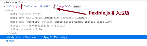
1.引入flexible
<script src="js/flexible.js"></script>
2.修改flexible配置 为24
// set 1rem = viewWidth / 10
  function setRemUnit() {
    var rem = docEl.clientWidth / 24;
    docEl.style.fontSize = rem + "px";
  }
3.前端查看是否引入成功
cssrem配置
1.安装cssrem插件拓展
extensions搜索cssrem
2.修改cssrem拓展的默认配置

03-基础设置
- css初始化
- body 设置背景图 ,缩放为 100% , 行高1.15
CSS初始化
- 引入easyless插件
- 在css目录下创建index.less
在css目录下创建index.less
执行ctrl+s 保存
会自动编译成index.css文件
- 在index.less进行css初始化
* {
    margin: 0;
    padding: 0;
    box-sizing: border-box;
}
content-box 与 border-box

- 在index.html中引入css
 <head>
    <meta charset="UTF-8">
    <meta name="viewport" content="width=device-width, initial-scale=1.0">
    <script src="js/flexible.js"></script>
    <link rel="stylesheet" href="css/index.css">
    <title>Document</title>
</head>
<body>
    <div class="box">123</div>
</body>
- 查看引入之后的效果,
body背景图
body 设置背景图 ,缩放为 100% , 行高1.15
body {
    background: url(../images/bg.jpg)
    no-repeat top center;
    line-height: 1.15;
}
04-header 布局
- 高度为100px
- 背景图,在容器内显示
- 缩放比例为 100%
- h1 标题部分 白色 38像素 居中显示 行高为 80像素
- 时间模块 showTime 定位右侧 right 为 30px 行高为 75px 文字颜色为:rgba(255, 255, 255, 0.7) 而文字大小为 20像素
html布局
<header>
        <h1>Echarts - dashboard</h1>
        <div class="showTime"></div>
        <script>
            var t = null;
            t = setTimeout(time, 1000);//開始运行
            function time() {
                clearTimeout(t);//清除定时器
                dt = new Date();
                var y = dt.getFullYear();
                var mt = dt.getMonth() + 1;
                var day = dt.getDate();
                var h = dt.getHours();//获取时
                var m = dt.getMinutes();//获取分
                var s = dt.getSeconds();//获取秒
                document.querySelector(".showTime").innerHTML = '当前时间:' + y + "年" + mt + "月" + day + "-" + h + "时" + m + "分" + s + "秒";
                t = setTimeout(time, 1000); //设定定时器,循环运行
            }
        </script>
    </header>
CSS布局
header{
    position: relative;
    height: 1.25rem;
    background: url(../images/head_bg.png) no-repeat top center;
    background-size: 100% 100%;
    h1 {
        font-size: .475rem;
        text-align: center;
        color: #fff;
        line-height: 1rem;

    }
    .showTime{
        position: absolute;
        right:.375rem;
        top: 0;
        line-height: .9375rem;
        font-size: .25rem;
        color:rgba(255, 255, 255, 0.7)

    }
}
05-mainbox 主体模块
- 需要一个上左右的10px 的内边距
- column 列容器,分三列,占比 3:5:3
html布局
    <section class="mainbox">
        <div class="column">1</div>
        <div class="column">2</div>
        <div class="column">3</div>
    </section>
css样式:
.mainbox{
    min-width: 1024px;
    max-width: 1920px;
    padding: .125rem .125rem 0;
    display: flex;
    background-color: red;
    .column {
        flex: 3;
        &:nth-child(2){
            flex:5;
            margin: 0 .125rem .1875rem;
            overflow: hidden;
        }
    }
}
效果如下:

06-公共面板模块 panel + bar
-
高度为 310px
-
1像素的 1px solid rgba(25, 186, 139, 0.17) 边框
-
有line.jpg 背景图片
-
padding为 上为 0 左右 15px 下为 40px
-
下外边距是 15px
-
利用panel 盒子 before 和after 制作上面两个角 大小为 10px 线条为 2px solid #02a6b5
-
新加一个盒子before 和after 制作下侧两个角 宽度高度为 10px
-
标题模块 h2 高度为 48px 文字颜色为白色 文字大小为 20px
-
图标内容模块 chart 高度 240px
-
以上可以作为panel公共样式部分
Html布局
    <section class="mainbox">
        <div class="column">
            <div class="panel bar">
                <h2>bar chart</h2>
                <div class="chart"> bar Echarts </div>
                <div class="panel-footer"></div>
            </div>
        </div>
        <div class="column">2</div>
        <div class="column">3</div>
    </section>
CSS布局
```css
.panel {
    position: relative;
    height: 3.875rem;
    border: 1px solid rgba(25, 186, 139, 0.17);
    background: url(../images/line\(1\).png) rgba(255, 255, 255, 0.03);
    padding: 0 .1875rem .5rem ;
    margin-bottom: .1875rem;
    // 定义左上角的border
    &::before {
        position: absolute; // 子绝父相
        top: 0;
        left: 0;
        content: "";
        width: 10px;
        height: 10px;
        border-top: 2px solid #02a6b5;
        border-left: 2px solid #02a6b5;
      }
      &::after {
        position: absolute;
        top: 0;
        right: 0;
        content: "";
        width: 10px;
        height: 10px;
        border-top: 2px solid #02a6b5;
        border-right: 2px solid #02a6b5;
      }

    //  定义底部的样式
    .panel-footer {
        position: absolute;
        height: 1.25rem;
        // background-color: red;
        left: 0;
        bottom: 0;
        height: 15%;
        width: 100%;
        &::before {
          position: absolute;
          bottom: 0;
          left: 0;
          content: "";
          width: 10px;
          height: 10px;
          border-bottom: 2px solid #02a6b5;
          border-left: 2px solid #02a6b5;
        }
        &::after {
          position: absolute;
          bottom: 0;
          right: 0;
          content: "";
          width: 10px;
          height: 10px;
          border-bottom: 2px solid #02a6b5;
          border-right: 2px solid #02a6b5;
        }


    }
    h2{
        height: .6rem;
        color: #fff;
        font-size: .25rem;
        font-weight: 400;

    }
    .chart {
        height: 3rem;
        background-color: beige;
    }
}
截图:

07-左右布局
将
			<div class="panel bar">
                <h2>bar chart</h2>
                <div class="chart"> bar Echarts </div>
                <div class="panel-footer"></div>
            </div>
在左右的column中各复制3份即可
效果如下:

08-中间布局
- 上面是no 数字模块
- 下面是map 地图模块
- 数字模块 no 有个背景颜色 rgba(101, 132, 226, 0.1); 有个15像素的内边距
- 注意中间列 column 有个 左右 10px 下 15px 的外边距
- no 模块里面上下划分 上面是数字(no-hd) 下面 是 相关文字说明(no-bd)
- no-hd 数字模块 有一个边框 1px solid rgba(25, 186, 139, 0.17)
- no-hd 数字模块 里面分为两个小li 每个小li高度为 80px 文字大小为 70px 颜色为 #ffeb7b 字体是图标字体 electronicFont
- no-hd 利用 after 和 before制作2个小角, 边框 2px solid #02a6b5 宽度为 30px 高度为 10px
- 小竖线 给 第一个小li after 就可以 1px宽 背景颜色为 rgba(255, 255, 255, 0.2); 高度 50% top 25% 即可
- no-bd 里面也有两个小li 高度为 40px 文字颜色为 rgba(255, 255, 255, 0.7) 文字大小为 18px 上内边距为 10px
中间列的no模块布局
html布局
        <div class="no">
          <div class="no-hd">
            <ul>
              <li>125811</li>
              <li>104563</li>
            </ul>
          </div>
          <div class="no-bd">
            <ul>
              <li>前端需求人数</li>
              <li>市场供应人数</li>
            </ul>
          </div>
        </div>
li {
    list-style: none;
  }

@font-face {
    font-family: electronicFont;
    src: url(../font/DS-DIGIT.TTF);
}

.no{
    background-color: rgba(101, 132, 226, 0.1);
    padding: 0.1875rem;
    .no-hd{
        position: relative;
        border: 1px solid rgba(25, 186, 139, 0.17);
        &::before {
            content: "";
            position: absolute;
            width: 30px;
            height: 10px;
            border-top: 2px solid #02a6b5;
            border-left: 2px solid #02a6b5;
            top: 0;
            left: 0;
          }
          &::after {
            content: "";
            position: absolute;
            width: 30px;
            height: 10px;
            border-bottom: 2px solid #02a6b5;
            border-right: 2px solid #02a6b5;
            right: 0;
            bottom: 0;
          }
          ul {
            display: flex;
            li {
              position: relative;
              flex: 1;
              text-align: center;
              height: 1rem;
              line-height: 1rem;
              font-size: 0.875rem;
              color: #ffeb7b;
              padding: 0.05rem 0;
              font-family: electronicFont;
              font-weight: bold;
              &:first-child::after {
                content: "";
                position: absolute;
                height: 50%;
                width: 1px;
                background: rgba(255, 255, 255, 0.2);
                right: 0;
                top: 25%;
              }
            }
          }
    }
    .no-bd ul {
        display: flex;
        li {
          flex: 1;
          height: 0.5rem;
          line-height: 0.5rem;
          text-align: center;
          font-size: 0.225rem;
          color: rgba(255, 255, 255, 0.7);
          padding-top: 0.125rem;
        }
      }
}
map模块配置
地图模块制作:
- 地图模块高度为 810px 里面包含4个盒子 chart 放图表模块 球体盒子 旋转1 旋转2
- 球体图片模块 map1 大小为 518px 要加背景图片 因为要缩放100% 定位到最中央 透明度 .3
- 旋转1 map 2 大小为 643px 要加背景图片 因为要缩放100% 定位到中央 透明度 .6 做旋转动画 利用z-index压住球体
- 旋转2 map3 大小为 566px 要加背景图片 因为要缩放100% 定位到中央 旋转动画 注意是逆时针
Html布局
        <!-- middle column -->
        <div class="column">
                <div class="no">
                <div class="no-hd">
                  <ul>
                    <li>125811</li>
                    <li>104563</li>
                  </ul>
                </div>
                <div class="no-bd">
                  <ul>
                    <li>前端需求人数</li>
                    <li>市场供应人数</li>
                  </ul>
                </div>
            </div>
              <div class="map">
                <div class="chart"></div>
                <div class="map1"></div>
                <div class="map2"></div>
                <div class="map3"></div>
            </div>
        </div>
CSS布局
.map{
    position: relative;
    height: 10.125rem;
    // background-color: #02a6b5;
    .chart{
        position: absolute;
        top: 0;
        left: 0;
        z-index: 5;
        height: 10.125rem;
        width: 100%;
    }
    .map1,
    .map2,
    .map3{
        position: absolute;
        top: 50%;
        left: 50%;
        transform: translate(-50%,-50%);
        width: 6.475rem;
        height: 6.475rem;
        background: url(../images/map.png) no-repeat;
        background-size: cover;
        opacity: 0.3;
        z-index: 1;
    }
    .map2 {
        width: 8.0375rem;
        height: 8.0375rem;
        background-image: url(../images/lbx.png);
        opacity: 0.6;
        animation: rotate 15s linear infinite;
        z-index: 2;
      }
    .map3 {
        width: 7.075rem;
        height: 7.075rem;
        background-image: url(../images/jt.png);
        animation: rotate1 10s linear infinite;
    }

    @keyframes rotate {
        from {
            transform: translate(-50%, -50%) rotate(0deg);
          }
          to {
            transform: translate(-50%, -50%) rotate(360deg);
          }
      }
      @keyframes rotate1 {
        from {
          transform: translate(-50%, -50%) rotate(0deg);
        }
        to {
          transform: translate(-50%, -50%) rotate(-360deg);
        }
    }
}

@media screen and (max-width: 1024px) {
    html {
      font-size: 42px !important;
    }
  }
  @media screen and (min-width: 1920) {
    html {
      font-size: 80px !important;
    }
  }
截图:

相关文章
- SQL案例分析-应用系统用户权限设计.sql
- 方块跟着鼠标移动的案例
- 图解css6:核心技术与案例实战. 1.3 渐进增强
- 图解css3:核心技术与案例实战. 2.5 目标伪类选择器
- 《深度学习导论及案例分析》一第一部分 基 础 理 论
- 30分钟入门DSL工具Antlr4——概念、案例
- 模型交易平台案例分析:姓名数据的性别智能分类解决方案
- 《Android 应用案例开发大全(第二版)》——2.1节案例背景及功能概述
- 《Android 应用案例开发大全(第二版)》——6.1节Android系统的信使:Intent
- 《MapReduce 2.0源码分析与编程实战》一1.2 HBase使用场景和成功案例
- Storm自带测试案例的运行
- 两岸信息产业界公布7项共通标准和云计算案例汇编
- 《R语言与数据挖掘最佳实践和经典案例》—— 3.1 查看数据
- 《数据科学R语言实践:面向计算推理与问题求解的案例研究法》一一1.2 原始数据
- 《数据科学R语言实践:面向计算推理与问题求解的案例研究法》一一2.4 探索所有男选手的跑步时间
- 《Mahout算法解析与案例实战》一一 第3章 聚 类 算 法
- STC89C52单片机中指针的运用与实际案例演示
- Flutter 学习之旅 之 flutter 工程目录文件夹说明,以及几个简单 Flutter 案例
- Vue学习第22天——Vuex安装使用详解及案例练习(彻底搞懂vuex)
- 三个案例透析大数据思维的核心