
还在用shape、selector,试试自定义圆角组件吧
组件 自定义 圆角 试试 Shape Selector
2023-09-27 14:22:50 时间
在进行Android应用开发过程中,设计师经常会给应用中涉及的卡片和按钮来个圆角。对于卡片,我们可以直接使用CardView等,对于圆角按钮通常会shape、selector等xml的方式进行配置。
虽然shape、selector的xml写法可以解决视觉问题,但是写的很多,对于代码的简洁性来说确实大打折扣,并且xml对于Apk包的大小来说也不是很友好。所以,我们不妨考虑试试自定义圆角组件的方式来解决问题。
基于按钮的一些常用的属性,我们提供了如下的一些属性,比如,按钮的圆角大小、圆角颜色、按钮颜色、文字颜色、单独设置4个角的圆角大小等。
<declare-styleable name="RectgleTextView">
        <attr name="shapeType" format="integer|enum">
            <enum name="rectangle" value="0" />
            <enum name="oval" value="1" />
            <enum name="LINE" value="2" />
        </attr>
        <attr name="totalRadius" format="dimension" />
        <attr name="radiusTopLeft" format="dimension" />
        <attr name="radiusBottomLeft" format="dimension" />
        <attr name="radiusTopRight" format="dimension" />
        <attr name="radiusBottomRight" format="dimension" />
        <attr name="topLeft" format="dimension" />
        <attr name="topRight" format="dimension" />
        <attr name="bottomLeft" format="dimension" />
        <attr name="bottomRight" format="dimension" />
        <attr name="strColor" format="color" />
        <attr name="strWidth" format="dimension" />
        <attr name="solidBac" format="color" />
        <attr name="textPadding" format="dimension" />
        <attr name="textLeft" format="string" />
        <attr name="textRight" format="string" />
        <attr name="iconColor" format="reference|color" />
        <attr name="textLeftColor" format="reference|color" />
        <attr name="textRightColor" format="reference|color" />
        <attr name="textLeftSize" format="dimension" />
        <attr name="textRightSize" format="dimension" />
        <attr name="textLeftStyle">
            <enum name="bold" value="1" />
            <enum name="italic" value="2" />
        </attr>
        <attr name="textRightStyle">
            <enum name="bold" value="1" />
            <enum name="italic" value="2" />
        </attr>
        <attr name="textCenterStyle">
            <enum name="bold" value="1" />
            <enum name="italic" value="2" />
        </attr>
        <attr name="autoMaxHeight" format="boolean" />
        <attr name="gradientOrientation">
            <enum name="top_bottom" value="0" />
            <enum name="tp_bl" value="1" />
            <enum name="right_left" value="2" />
            <enum name="br_tl" value="3" />
            <enum name="bottom_top" value="4" />
            <enum name="bl_tr" value="5" />
            <enum name="left_right" value="6" />
            <enum name="tl_br" value="7" />
        </attr>
        <attr name="startSolid" format="reference|color" />
        <attr name="centerSolid" format="reference|color" />
        <attr name="endSolid" format="reference|color" />
    </declare-styleable>
然后,我们创建一个自定义的View,RectgleTextView继承自AppCompatTextView。然后,就是对我们自定义的属性进行处理,具体不再解释,可以看文末的源码。最后,只需要在布局中引入我们自定义的组件即可,比如。
<com.avatar.demo.shape.RectgleTextView
        android:layout_width="wrap_content"
        android:layout_height="wrap_content"
        android:layout_marginTop="15dp"
        android:layout_gravity="center"
        android:paddingHorizontal="15dp"
        android:paddingVertical="8dp"
        android:text="实心圆角按钮"
        android:textColor="@color/white"
        android:textSize="18sp"
        app:solidBac="@color/black"
        app:totalRadius="5dp" />
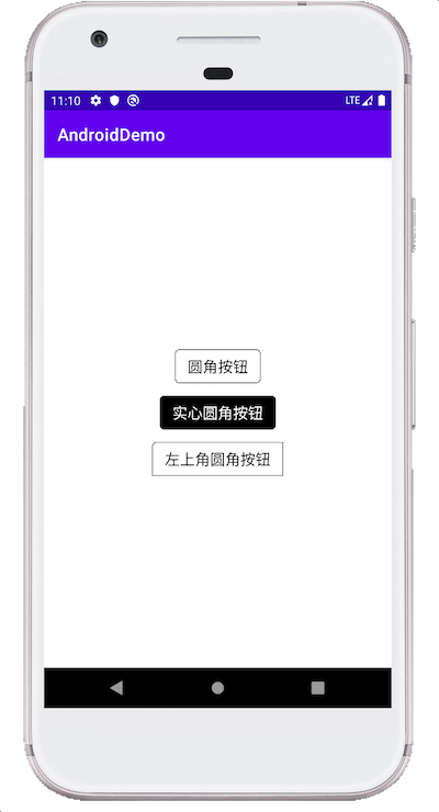
以下是部分效果图。
附件: 自定义圆角组件
相关文章
- [Sentinel1]-雪崩效应和常见容错组件
- 华为云VSS漏洞扫描服务之开源组件漏洞检测能力
- Vue自定义组件以及组件通信的几种方式
- vue 2 实现自定义组件一到多个v-model双向数据绑定的方法
- react自动生成React组件命令
- 如何写RN样式 如何写RN组件 如何满屏 如何使用变量
- ASP.NET CORE 自定义视图组件(ViewComponent)注意事项
- cocos2d-js 3.0 rc2 自定义UI控件组件 例子:能播放动画的MenuItem。MenuItemSprite的bug
- Android-Universal-Image-Loader三大组件DisplayImageOptions、ImageLoader、ImageLoaderConfiguration详解
- 博客园设置自定义皮肤,添加自定义小模块悬浮天气组件,github图标链接等
- vue2实现组件props双向绑定
- 组件的自定义事件①
- 计算机视觉系列-MMCV 配置组件分析: Config
- 微信小程序自定义组件(超详细)
- JS组件系列——BootstrapTable 行内编辑解决方案:x-editable
- PyQt学习随笔:重写组件的event方法捕获组件的事件
- Vue3通透教程【九】父子组件通讯一目了然
- 微信小程序自定义组件Component总结
- Js组件的一些写法
- 【Android 屏幕适配】屏幕适配通用解决方案 ⑤ ( 自定义组件解决方案 | 自定义 ViewGroup 组件 onMeasure 方法中计算每个子组件坐标数据 | 自定义组件完整代码 )
- 【Android 屏幕适配】屏幕适配通用解决方案 ④ ( 自定义组件解决方案 | 计算设计稿与实际布局的比例系数 )
- Android 自定义标签 和 自定义组件
- Vue的异步组件
- 详解Vue组件系统
- antD——tree组件自定义父子图标及展开/折叠图标