
Echarts-画堆积柱状图
echarts 柱状图 堆积
2023-09-27 14:20:52 时间
导入echarts包
<script src='../scripts/libraries/echarts/echarts-all.js'></script>
堆积图js
$(function () {
    var myChart = echarts.init(document.getElementById('main1'));
    myChart.setOption({
        title : {
            text : ""
        },
        tooltip : {
            trigger : 'axis',
            showDelay : 0, // 显示延迟,添加显示延迟可以避免频繁切换,单位ms
            axisPointer : {            // 坐标轴指示器,坐标轴触发有效
                type : 'shadow'        // 默认为直线,可选为:'line' | 'shadow'
            }
        },
        legend: {
            data:['直接访问', '邮件营销','联盟广告','视频广告','搜索引擎']
        },
        toolbox: {
            show : true,
            feature : {
                mark : {show: true},
                dataView : {show: true, readOnly: false},
                magicType : {show: true, type: ['line', 'bar', 'stack', 'tiled']},
                restore : {show: true},
                saveAsImage : {show: true}
            }
        },
        calculable : true,
        xAxis : [
            {
                type : 'value'
            }
        ],
        yAxis : [
                 {
                     type : 'category',
                     data : ['周一','周二','周三','周四','周五','周六','周日']
                 }
             ],
         series : [
             {
                 name:'直接访问',
                 type:'bar',
                 stack: '总量',
                 itemStyle : { normal: {label : {show: true, position: 'insideRight'}}},
                 data:[320, 302, 301, 334, 390, 330, 320]
             },
             {
                 name:'邮件营销',
                 type:'bar',
                 stack: '总量',
                 itemStyle : { normal: {label : {show: true, position: 'insideRight'}}},
                 data:[120, 132, 101, 134, 90, 230, 210]
             },
             {
                 name:'联盟广告',
                 type:'bar',
                 stack: '总量',
                 itemStyle : { normal: {label : {show: true, position: 'insideRight'}}},
                 data:[220, 182, 191, 234, 290, 330, 310]
             },
             {
                 name:'视频广告',
                 type:'bar',
                 stack: '总量',
                 itemStyle : { normal: {label : {show: true, position: 'insideRight'}}},
                 data:[150, 212, 201, 154, 190, 330, 410]
             },
             {
                 name:'搜索引擎',
                 type:'bar',
                 stack: '总量',
                 itemStyle : { normal: {label : {show: true, position: 'insideRight'}}},
                 data:[820, 832, 901, 934, 1290, 1330, 1320]
             }
         ]
    });
});
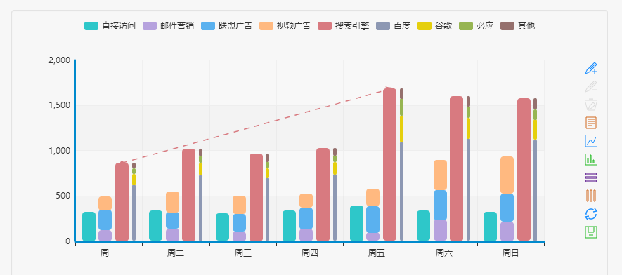
以上堆积柱状图为横着这摆放,如需要竖着摆放这将xAxis 和yAxis兑换就可
html页面
<div class="chart" id="main1" style="margin-bottom:-70px;margin-top:-50px;"></div>
相关文章
- 【独家】ECharts 2.0发布,大量细节曝光
- ECharts实现数据超出Y轴最大值max但不隐藏
- echarts参数详解--散点图
- Echarts + vue + koa2实现数据同页面,切换全屏内容
- 基于JavaScript+Koa2实现 Echarts 电商平台数据可视化大屏全栈【100010415】
- Echarts调整图表上下左右的间距,Echarts调整柱状图左右的间距
- Vue+Echarts监控大屏实例十四:智慧物流监控模板实例上
- Vue+Echarts监控大屏实例七:智慧养老监控模板实例下
- echarts使用记录(三):x/y轴数据和刻度显示及坐标中网格显示、格式化x/y轴数据、echarts 图例显示到右边、折线图平滑曲线、echarts图例不显示问题、让x轴刻度居中、柱状图显示背景色
- Web 插件 之 ECharts 可视化图表库简单介绍和使用
- 使用echarts做一个可视化报表(一)
- Echarts 中当y轴有负数时,让x轴下落在y轴最小值(转载)
- echarts中如何去掉柱状图的横线和竖线(转载)
- echarts legend.type scroll 显示问题;渲染错误
- ECharts+百度地图,默认选中 卫星地图
- Echarts实现Excel趋势线和R平方计算思路
- echarts X轴显示不全 有省略
- SpringBoot引入Echarts入门案例(柱状图,圆饼图,曲线图)