
Bootstrap 网页1
2023-09-11 14:22:19 时间
<!DOCTYPE html>
<html>
<head>
<meta charset="utf-8" />
<title>实战</title>
<link rel="stylesheet" href="css/bootstrap.min.css" />
<style>
.jumbotron {
padding :50px 180px;
}
</style>
</head>
<body>
<nav class="navbar navbar-default .navbar-fixed-top ">
<div class="container">
<!-- Brand and toggle get grouped for better mobile display -->
<div class="navbar-header">
<a class="navbar-brand" href="#">Project name</a>
</div>
<!-- Collect the nav links, forms, and other content for toggling -->
<div class="collapse navbar-collapse" id="bs-example-navbar-collapse-1">
<ul class="nav navbar-nav">
<li class="active"><a href="#">Home <span class="sr-only">(current)</span></a></li>
<li><a href="#">About</a></li>
<li><a href="#">Contact</a></li>
<li class="dropdown">
<a href="#" class="dropdown-toggle" data-toggle="dropdown" role="button" aria-haspopup="true" aria-expanded="false">Dropdown <span class="caret"></span></a>
<ul class="dropdown-menu">
<li><a href="#">Action</a></li>
<li><a href="#">Another action</a></li>
<li><a href="#">Something else here</a></li>
<li role="separator" class="divider"></li>
<li><a href="#">Separated link</a></li>
<li role="separator" class="divider"></li>
<li><a href="#">One more separated link</a></li>
</ul>
</li>
</ul>
<ul class="nav navbar-nav navbar-right">
<li><a href="#">Default</a></li>
<li><a href="#">Static top</a></li>
<li><a href="#">Fixed top</a></li>
</ul>
</div><!-- /.navbar-collapse -->
</div><!-- /.container-fluid -->
</nav>
<div class="jumbotron">
<h1>Navbar example</h1>
<p class="lead">This example is a quick exercise to illustrate how the default, static and fixed to top navbar work. It includes the responsive CSS and HTML, so it also adapts to your viewport and device.
To see the difference between static and fixed top navbars, just scroll.</p>
<p><a class="btn btn-lg btn-primary" href="#" role="button">View navbar docs »</a></p>
</div>
<script type="text/javascript" src="js/jquery-3.0.0.min.js" ></script>
<script type="text/javascript" src="js/bootstrap.min.js" ></script>
</body>
</html>
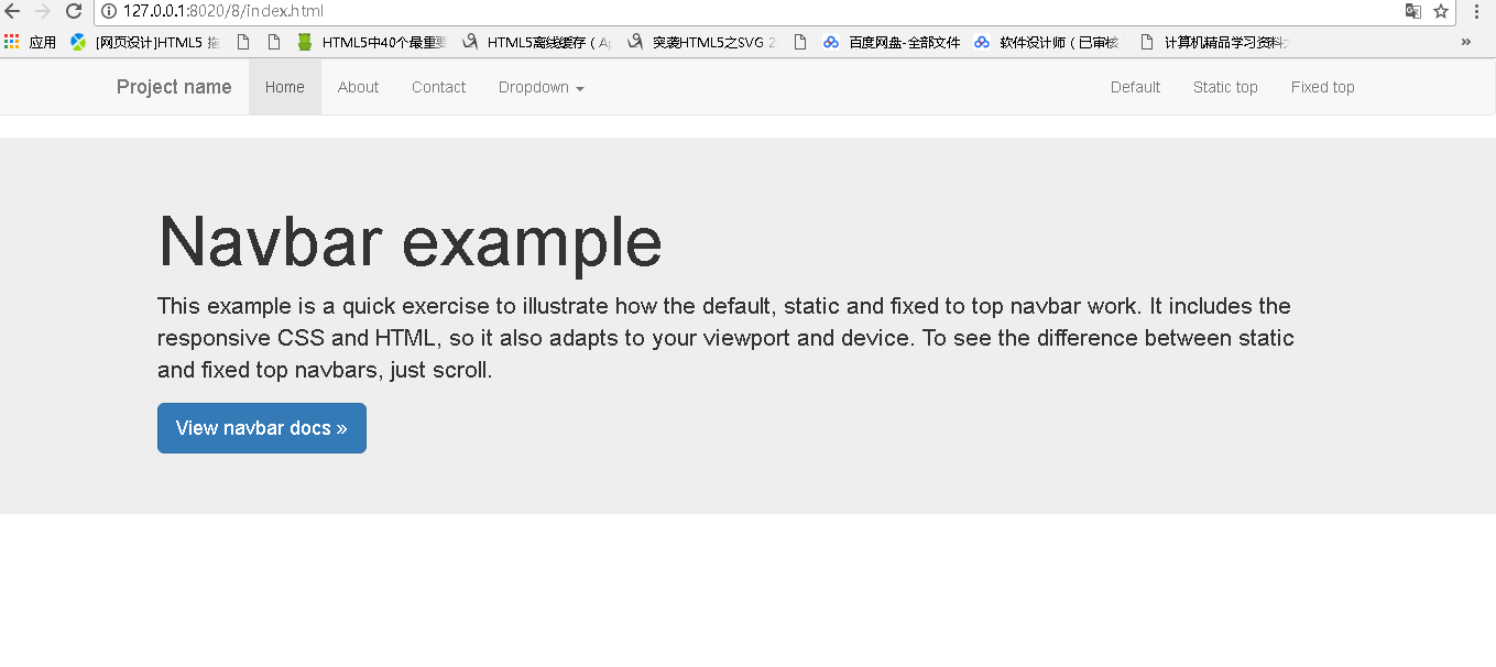
效果:
相关文章
- Five equal columns in twitter bootstrap
- Bootstrap的表单控件
- 记一个bootstrap定制container导致页面X轴出现横向滚动条的坑
- bootstrap教程,SQL
- Bootstrap-基于jquery的bootstrap在线文本编辑器插件Summernote
- Bootstrap fileinput v1.0(ssm版)
- 基于 Bootstrap 5 的多用途企业主题 HTML 网站模板
- 基于 Bootstrap 5 的教育和课程主题 HTML 网站模板
- 二、bootstrap缩略图幅
- bootstrap下拉菜单弹不出来
- Bootstrap_CSS概览
- bootstrap 时间控件
- 最值得收藏的Bootstrap资源网站
- bootstrap-markdown编辑器引入
- Bootstrap 网页实例