
【快应用】实现自定义导航栏组件
2023-09-11 14:20:23 时间
快应用实现自定义导航栏组件。
1. 简介
导航栏组件,主要用于头部导航。
导航栏(Nav_bar)组件结构大致分为两部分,一部分是图标,另一部分是文本,子组件实现,父组件引用。
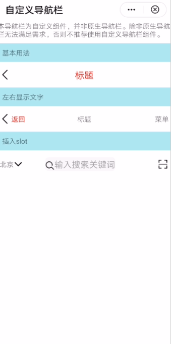
效果图如下:
基本布局代码如下:
<template>

  <div class="container">

    <text>本导航栏为自定义组件,并非原生导航栏。除非原生导航栏无法满足需求,否则不推荐使用自定义导航栏组件。</text>

    <text class="section">基本用法</text>

    <div class="example-body">

      <nav_bar height="50px" backgroundcolor="#ffffff" left-icon="{{leftIcon}}" title="标题"

          @clickleft="back" title-style="font-size: 40px; color:red"></nav_bar>

</div>

</div>

<template>
2.开发指引
2.1自定义子组件
1.定义布局样式。
导航栏组件布局包括三个部分:左侧图标内容部分、标题内容部分、右侧图标内容部分。
左侧图标内容部分、右侧图标内容部分通过image+text+slot组件实现
标题内容部分由text+slot组件实现。
代码如下:
<template>

  <div>

    <div class="navbar_content" style="height:{{height}};background-color:{{backgroundcolor}}">

      <div class="navbar_btns_left" onclick="clickLeft">

        <div if="leftIcon.length">

          <image style="height: 50px" src="{{leftIcon}}"></image>

        </div>

        <div if="leftText.length">

          <text style="{{leftTextStyle}}">{{ leftText }}</text>

        </div>

        <slot name="left"></slot>

      </div>

      <div class="navbar_container" onclick="clickTitle">

        <text class="text_context" style="{{titleStyle}}"

            if="title.length">{{ title }}</text>

        <slot name="mid"></slot>

      </div>

      <div class="navbar_btns_right" onclick="clickRight">

        <div if="rightIcon.length">

          <image style="height: 50px" src="{{rightIcon}}"></image>

        </div>

        <div class="*" if="rightText.length && !rightIcon.length">

          <text style="{{rightTextStyle}}">{{ rightText }}</text>

        </div>

        <slot name="right"></slot>

      </div>

    </div>

  </div>

</template>
2.2子组件设计
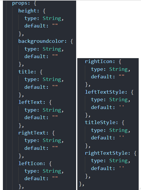
支持的属性如下:
| 属性名 | 类型 | 默认值 | 说明 |
| title | String | null | 标题文字 |
| height | String | null | 导航栏高度 |
| backgroundcolor | String | null | 导航栏背景色 |
| leftText | String | null | 左侧按钮文本 |
| rightText | String | null | 右侧按钮文本 |
| leftIcon | String | null | 左侧按钮图标 |
| rightIcon | String | null | 右侧按钮图标 |
支持的事件:
| 事件名称 | 说明 | 返回值 |
| clickLeft | 无 | 点击当前点击状态 |
| clickRight | 无 | 点击当前点击状态 |
| clickTitle | 无 | 点击当前点击状态 |
2.3父子组件通信
2.3.1父组件给子组件传递数据
子组件通过在props定义参数,接收来自父组件的传值数据,如height、title等。如下图所示:
2.3.2子组件通过this.$emit方法触发父组件的自定义事件
3.总结
实现导航栏组件,您可以从中学会如下知识点:
l 熟悉快应用子组件的设计和属性定义;
l 熟悉父子组件通信;
l 熟悉slot组件的运用;
想欲了解更多详情,请参见:
华为快应用官网:
最后附上完整的实现代码:
导航栏组件nav_bar.ux
<template>

  <div>

    <div class="navbar_content" style="height:{{height}};background-color:{{backgroundcolor}}">

      <div class="navbar_btns_left" onclick="clickLeft">

        <div if="leftIcon.length">

          <image style="height: 50px" src="{{leftIcon}}"></image>

        </div>

        <div if="leftText.length">

          <text style="{{leftTextStyle}}">{{ leftText }}</text>

        </div>

        <slot name="left"></slot>

      </div>

      <div class="navbar_container" onclick="clickTitle">

        <text class="text_context" style="{{titleStyle}}"

            if="title.length">{{ title }}</text>

        <slot name="mid"></slot>

      </div>

      <div class="navbar_btns_right" onclick="clickRight">

        <div if="rightIcon.length">

          <image style="height: 50px" src="{{rightIcon}}"></image>

        </div>

        <div class="*" if="rightText.length && !rightIcon.length">

          <text style="{{rightTextStyle}}">{{ rightText }}</text>

        </div>

        <slot name="right"></slot>

      </div>

    </div>

  </div>

</template>

<script>

  /**

   * NavBar 自定义导航栏

   * @description 导航栏组件,主要用于头部导航

   * @tutorial https://ext.dcloud.net.cn/plugin?id=52

   * @property {String} title 标题文字

   * @property {String} height 导航栏高度

   * @property {String} backgroundcolor 导航栏背景色

   * @property {String} leftText 左侧按钮文本

   * @property {String} rightText 右侧按钮文本

   * @property {String} leftIcon 左侧按钮图标

   * @property {String} rightIcon 右侧按钮图标

   * @property {String} leftTextStyle 左侧按钮文本样式

   * @property {String} titleStyle 中间标题文本样式

   * @property {String} rightTextStyle 右侧按钮文本样式

   * @event {Function} clickLeft 左侧按钮点击时触发

   * @event {Function} clickRight 右侧按钮点击时触发

   * @event {Function} clickTitle 中间标题点击时触发

  */

  module.exports = {

    props: {

      height: {

        type: String,

        default: ""

      },

      backgroundcolor: {

        type: String,

        default: ""

      },

      title: {

        type: String,

        default: ""

      },

      leftText: {

        type: String,

        default: ""

      },

      rightText: {

        type: String,

        default: ""

      },

      leftIcon: {

        type: String,

        default: ""

      },

      rightIcon: {

        type: String,

        default: ""

      },

      leftTextStyle: {

        type: String,

        default: ''

      },

      titleStyle: {

        type: String,

        default: ''

      },

      rightTextStyle: {

        type: String,

        default: ''

      },

    },


    onInit() {

      this.$page.setTitleBar({ text: '自定义导航栏' })

    },

    clickLeft() {

      this.$emit("clickleft");

    },

    clickRight() {

      this.$emit("clickright");

    },

    clickTitle() {

      this.$emit("clicktitle");

    }

  }

</script>


<style>

  .navbar_content {

    display: flex;

    align-items: center;

    flex-direction: row;

  }


  .navbar_btns_left {

    width: 150px;

  }

  .navbar_container {

    width: 500px;

  }

  .text_context {

    width: 480px;

    text-align: center;

  }

  .navbar_btns_right {

    width: 150px;

    justify-content: flex-end;

  }

</style>
主页面hello.ux
<import name="nav_bar" src="./Nav_bar/nav_bar.ux"></import>
<template>
<div class="container">
<text>本导航栏为自定义组件,并非原生导航栏。除非原生导航栏无法满足需求,否则不推荐使用自定义导航栏组件。</text>
<text class="section">基本用法</text>
<div class="example-body">
<nav_bar height="50px" backgroundcolor="#ffffff" left-icon="{{leftIcon}}" title="标题" @clickleft="back" title-style="font-size: 40px; color:red"></nav_bar>
</div>
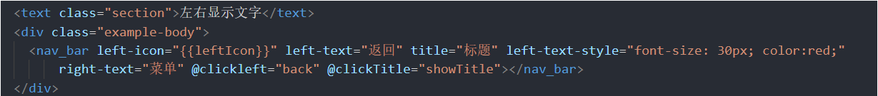
<text class="section">左右显示文字</text>
<div class="example-body">
<nav_bar left-icon="{{leftIcon}}" left-text="返回" title="标题" left-text-style="font-size: 30px; color:red;" right-text="菜单" @clickleft="back" @clickTitle="showTitle"></nav_bar>
</div>
<text class="section">插入slot</text>
<div class="example-body">
<nav_bar right-icon="{{rightIcon}}" @clickleft="showCity" @clickright="scan">
<div slot="left">
<div>
<text>北京</text>
<image src="../Common/arrowdown.png"></image>
</div>
</div>
<div slot="mid">
<div class="input-view">
<image style="height: 40px; margin-top: 15px" src="../Common/search.png"></image>
<input enterkeytype="search" placeholder="输入搜索关键词" @enterkeyclick="confirm" />
</div>
</div>
</nav_bar>
</div>
</div>
</template>
<script>
import router from '@system.router'
import prompt from '@system.prompt'
export default {
data() {
return {
city: "BeiJing",
leftIcon: "../Common/leftIcon.png",
rightIcon: "../Common/rightIcon.png"
}
},
back() {
router.back()
},
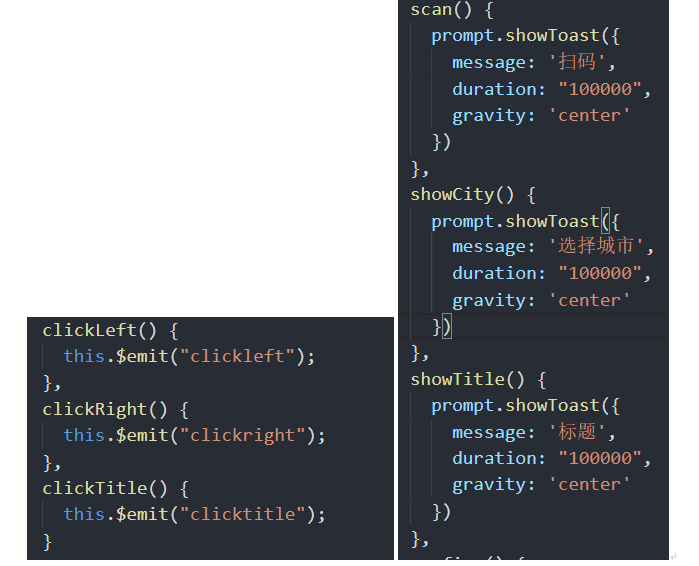
scan() {
prompt.showToast({
message: '扫码',
duration: "100000",
gravity: 'center'
})
},
showCity() {
prompt.showToast({
message: '选择城市',
duration: "100000",
gravity: 'center'
})
},
showTitle() {
prompt.showToast({
message: '标题',
duration: "100000",
gravity: 'center'
})
},
confirm() {
prompt.showToast({
message: '搜索',
duration: "100000",
gravity: 'center'
})
}
}
</script>
<style>
.container {
flex: 1;
flex-direction: column;
background-color: #ffffff;
}
.section {
background-color: #afeeee;
margin-top: 20px;
margin-bottom: 20px;
font-size: 30px;
padding: 20px;
width: 100%;
}
.example-body {
flex-direction: row;
padding: 10px;
background-color: #ffffff;
width: 100%;
}
.input-view {
flex-direction: row;
background-color: #f8f8f8;
height: 60px;
border-radius: 15px;
margin-left: 60px;
margin-right: 60px;
line-height: 30px;
}
</style>
欲了解更多更全技术文章,欢迎访问https://developer.huawei.com/consumer/cn/forum/?ha_source=zzh
相关文章
- 微服务工程中,基础组件应用
- 【Vue】Vue组件中事件和方法的混合(mixin)应用(图文+代码示例)
- 大数据在营销和销售中的十大应用
- 【前端】web网站应用微信扫码登陆功能实现
- 【快应用】销毁自定义组件,避免组件事件被多次触发
- 【快应用】H5快应用Web组件打开的网页出现跨域问题如何解决?
- 【快应用】通知消息定时提醒
- 《51单片机应用开发从入门到精通》——1.5 测试方法和工具
- 《Android 应用案例开发大全(第二版)》——2.7节线程相关类
- 《iOS组件与框架——iOS SDK高级特性剖析》——第8章,第8.1节示例应用
- 基于ABP的应用执行Update-Database出现异常的解决办法
- Qt编写项目作品35-数据库综合应用组件
- 基于 Flink ML 搭建的智能运维算法服务及应用
- 《Storm企业级应用:实战、运维和调优》——1.3 Storm核心组件
- 快应用richtext组件背景色填充问题
- 【快应用】销毁自定义组件,避免组件事件被多次触发
- 如何在快应用中实现滑动操作组件
- 【正点原子Linux连载】第十五章点亮LED-摘自【正点原子】I.MX6U嵌入式Linux C应用编程指南V1.1
- 13种商业数据挖掘的应用场景和主题
- 内蒙古国税局持续提升大数据应用水平
- 华为快应用-兄弟组件之间的通信
- 关于Docker在测试方面的应用
- 推进大数据应用打造“智慧检务”
- 一步一步从安装系统开始搭建openstack、构建私有云服务和计算、通过相关组件管理虚拟机和容器、以及通过 api 进行自定义应用开发
- Min-Max容斥及其推广和应用