
grid项目属性之grid-area&justify-self/align-self
2023-09-11 14:19:18 时间
简介
- 使用
grid-area一般搭配grid-template-areas一起使用,详情点击,并搜索在网格布局中自定义摆放元素 justify-self/align-self一般用于项目在容器内的排放位置
例子
grid-area
- 这里指介绍作为简写的
grid-area,非简写形式的使用我们可以看简介中的文章 - 作为先写形式,他是
grid-row-start、grid-row-end、grid-column-start、grid-column-end的合并简写,语法如下
grid-area:<grid-row-start> / <grid-column-start> / <grid-row-end> / <grid-column-end>
例子
<body>
    <style>
        * {
            list-style: none;
            margin: 0;
            padding: 0;
        }

        ul {
            width: 600px;
            height: 600px;
            border: 3px solid rebeccapurple;
            font-weight: bold;
            color: white;
            text-align: center;
            line-height: 100px;
            font-size: 40px
        }

        li:nth-child(even) {
            background-color: red;
        }

        li:nth-child(odd) {
            background-color: #000000;
        }

        ul{
            display: grid;
            grid-template-rows: repeat(3,1fr);
            grid-template-columns: repeat(3,1fr);
            gap: 20px 10px;
        }
        li:nth-child(1) {
            grid-area: 1/1/3/3;
        }

    </style>
    <ul>
        <li>1</li>
        <li>2</li>
        <li>3</li>
        <li>4</li>
        <li>5</li>
        <li>6</li>
    </ul>
</body>
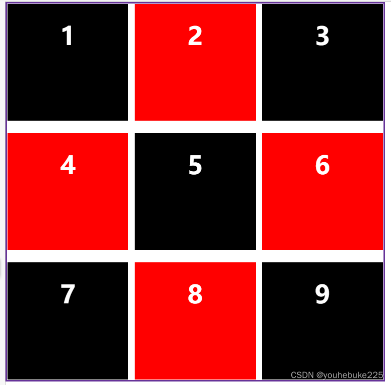
效果如下
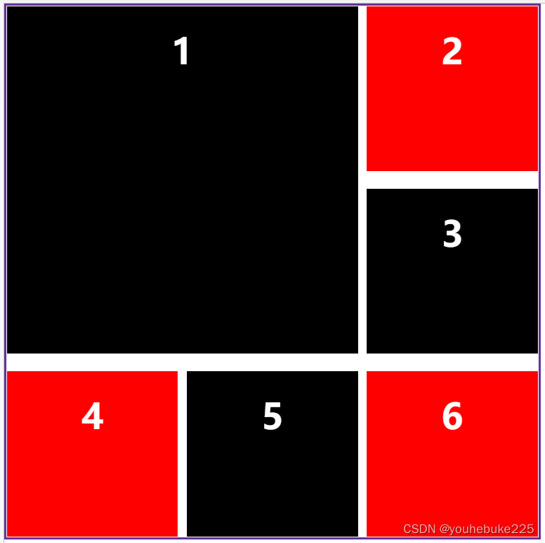
根据grid-area属性值,我们就可以看到项目序号为1的盒子占据了4个空间
justify-self/align-self
- 他们的属性值可取如下
start | end | center | stretch justify-self用于调整水平方向上面的布局,如果用上了当前的属性,那么水平方向上的align-self用于调整垂直方向上面的布局- 项目只要用上了这个属性,那么项目的大小就是有内容撑开,或者自定义的大小
- 这两个有一个单独的缩写属性就是
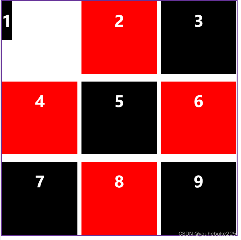
start
ul{
    display: grid;
    grid-template-rows: repeat(3,1fr);
    grid-template-columns: repeat(3,1fr);
    gap: 20px 10px;
}

li:nth-child(1) {
    justify-self: start;
    align-self: start;
}
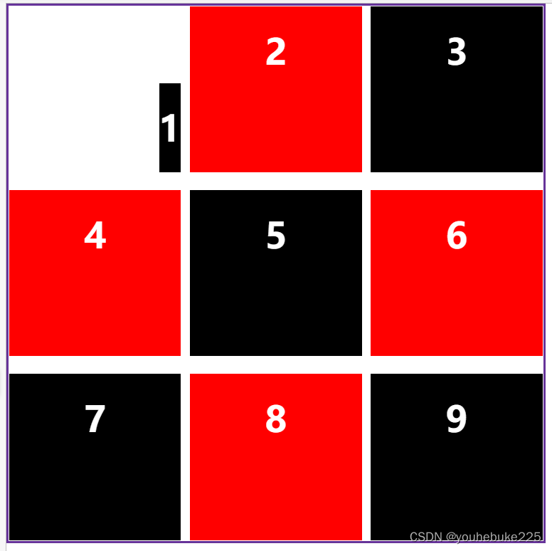
end
ul{
    display: grid;
    grid-template-rows: repeat(3,1fr);
    grid-template-columns: repeat(3,1fr);
    gap: 20px 10px;
}

li:nth-child(1) {
    justify-self: end;
    align-self: end;
}
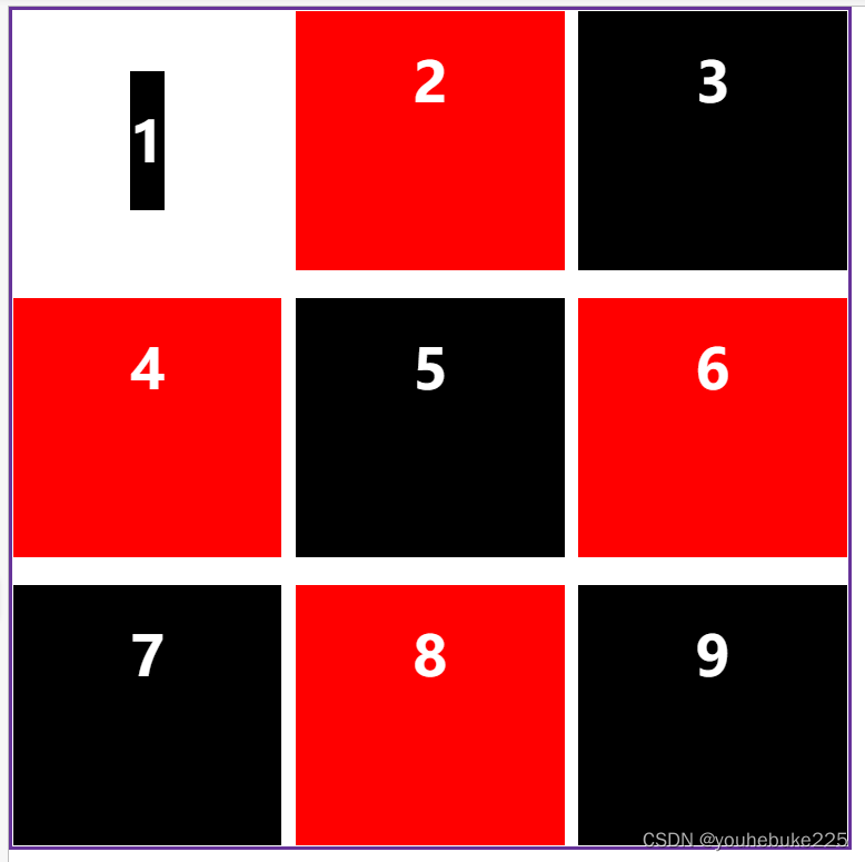
center
ul{
    display: grid;
    grid-template-rows: repeat(3,1fr);
    grid-template-columns: repeat(3,1fr);
    gap: 20px 10px;
}

li:nth-child(1) {
    justify-self: center;
    align-self: center;
}
stretch
ul{
    display: grid;
    grid-template-rows: repeat(3,1fr);
    grid-template-columns: repeat(3,1fr);
    gap: 20px 10px;
}

li:nth-child(1) {
    /* 水平方向拉伸 */
    justify-self: stretch;
    /* 垂直方向拉伸 */
    align-self: center;
}
placeself
这个属于justify-self和align-self的缩写,他的摆放是先水平,然后再垂直
li:nth-child(1) {
    /* 水平方向拉伸 */
    justify-self: stretch;
    /* 垂直方向拉伸 */
    align-self: center;
}
可以写成
li:nth-child(1) {
    place-self: stretch stretch;
}
相关文章
- linux 的nohup & 和daemon 总结(转)
- 前端学习 -- Html&Css -- 条件Hack 和属性Hack
- Property属性, KVC键值编码OC…
- 前端学习 -- Html&Css -- 条件Hack 和属性Hack
- [Kotlin] Try catch & Throw
- SpringBoot + Shiro 缓存&记住密码
- VMware 打开虚拟机电源时提示"内部错误"
- 华为OD机试 - 高效的任务规划(Java & JS & Python)
- 华为OD机试 - 用户调度问题(Java & JS & Python)
- Python编程语言学习:python语言中快速查询python自带模块&函数的用法及其属性方法、如何查询某个函数&关键词的用法、输出一个类或者实例化对象的所有属性和方法名之详细攻略
- 第一章 SDN介绍 (附件2)【SDN&NFV基础、云计算】
- 带你读AI论文丨S&P21 Survivalism: Living-Off-The-Land 经典离地攻击
- Object-C--->Swift之(十一)属性观察者
- [转]一次Delete&Insert引发的Mysql死锁
- Tomcat以Daemon的方式启动(CentOS6&7)
- 黑马day16 jquery&属性过滤选择器
- 变化Android系统属性SystemProperties.set("sys.powerctl", "shutdown")关机分析
- 一 · 路由事件的三种方式/策略(冒泡 直接 隧道)
- OpenCV入门(九)快速学会OpenCV8漫水填充floodFill&ROI
- 【C++要笑着学】STL stack&queue | 优先级队列 priority_queue | 双端队列 deque