
CSS中的那些百分比
CSS 那些 百分比
2023-09-11 14:19:18 时间
宽高
- 如果
width和height的值为百分比,那么他的值的参照为父元素的宽高
<div style="width: 200px;height: 100px; border: 1px solid black;">
    <div style="width: 50%; height: 50%; background-color: red;"></div>
</div>
我们看到的图形如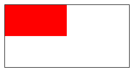
margin和padding
- 一般是按照父元素的宽度来进行计算的
<div style="width: 200px;height:100px;border:1px solid black">
    <div style="margin-top: 50%; border: 1px solid red;">子元素1</div>
    <div style="padding-left: 50%;border: 1px solid rgb(54, 103, 196);">子元素2</div>
</div>
我们看到的图形如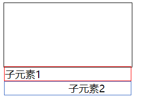
我们就会发现百分比所参照的就是父元素的宽度
定位
相对定位
top和bottom是相对于父元素的高left和right是相对于父元素的宽
<body>
    <div style="width: 200px;height: 100px; border: 1px solid black;">
        <div style="
        width: 50px; height: 50px; background-color: red;
        position: relative;
        top: 50%;
        left: 50%;
        "></div>
    </div>
</body>
我们可以看到如下图片
绝对定位
- 先找到有没有定位的元素
- 如果向上找到了定位元素,以定位元素的宽高为参照
- 如果向上没有找到定位元素,就以
html标签为参照
<body>
    <div style="
    width: 200px;height: 100px;
    border: 1px solid black;
    position: relative;
    ">
        <div style="
        width: 50px; height: 50px; background-color: red;
        position: absolute;
        top: 50%;
        left: 50%;
        "></div>
    </div>
</body>
如下图形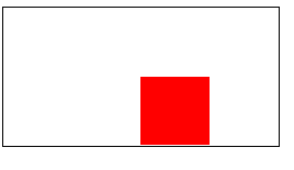
translate
- 在translate中使用的百分比,他是根据元素自身的大小来进行计算的
<html lang="en">
<head>
    <title>Document</title>
    <style>
        body{
            margin: 0;
            padding: 0;
        }
        #box{
            width: 100px;
            height: 100px;
            background-color: red;
            position: relative;
            transform: translateX(50%);
        }
    </style>
</head>
<body>
    <div id="box"></div>
</body>
</html>
- 通过图像我们可以看出来盒子的宽度为100px,但是他向右移动了50px
相关文章
- css流程图、步骤图,流程线与环节分别实现,支持单环节、多环节情况。scss生成CSS
- 前端入门-day2(常见css问题及解答)
- CSS - 解决子级用css float浮动 而父级div没高度不能自适应高度
- CSS动画示例(上一篇是CSS过渡…)
- 解决——CSS :before、:after ,当content使用中文时有时候会出现乱码
- [CSS] :not Selector
- [AngularJS] ngAnimate using css. 1
- CSS — BEM 命名规范
- [CSS] Create an Automatically Responsive Flexbox Image Gallery
- [CSS] Useful CSS tool for Web designer and developer
- [TypeStyle] Add type safety to CSS using TypeStyle
- [CSS] Specify grid columns, rows, and areas at once with the grid-template shorthand
- reactjs antd(ant-design)安装、基本使用及css样式的按需引入
- 为什么CSS这么难学?css核心知识点攻坚指南
- Css预编译神器
- Atitit.css 规范 bem 项目中 CSS 的组织和管理
- css鼠标滑过文字的波纹demo效果示例(整理)
- 3行3列表格 table实现,div+css实现
- 【CSS】css弹性布局、CSS hack_08