
vue之基础---组件基础
(1)基本示例
Vue组件示例
        /* 先注册组件,定义一个名为button-component的新组件 */
        Vue.component('button-component',{
            data:function(){
                return {
                    count:0
                }
            },
            template:'<button v-on:click="count++">您点击了{{count}}次</button>'
        })
组件是可复用的 Vue 实例,且带有一个名字:在这个例子中是 <button-counter>。我们可以在一个通过 new Vue 创建的 Vue 根实例中,把这个组件作为自定义元素来使用:
<div id="component_area">
     <button-component></button-component>
</div>

/* 再实例化,构建组件模板 */
var component_area = new Vue({
      el:"#component_area"
});
因为组件是可复用的 Vue 实例,所以它们与 new Vue 接收相同的选项,例如 data、computed、watch、methods 以及生命周期钩子等。仅有的例外是像 el这样根实例特有的选项。
(2)组件的复用
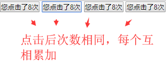
可以将组件进行任意次数的复用:
<div id="component_area">
    <button-component></button-component>
    <button-component></button-component>
    <button-component></button-component>
    <button-component></button-component>
</div>
注意:①当点击按钮时,每个组件都会各自独立维护它的 count。因为每用一次组件,就会有一个新实例被创建。
②data必须是一个函数
当我们定义这个 <button-counter> 组件时,你可能会发现它的 data 并不是像这样直接提供一个对象:
data: {
  count: 0
}
取而代之的是,一个组件的 data 选项必须是一个函数,因此每个实例可以维护一份被返回对象的独立的拷贝:
data: function () {
  return {
    count: 0
  }
}
如果 Vue 没有这条规则,点击一个按钮就可能会像如下代码一样影响到其它所有实例。如下所示
var start_count = {count:0};
/* 先注册组件,定义一个名为button-component的新组件 */
Vue.component('button-component',{
    data:function(){
         return start_count;
    },
    template:'<button v-on:click="count++">您点击了{{count}}次</button>'
})
demo:
    <div id="component_area">
        <button-area></button-area>
        <button-area></button-area>
        <button-area></button-area>
    </div>
    <script type="text/javascript">
        /* 1、注册组件 */
        Vue.component('button-area',{
            data:function(){
                return {
                    count:0
                }
            },
            template:"<button @click='count++'>您点击了{{count}}次</button>"
        })
        /* 2、实例化,构建组件模板 */
        new Vue({
            el:"#component_area"
        })
    </script>
(3)组件的组织
通常一个应用会以一棵嵌套的组件树的形式来组织:
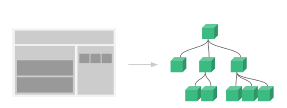
例如,你可能会有页头、侧边栏、内容区等组件,每个组件又包含了其它的像导航链接、博文之类的组件。为了能在模板中使用,这些组件必须先注册以便 Vue 能够识别。这里有两种组件的注册类型:全局注册和局部注册。至此,我们的组件都只是通过 Vue.component 全局注册的:
vue.component(my-component-name,{
     ...
})
全局注册的组件可以用在其被注册之后的任何 (通过 new Vue) 新创建的 Vue 根实例,也包括其组件树中的所有子组件的模板中。到目前为止,关于组件注册你需要了解的就这些了,如果你阅读完本页内容并掌握了它的内容,推荐再回来把组件注册读完。
(4)通过prop向子组件传递数据
早些时候,我们提到了创建一个博文组件的事情。问题是如果你不能向这个组件传递某一篇博文的标题或内容之类的我们想展示的数据的话,它是没有办法使用的。这也正是 prop 的由来。
prop 是你可以在组件上注册的一些自定义特性。当一个值传递给一个 prop 特性的时候,它就变成了那个组件实例的一个属性。为了给博文组件传递一个标题,我们可以用一个 props 选项将其包含在该组件可接受的 prop 列表中:
Vue.component('blog-title',{
    props:[title],
    template:"<h3>{{title}}</h3>"
})
一个组件默认可以拥有任意数量的 prop,任何值都可以传递给任何 prop。在上述模板中,你会发现能够在组件实例中访问这个值,就像访问 data 中的值一样。一个 prop 被注册之后,就可以像这样把数据作为一个自定义特性传递进来:
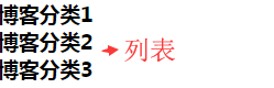
<h-component title="博客分类1"></h-component>
<h-component title="博客分类2"></h-component>
<h-component title="博客分类3"></h-component>
然而在典型应用中,在 data 里一般有一个博文的数组:
<div class="h_area">
    <h-component v-for="info in infos" v-bind:title="info.name"></h-component>
</div>
        /* 1、注册组件 */
        Vue.component('h-component',{
            props:['title'],
            template:'<h3>{{title}}</h3>'
        });
        /* 2、实例化,构建组件模板 */
        new Vue({
            el:".h_area",
            data:{
                infos:[
                    {name:"博客列表1"},
                    {name:"博客列表2"},
                    {name:"博客列表3"}
                ]
            }
        });
如上所示,你会发现我们可以使用 v-bind 来动态传递 prop。这在你一开始不清楚要渲染的具体内容,比如从一个 API 获取博文列表的时候,是非常有用的。到目前为止,关于 prop 你需要了解的大概就这些了,如果你阅读完本页内容并掌握了它的内容,推荐再回来把 prop 读完。
(4)单个根元素
先来简单回顾下组件
Start:
<div class="blog_area">
    <blog-info title="博客文章1"></blog-info>
    <blog-info title="博客文章2"></blog-info>
    <blog-info title="博客文章3"></blog-info>
</div>
Vue.component('blog-info',{
        props:['title'],
        template:"<h3>{{title}}</h3>"
});
new Vue({
        el:".blog_area"
});

接下来将数据放到数组中
<div class="blog_area">
    <blog-info v-for="blog in blogs" :title="blog.name" :id="blog.id"></blog-info>
</div>
        Vue.component('blog-info',{
            props:['id','title'],
            template:"<h3>{{id}}</h3><h4>{{title}}</h4>"
        });
        new Vue({
            el:".blog_area",
            data:{
                blogs:[
                    {id:100,name:"博客文章1"},
                    {id:200,name:"博客文章2"},
                    {id:300,name:"博客文章3"}
                ]
            }
        })
结果:
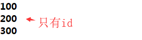
注意:此时发现一个问题,即组件模板中的h4渲染不出来,控制台也没报错,调试后发现,将其嵌套到h3里才可以正常渲染出来
Vue.component('blog-info',{
    props:['id','title'],
    template:"<h3>{{id}}<h4>{{title}}</h4></h3>"
});
End
当构建一个 <blog-post> 组件时,你的模板最终会包含的东西远不止一个标题和id:
<h3>{{id}}<h4>{{title}}</h4></h3>
然而如果你在模板中尝试这样写,Vue 旧版一般会报错,并解释道every component must have a single root element (每个组件必须只有一个根元素)。
解决方案:可以将模板的内容包裹在一个父元素内,来修复这个问题
        // 1、注册组件
        Vue.component('blog-info',{
            props:['id','title','content'],
            template:"<h3>{{id}}\
                            <h4>{{title}}</h4>\
                            <div v-html='content'></div>\
                    </h3>"
        });
        // 2、实例化,构建组件模板
        new Vue({
            el:".blog_area",
            data:{
                blogs:[
                    {id:100,name:"博客文章1",content:"博客1文章内容信息content..."},
                    {id:200,name:"博客文章2",content:"博客2文章内容信息content..."},
                    {id:300,name:"博客文章3",content:"博客3文章内容信息content..."}
                ]
            }
        })
当组件变得越来越复杂的时候,我们的博文不只需要标题和内容,还需要发布日期、评论等等。为每个相关的信息定义一个 prop 会变得很麻烦,例如:
<div class="blog_area">
    <blog-info
        v-for="blog in blogs"
        :title="blog.name"
        :id="blog.id"
        :content="blog.content"
        :date="blog.date"
    ></blog-info>
</div>
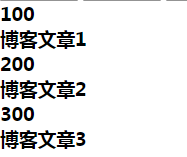
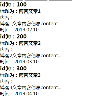
        // 1、注册组件
        Vue.component('blog-info',{
            props:['id','title','content','date'],
            template:"<div>\
                            <h3>id为:{{id}}</h3>\
                            <h4>标题为:{{title}}</h4>\
                            内容:<div v-html='content'></div>\
                            时间:<span v-html='date'></span>\
                    </div>"
        });
        // 2、实例化,构建组件模板
        new Vue({
            el:".blog_area",
            data:{
                blogs:[
                    {id:100,name:"博客文章1",content:"博客1文章内容信息content...",date:"2019.02.10"},
                    {id:200,name:"博客文章2",content:"博客2文章内容信息content...",date:"2019.03.10"},
                    {id:300,name:"博客文章3",content:"博客3文章内容信息content...",date:"2019.04.10"}
                ]
            }
        })
结果:
重构组件:所以是时候重构一下这个 <blog-info> 组件了,让它变成接受一个单独的 blog prop:
<div class="blog_area">
    <blog-info
        v-for="blog in blogs"
        :blog="blog"
    ></blog-info>
</div>
Vue.component('blog-info',{
     props:['blog'],
     template:"<div>\
                   <h3>id为:{{blog.id}}</h3>\
                   <h4>标题为:{{blog.name}}</h4>\
                    内容:<div v-html='blog.content'></div>\
                    时间:<span v-html='blog.date'></span>\
              </div>"
});
上述的这个和一些接下来的示例使用了 JavaScript 的模板字符串来让多行的模板更易读。它们在 IE 下并没有被支持,所以如果你需要在不 (经过 Babel 或 TypeScript 之类的工具) 编译的情况下支持 IE,请使用折行转义字符取而代之。
现在,不论何时为 blog对象添加一个新的属性,它都会自动地在 <blog-info> 内可用。
(5)监听子组件事件
在开发 <blog-post> 组件时,它的一些功能可能要求和父级组件进行沟通。例如可能会引入一个可访问性的功能来放大博文的字号,同时让页面的其它部分保持默认的字号。
在其父组件中,可以通过添加一个 postFontSize 数据属性来支持这个功能:
    new Vue({
            el:".blog_area",
            data:{
                blogs:[
                    {id:100,name:"博客文章1",content:"博客1文章内容信息content...",date:"2019.02.10"},
                    {id:200,name:"博客文章2",content:"博客2文章内容信息content...",date:"2019.03.10"},
                    {id:300,name:"博客文章3",content:"博客3文章内容信息content...",date:"2019.04.10"}
                ],
                blogFontSize:1
            }
        })
它可以在模板中用来控制所有博文的字号:
<div class="blog_area" :style="{ fontSize: blogFontSize + 'em' }">
    <blog-info
        v-for="blog in blogs"
        :blog="blog"
        v-on:enlarge-text="blogFontSize += 0.1"
    ></blog-info>
</div>
现在我们在每篇博文正文之前添加一个按钮来放大字号:
        Vue.component('blog-info',{
            props:['blog'],
            template:'\
                    <div><h3>id为:{{blog.id}}</h3>\
                            <h4>标题为:{{blog.name}}</h4>\
                            内容:<div v-html="blog.content"></div>\
                            时间:<span v-html="blog.date"></span><br>\
                            按钮:<button>点击放大</button>\
                    </div>\
                    '
        });
问题是这个按钮不会做任何事:
当点击这个按钮时,需要告诉父级组件放大所有博文的文本。幸好 Vue 实例提供了一个自定义事件的系统来解决这个问题。父级组件可以像处理 native DOM 事件一样通过 v-on 监听子组件实例的任意事件:
<div id="blog-posts-events-demo" style="display: none;">
          <div :style="{ fontSize: postFontSize + 'em' }">
            <blog-post
                v-for="post in posts"
                v-bind:key="post.id"
                v-bind:post="post"
                v-on:enlarge-text="postFontSize += 0.1"
            ></blog-post>
          </div>
</div>
同时子组件可以通过调用内建的 $emit 方法 并传入事件名称来触发一个事件:
        // 1、注册组件
        Vue.component('blog-info',{
            props:['blog'],
            template:'\
                    <div><h3>id为:{{blog.id}}</h3>\
                            <h4>标题为:{{blog.name}}</h4>\
                            内容:<div v-html="blog.content"></div>\
                            时间:<span v-html="blog.date"></span><br>\
                            按钮:<button v-on:click="$emit(\'enlarge-text\')">点击放大</button>\
                    </div>\
                    '
        });
有了这个 v-on:enlarge-text="postFontSize += 0.1" 监听器,父级组件就会接收该事件并更新 postFontSize 的值。
①使用事件抛出一个值
有的时候用一个事件来抛出一个特定的值是非常有用的。例如我们可能想让 <blog-info> 组件决定它的文本要放大多少。这时可以使用 $emit 的第二个参数来提供这个值:
按钮:<button v-on:click="$emit(\'enlarge-text\',0.1)">点击放大</button>\
然后当在父级组件监听这个事件的时候,可以通过 $event 访问到被抛出的这个值:
<blog-post
  ...
  v-on:enlarge-text="postFontSize += $event"
></blog-post>
或者,如果这个事件处理函数是一个方法:
<blog-post
  ...
  v-on:enlarge-text="onEnlargeText"
></blog-post>
那么这个值将会作为第一个参数传入这个方法:
methods: {
  onEnlargeText: function (enlargeAmount) {
    this.blogFontSize += enlargeAmount
  }
}
②在组件上使用v-model
首先,写个简单案例测试下组件里是否可以包含表单输入框选项
测试Start:
    <!-- 组件上使用v-model -->
    <div class="input_area">
        <form>
            <input-component value="我是默认值1"></input-component>
            <input-component value="我是默认值2"></input-component>
        </form>
    </div>
        // 1、注册组件
        Vue.component('input-component',{
            props:['value'],
            template:"\
                <div><input type='text' placeholder='请输入名称' v-model='value'>\
                <p>输入数据为:{{value}}</p>\
                </div>\
                "
        });
        // 2、实例化,构建组件模板
        new Vue({
            el:".input_area"
        })
结果:
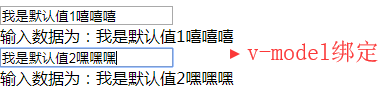
End
接下来依次分析下
自定义事件也可以用于创建支持 v-model 的自定义输入组件
<input type="text" v-model="searchText1"><span>输入:{{searchText1}}</span>

data中:
searchText1:"默认值1"
上面写法等价于
<input type="text" v-bind:value="searchText2" v-on:input="searchText2 = $event.target.value">
<span>输入为{{searchText2}}</span>

data中:
searchText2:'默认值2'
当用在组件上时,v-model 则会这样:
<input-component
    v-bind:value="searchText3"
    v-on:input="searchText3=$event"
></input-component>
为了让它正常工作,这个组件内的 <input> 必须:
- 将其
value特性绑定到一个名叫value的 prop 上 - 在其
input事件被触发时,将新的值通过自定义的input事件抛出
Vue.component('input-component',{
    props:['value'],
    template:'\
             <div><input type="text" placeholder="请输入名称" v-bind:value="value" v-on:input="$emit(\'input\',$event.target.value)">\
             <p>姓名输入数据为:{{value}}</p>\
             </div>\
            '
});
现在 v-model 就应该可以在这个组件上完美地工作起来了:
<input-component v-bind:value="searchText3" v-on:input="searchText3=$event"></input-component>
 ||
等价于:
 ||
<input-component v-model="searchText3"></input-component>
到目前为止,关于组件自定义事件你需要了解的大概就这些了,如果阅读完本页内容并掌握了它的内容,推荐再回来把自定义事件读完。
(6)通过插槽分发内容
和 HTML 元素一样,我们经常需要向一个组件传递内容,像这样:
<alert-box>
    发生错误哦
</alert-box>
可能会渲染出这样的东西:
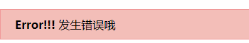
幸好,Vue 自定义的 <slot> 元素让这变得非常简单:
        Vue.component('alert-box',{
            template:'<div class="alert_box_area">\
                        <strong>Error!!!</strong>\
                        <slot></slot>\
                    </div>\
                    '
        });
        new Vue({
            el:".alert_area"
        })
如你所见,只要在需要的地方加入插槽就行了——就这么简单!到目前为止,关于插槽你需要了解的大概就这些了,如果你阅读完本页内容并掌握了它的内容,推荐你再回来把插槽读完。
(7)动态组件
有的时候,在不同组件之间进行动态切换是非常有用的,比如在一个多标签的界面里:
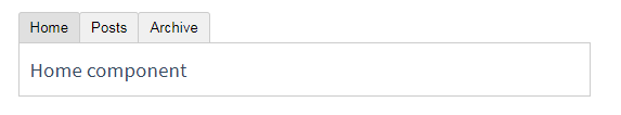
上述内容可以通过 Vue 的 <moving-area> 元素加一个特殊的 is 特性来实现:
<!-- 组件会在 `currentTabComponent` 改变时改变 -->
<moving-area v-bind:is="currentTabComponent"></moving-area>
在上述示例中,currentTabComponent 可以包括
- 已注册组件的名字,或
- 一个组件的选项对象
你可以在这里查阅并体验完整的代码,或在这个版本了解绑定组件选项对象,而不是已注册组件名的示例。到目前为止,关于动态组件你需要了解的大概就这些了,如果你阅读完本页内容并掌握了它的内容,推荐再回来把动态和异步组件读完。
(8)解析DOM模板时的注意事项
先来看个正常解析案例:
Start:
<div class="dom_area">
        <p-component
            v-for="info in infos"
            :info="info"
        ></p-component>
</div>
        Vue.component('p-component',{
            props:['info'],
            template:"<p>{{info}}</p>"
        })
        new Vue({
            el:".dom_area",
            data:{
                infos:['展示信息1','展示信息2','展示信息3']
            }
        })
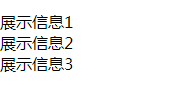
代码结构正确解析
End
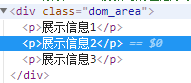
接下来换成table
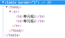
<div class="dom_area">
    <table>
        <tr-component></tr-component>
    </table>
</div>
Vue.component('tr-component',{
    template:"<tr><td>单元格1</td><td>单元格2</td></tr>"
})
new Vue({
    el:".dom_area"
})
渲染结果:
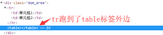
有些 HTML 元素,诸如 <ul>、<ol>、<table> 和 <select>,对于哪些元素可以出现在其内部是有严格限制的。而有些元素,诸如 <li>、<tr> 和 <option>,只能出现在其它某些特定的元素内部。这会导致我们使用这些有约束条件的元素时遇到一些问题,如上所示。自定义组件 <tr-component> 会被作为无效的内容提升到外部,并导致最终渲染结果出错。幸好这个特殊的 is 特性给了我们一个变通的办法:
<table border="1">
    <tr is="tr-component"></tr>
</table>
此时,tr标签可以正确渲染到table里
需要注意的是如果我们从以下来源使用模板的话,这条限制是不存在的:
- 字符串 (例如:
template: '...') - 单文件组件 (
.vue) <script type="text/x-template">
到这里,你需要了解的解析 DOM 模板时的注意事项——实际上也是 Vue 的全部必要内容,大概就是这些了。恭喜你!接下来还有很多东西要去学习,不过首先,我们推荐你先休息一下,试用一下 Vue,自己随意做些好玩的东西。如果你感觉已经掌握了这些知识,我们推荐你再回来把完整的组件指南,包括侧边栏中组件深入章节的所有页面读完。
.
相关文章
- vue - 组件基础
- 【Vue】通过keep-alive实现路由组件的数据缓存
- 【Vue】单文件的组件(.vue)代码实例
- 【css/vue】Vue组件中对body操作样式的一种解决方案
- vue + vue-lazyload 实现图片懒加载
- vue 的 起手式
- vue 试图改变子组件props 属性值时,控制台报错解决方案
- Vue项目--防抖与节流
- vue一个组件监听另一个组件
- 来吧!一文彻底搞定Vue组件!
- vue引入mock的json数据
- vue跨域,生产环境和线上环境
- Vue 国际化之 vue-i18n 的使用
- vue动态生成表单
- vue引用qrcodejs2生成、下载二维码、复制到剪贴板
- vue基础 Vue.extend
- Vue组件进阶知识总结
- Vue组件基础知识总结
- vue基础八(路由组件)
- vue前台(二)在路由配置项中,配置meta属性来影藏组件
- vue数据代理
- vue-cli4.5 创建项目