
WPF中阴影效果和模糊效果的使用
WPF 效果 模糊 阴影 使用
2023-09-11 14:17:48 时间
总目录
文章目录
前言
WPF中的控件效果主要通过Effect来实现,而Effect有DropShadowEffect(投影效果)和BlurEffect(模糊效果)两个派生类,本文将主要介绍Effect的运用!
一、DropShadowEffect
1、DropShadowEffect各属性效果图
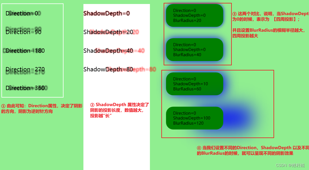
另外还有两个常用的属性,没有在上图介绍
- Color 属性 设置阴影的颜色
- Opacity 属性 设置阴影的透明度
2、实现代码
    <UniformGrid Background="LightGreen" Columns="4">
        <StackPanel Margin="20">
            <TextBlock Text="Direction=0" Margin="0,20">
                <TextBlock.Effect>
                    <DropShadowEffect Color="Black" Direction="0" ShadowDepth="10"/>
                </TextBlock.Effect>
            </TextBlock>
            <TextBlock Text="Direction=90" Margin="0,20">
                <TextBlock.Effect>
                    <DropShadowEffect Color="Black" Direction="90" ShadowDepth="10"/>
                </TextBlock.Effect>
            </TextBlock>
            <TextBlock Text="Direction=180" Margin="0,20">
                <TextBlock.Effect>
                    <DropShadowEffect Color="Black" Direction="180" ShadowDepth="10"/>
                </TextBlock.Effect>
            </TextBlock>
            <TextBlock Text="Direction=270" Margin="0,20">
                <TextBlock.Effect>
                    <DropShadowEffect Color="Black" Direction="270" ShadowDepth="10"/>
                </TextBlock.Effect>
            </TextBlock>
            <TextBlock Text="Direction=360" Margin="0,20">
                <TextBlock.Effect>
                    <DropShadowEffect Color="Black" Direction="360" ShadowDepth="10"/>
                </TextBlock.Effect>
            </TextBlock>

        </StackPanel>
        <StackPanel Margin="20" Background="White">
            <TextBlock Text="ShadowDepth=0" Margin="0,20">
                <TextBlock.Effect>
                    <DropShadowEffect Color="Red" Direction="0" ShadowDepth="0"/>
                </TextBlock.Effect>
            </TextBlock>
            <TextBlock Text="ShadowDepth=20" Margin="0,20">
                <TextBlock.Effect>
                    <DropShadowEffect Color="Red" Direction="0" ShadowDepth="20"/>
                </TextBlock.Effect>
            </TextBlock>
            <TextBlock Text="ShadowDepth=40" Margin="0,20">
                <TextBlock.Effect>
                    <DropShadowEffect Color="Red" Direction="0" ShadowDepth="40"/>
                </TextBlock.Effect>
            </TextBlock>
            <TextBlock Text="ShadowDepth=80" Margin="0,20">
                <TextBlock.Effect>
                    <DropShadowEffect Color="Red" Direction="0" ShadowDepth="80"/>
                </TextBlock.Effect>
            </TextBlock>

        </StackPanel>
        <StackPanel>
            <Border Height="80" Width="200" CornerRadius="25" Background="Green" Margin="0,20">
                <Border.Effect>
                    <DropShadowEffect Color="Blue" Direction="0" ShadowDepth="0" BlurRadius="20"/>
                </Border.Effect>
                <TextBlock Text="Direction=0 ShadowDepth=0 BlurRadius=20" FontSize="14" VerticalAlignment="Center" TextWrapping="Wrap" Width="150"></TextBlock>
            </Border>

            <Border Height="80" Width="200" CornerRadius="25" Background="Green" Margin="0,20">
                <Border.Effect>
                    <DropShadowEffect Color="Blue" Direction="0" ShadowDepth="0" BlurRadius="40"/>
                </Border.Effect>
                <TextBlock Text="Direction=0 ShadowDepth=0 BlurRadius=40" FontSize="14" VerticalAlignment="Center" TextWrapping="Wrap" Width="150"></TextBlock>
            </Border>

            <Border Height="80" Width="200" CornerRadius="25" Background="Green" Margin="0,20">
                <Border.Effect>
                    <DropShadowEffect Color="Blue" Direction="0" ShadowDepth="10" BlurRadius="60"/>
                </Border.Effect>
                <TextBlock Text="Direction=0 ShadowDepth=10 BlurRadius=60" FontSize="14" VerticalAlignment="Center" TextWrapping="Wrap" Width="150"></TextBlock>
            </Border>

            <Border Height="80" Width="200" CornerRadius="25" Background="Green" Margin="0,20">
                <Border.Effect>
                    <DropShadowEffect Color="Blue" Direction="0" ShadowDepth="100" BlurRadius="120"/>
                </Border.Effect>
                <TextBlock Text="Direction=0 ShadowDepth=100 BlurRadius=120" FontSize="14" VerticalAlignment="Center" TextWrapping="Wrap" Width="150"></TextBlock>
            </Border>
        </StackPanel>
    </UniformGrid>
二、BlurEffect
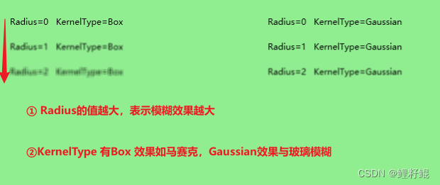
1、BlurEffect各属性效果图
2、实现代码
    <UniformGrid Background="LightGreen" Columns="3">
        <StackPanel Margin="20">
            <TextBlock Text="Radius=0   KernelType=Box" Margin="0,10">
                <TextBlock.Effect>
                    <BlurEffect Radius="0"  KernelType="Box"/>
                </TextBlock.Effect>
            </TextBlock>
            <TextBlock Text="Radius=1   KernelType=Box" Margin="0,10">
                <TextBlock.Effect>
                    <BlurEffect Radius="1"  KernelType="Box"/>
                </TextBlock.Effect>
            </TextBlock>
            <TextBlock Text="Radius=2   KernelType=Box" Margin="0,10">
                <TextBlock.Effect>
                    <BlurEffect Radius="2"  KernelType="Box"/>
                </TextBlock.Effect>
            </TextBlock>
        </StackPanel>
        <StackPanel Margin="20">
            <TextBlock Text="Radius=0   KernelType=Gaussian" Margin="0,10">
                <TextBlock.Effect>
                    <BlurEffect Radius="0"  KernelType="Gaussian"/>
                </TextBlock.Effect>
            </TextBlock>
            <TextBlock Text="Radius=1   KernelType=Gaussian" Margin="0,10">
                <TextBlock.Effect>
                    <BlurEffect Radius="1"  KernelType="Gaussian"/>
                </TextBlock.Effect>
            </TextBlock>
            <TextBlock Text="Radius=2   KernelType=Gaussian" Margin="0,10">
                <TextBlock.Effect>
                    <BlurEffect Radius="2"  KernelType="Gaussian"/>
                </TextBlock.Effect>
            </TextBlock>
        </StackPanel>

    </UniformGrid>
3、进阶使用
详情可查:[WPF] 使用 Effect 玩玩阴影、内阴影、 长阴影
结语
以上就是本文的内容,希望以上内容可以帮助到您,如文中有不对之处,还请批评指正。
相关文章
- WPF DataGridTemplateColumn添加按钮
- Comparison: Standard WPF DataGrid and DevExpress WPF GridControl
- wpf 导出Excel Wpf Button 样式 wpf简单进度条 List泛型集合对象排序 C#集合
- 演练:我的第一个 WPF 桌面应用程序 https://docs.microsoft.com/zh-cn/dotnet/framework/wpf/getting-started/walkthrough-my-first-wpf-desktop-application
- WPF自学入门(九)WPF自定义窗口基类
- 【wpf】GridSplitter用法总结
- [WPF] 玩玩彩虹文字及动画
- [WPF] 抄一个 CSS3 实现的按钮
- [WPF 自定义控件]使用TextBlockHighlightSource强化高亮的功能,以及使用TypeConverter简化调用
- WPF中焦点详解
- 告诉你吧,一套皮肤在winform与wpf开发模式下实现的界面效果同样精彩,winform界面和wpf界面。
- WPF 有趣的动画效果
- 深入浅出WPF 第一部分(3)
- 【WPF】ListBox GridViewColumn Header 文字换行、文字多行显示
- 【WPF】自动完成/智能提示的文本框(AutoCompleteBox)
- 【WPF】BusyIndicator做Loading遮罩层
- 【WPF】一组CheckBox的全选/全不选功能