
WPF使用触发器需要注意优先级问题
WPF 需要 触发器 注意 优先级 问题 使用
2023-09-11 14:17:48 时间
总目录
前言
WPF使用触发器需要注意优先级问题
一、案例一
1、问题开始
现在有个需求:
初始状态(未选中)的时候,CheckBox的Content 为 “乒乓球”,然后选中之后,将“乒乓球”就改为“我爱乒乓球” 并且将文字加粗变为红色。
然后就编写代码如下:
    <Window.Resources>
        <Style x:Key="cb" TargetType="{x:Type CheckBox}">
            <Setter Property="Foreground" Value="Green"></Setter>
            <Setter Property="FontSize" Value="20"></Setter>
            <Style.Triggers>
                <Trigger Property="IsChecked" Value="True">
                    <Setter Property="Content" Value="我爱乒乓球"></Setter>
                    <Setter Property="FontWeight" Value="Bold"></Setter>
                    <Setter Property="Foreground" Value="Red"></Setter>
                </Trigger>
            </Style.Triggers>
        </Style>
    </Window.Resources>
    <WrapPanel VerticalAlignment="Top" Background="LightBlue">
        <CheckBox Content="乒乓球" Style="{StaticResource cb}" Margin="10"></CheckBox>
    </WrapPanel>
实现效果如下:
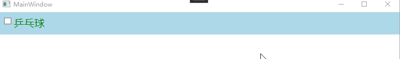
奇怪了,为什么文字没有改变呢?
2、问题说明
以上问题就是使用触发器初期很容易犯的错误:没有注意样式设置的优先级。
如上案例中:<CheckBox Content="乒乓球" Style="{StaticResource cb}" Margin="10"></CheckBox>
将CheckBox自身的元素标签上设置了Content,这里设置的属性具有最高的优先级,那么元素标签就不会再去使用其他地方设置的属性值,因此无论其他地方如何改变都不会生效。
3、问题订正
解决该问题只需要将需要在触发器中需要设置的属性中,将默认值设置到样式内,而不是设置在标签元素自身上。代码如下所示:
    <Window.Resources>
        <Style x:Key="cb" TargetType="{x:Type CheckBox}">
            <Setter Property="Foreground" Value="Green"></Setter>
            <Setter Property="FontSize" Value="20"></Setter>
            <Setter Property="Content" Value="乒乓球"></Setter>
            <Style.Triggers>
                <Trigger Property="IsChecked" Value="True">
                    <Setter Property="Content" Value="我爱乒乓球"></Setter>
                    <Setter Property="FontWeight" Value="Bold"></Setter>
                    <Setter Property="Foreground" Value="Red"></Setter>
                </Trigger>
            </Style.Triggers>
        </Style>
    </Window.Resources>
    <WrapPanel VerticalAlignment="Top" Background="LightBlue">
        <CheckBox Style="{StaticResource cb}" Margin="10"></CheckBox>
    </WrapPanel>
二、案例二
直接上代码:
<Window x:Class="WpfApp1.Views.Window2"
        xmlns="http://schemas.microsoft.com/winfx/2006/xaml/presentation"
        xmlns:x="http://schemas.microsoft.com/winfx/2006/xaml"
        Title="Window2" Height="450" Width="800">
    <Window.Resources>
        <Style x:Key="btnStyle" TargetType="{x:Type Button}">
            <Setter Property="Foreground" Value="Red"></Setter>
            <Style.Triggers>
                <Trigger Property="IsPressed" Value="True">
                    <Setter Property="Background" Value="Green"></Setter>
                </Trigger>
                <Trigger Property="IsMouseOver" Value="True">
                    <Setter Property="Background" Value="Blue"></Setter>
                </Trigger>
            </Style.Triggers>
        </Style>

        <Style x:Key="btnStyle2" TargetType="{x:Type Button}">
            <Setter Property="Template">
                <Setter.Value>
                    <ControlTemplate TargetType="Button">
                        <Border CornerRadius="20" Background="{TemplateBinding Background}" >
                            <ContentPresenter VerticalAlignment="{TemplateBinding VerticalContentAlignment}"
                                              HorizontalAlignment="{TemplateBinding HorizontalContentAlignment}"></ContentPresenter>
                        </Border>
                    </ControlTemplate>
                </Setter.Value>
            </Setter>
            <Style.Triggers>
                <Trigger Property="IsPressed" Value="True">
                    <Setter Property="Background" Value="Green"></Setter>
                </Trigger>
                <Trigger Property="IsMouseOver" Value="True">
                    <Setter Property="Background" Value="Blue"></Setter>
                </Trigger>
            </Style.Triggers>
        </Style>

        <Style x:Key="btnStyle3" TargetType="{x:Type Button}">
            <Setter Property="Template">
                <Setter.Value>
                    <ControlTemplate TargetType="Button">
                        <Border CornerRadius="20" Background="{TemplateBinding Background}" >
                            <ContentPresenter VerticalAlignment="{TemplateBinding VerticalContentAlignment}"
                                              HorizontalAlignment="{TemplateBinding HorizontalContentAlignment}"></ContentPresenter>
                        </Border>
                    </ControlTemplate>
                </Setter.Value>
            </Setter>
            <Style.Triggers>
                <Trigger Property="IsMouseOver" Value="True">
                    <Setter Property="Background" Value="Blue"></Setter>
                </Trigger>
                <Trigger Property="IsPressed" Value="True">
                    <Setter Property="Background" Value="Green"></Setter>
                </Trigger>
            </Style.Triggers>
        </Style>
    </Window.Resources>
    <StackPanel>
        <Button Content="测试原生Button的背景色"  Width="250" Height="80" Style="{StaticResource btnStyle}"  Margin="20"></Button>
        <Button Content="测试自定义模板Button的背景色"  Width="250" Height="80" Style="{StaticResource btnStyle2}" Margin="20"></Button>
        <Button Content="测试触发器优先级"  Width="250" Height="80" Style="{StaticResource btnStyle3}" Margin="20"></Button>
    </StackPanel>
</Window>
效果如下图:
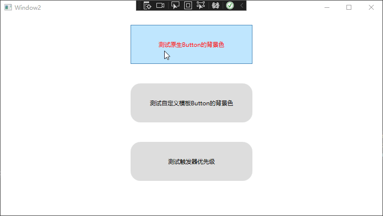
该案例说明了以下问题:
- 1 Button原生按钮是无法在IsPressed和IsMouseOver触发器中修改背景色的,因为当我们鼠标移上去的时候,首先触发的是原生的样式效果,显示浅蓝色
- 2 当我们通过模板修改了原生模板的时候,这个时候就可以修改背景色了,但是由于IsPressed 的触发器定义在IsMouseOver的上面,所以导致IsPressed 的触发效果被IsMouseOver覆盖掉
- 3 想要让两个触发器都生效,只需要调整触发器的先后顺序即可。
总结
以上就是本文的内容,希望以上内容可以帮助到你,如文中有不对之处,还请批评指正。
相关文章
- WPF DataGrid双向绑定
- WPF入门教程系列二——Application介绍
- WPF Validation - Using INotifyDataErrorInfo | .NET Land (kmatyaszek.github.io)
- WPF中的常用布局 栈的实现 一个关于素数的神奇性质 C# defualt关键字默认值用法 接口通俗理解 C# Json序列化和反序列化 ASP.NET CORE系列【五】webapi整理以及RESTful风格化
- [WPF]为什么使用SaveFileDialog创建文件需要删除权限?
- wpf中:xaml中的命名空间的引入方法
- WPF整理-使用逻辑资源
- csharp: Data binding in WPF DataGrid control
- WPF中获取Hwnd与窗体,Uid获取控件
- CYQ.Data 支持WPF相关的数据控件绑定(2013-08-09)
- WPF中Auto与*的差别
- 【WPF】图片按钮的单击与双击事件
- 【WPF】修改数据层ViewModel后,UI界面未同步更新
- 【C#/WPF】Button按钮动态设置Background背景颜色