
Day6:html和css
2023-09-11 14:16:53 时间

Day6:
html和css
复习
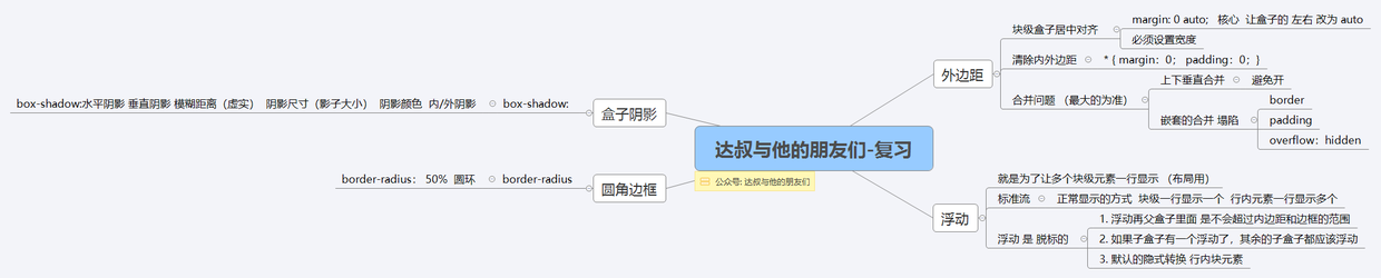
margin: 0;
padding: 0;
<!DOCTYPE html>
<html lang="en">
<head>
	<meta charset="UTF-8">
	<title>Demo</title>
	<style>
        // 父元素
	.father {
		border: 1px solid red;
		width: 300px;
	}
        // 添加浮动会导致父元素不被撑开
	.big {
		width: 100px;
		height: 100px;
		background-color: purple;
		float: left;
	}
	.small {
		width: 80px;
		height: 80px;
		background-color: blue;
		float: left;
	}
	.footer {
		width: 400px;
		height: 100px;
		background-color: pink;
	}
	</style>
</head>
<body>
	<div class="father">
		<div class="big"></div>
		<div class="small"></div>
	</div>
	<div class="footer"></div>
</body>
</html>
// 所以要进行清除浮动
清除浮动: overflow: hidden
添加在需要清除浮动的地方
<!DOCTYPE html>
<html lang="en">
<head>
	<meta charset="UTF-8">
	<title>Demo</title>
	<style>
	.father {
		border: 1px solid red;
		width: 300px;
		overflow: hidden;  // 添加在需要清除的地方
	}
	.big {
		width: 100px;
		height: 100px;
		background-color: purple;
		float: left;
	}
	.small {
		width: 80px;
		height: 180px;
		background-color: blue;
		float: left;
	}
	.footer {
		width: 400px;
		height: 100px;
		background-color: pink;
	}
	</style>
</head>
<body>
	<div class="father">
		<div class="big"></div>
		<div class="small"></div>
	</div>
	<div class="footer"></div>
</body>
</html>
// 清除浮动的效果会导致父元素撑开
<!DOCTYPE html>
<html lang="en">
<head>
	<meta charset="UTF-8">
	<title>Demo</title>
	<style>
	.father {
		border: 1px solid red;
		width: 300px;
	}
	.big {
		width: 100px;
		height: 200px;
		background-color: purple;
		float: left;
	}
	.small {
		width: 80px;
		height: 80px;
		background-color: blue;
		float: left;
	}
	.footer {
		width: 400px;
		height: 100px;
		background-color: pink;
	}
	.clear {
		clear: both;
		// 额外标签法
	}
	</style>
</head>
<body>
	<div class="father">
		<div class="big"></div>
		<div class="small"></div>
		<div class="clear"></div>
               // 在最后的标签,添加清除浮动
	</div>
	<div class="footer"></div>
</body>
</html>

// clear: both;
// after伪元素进行清除浮动
<!DOCTYPE html>
<html lang="en">
<head>
	<meta charset="UTF-8">
	<title>Demo</title>
	<style>
	.clearfix:after {
                // 父元素添加类
		content:"";
		display: block;
		height: 0;
		clear: both;
		visibility: hidden;
	}
	.clearfix {
		*zoom: 1;
	}
	.father {
		border: 1px solid red;
		width: 300px;
	}
	.big {
		width: 100px;
		height: 100px;
		background-color: purple;
		float: left;
	}
	.small {
		width: 80px;
		height: 80px;
		background-color: blue;
		float: left;
	}
	.footer {
		width: 400px;
		height: 100px;
		background-color: pink;
	}
	</style>
</head>
<body>
	<div class="father clearfix">
		<div class="big"></div>
		<div class="small"></div>
	</div>
	<div class="footer"></div>
</body>
</html>

// 在父类添加元素类,清除浮动

.clearfix:after {
 content: "";
 display: block;
 height: 0;
 clear: both;
 visibility: hidden;
}
.clearfix {
 *zoom: 1;
}
// 双伪元素进行清除浮动
<!DOCTYPE html>
<html lang="en">
<head>
	<meta charset="UTF-8">
	<title>Demo</title>
	<style>
	.clearfix:before, .clearfix:after {
		content: "";
		display: table;
	}
	.clearfix:after {
		clear: both;
	}
	.clearfix {
		*zoom: 1;
	}
	.father {
		border: 1px solid red;
		width: 300px;

	}
	.big {
		width: 100px;
		height: 100px;
		background-color: purple;
		float: left;
	}
	.small {
		width: 80px;
		height: 80px;
		background-color: blue;
		float: left;
	}
	.footer {
		width: 400px;
		height: 100px;
		background-color: pink;
	}
	</style>
</head>
<body>
	<div class="father clearfix">
		<div class="big"></div>
		<div class="small"></div>
	</div>
	<div class="footer"></div>
</body>
</html>

// 在父元素添加类 clearfix
// 双伪元素
.clearfix:before, .clearfix:after {
 content: "";
 display: table;
}
.clearfix:after {
 clear: both;
}
.clearfix {
 *zoom: 1;
}
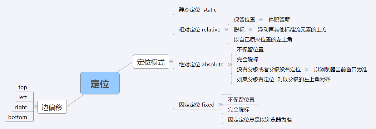
定位position
background-position 背景定位
定位属性
边偏移
| 属性 | 说明 |
|---|---|
| top | 顶端偏移量 |
| bottom | 底部偏移量 |
| left | 左侧偏移量 |
| right | 右侧偏移量 |
定位模式:
选择器{position: 属性值}
position属性的常用值
| 值 | 说明 |
|---|---|
| static | 自动定位 |
| relative | 相对定位,相对于其原文档流的位置进行定位 |
| absolute | 绝对定位,相对于其上一个已经定位的父元素进行定位 |
| fixed | 固定定位 |
position: static;
相对定位: a->a不变
绝对定位absolute
绝对定位是如果某个部分会滚动,那么滚动完,它还在那个位置上而已.
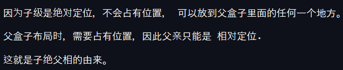
子绝父相
子级是绝对定位的话, 父级要用相对定位。
叠放次序(z-index)
四种定位总结
静态static 不脱标,正常模式
相对定位relative 脱标,占有位置
绝对定位absolute 完全脱标,不占有位置
固定定位fixed 完全脱标,不占有位置
元素的显示与隐藏
display visibility 和 overflow
display 显示 display : none display:block  隐藏之后,不再保留位置

visibility 可见性 visible 对象可视 hidden对象隐藏 隐藏之后,继续保留原有位置

overflow 溢出
visible
auto
hidden
scroll
相对定位
// 相对定位
<!DOCTYPE html>
<html lang="en">
<head>
	<meta charset="UTF-8">
	<title>Demo</title>
	<style>
	div {
		width: 200px;
		height: 200px;
	}
	.top {
		background-color: pink;
		/*position: relative; */
		top: 100px;
		left: 100px;
	}
	.bottom {
		background-color: purple;
	}
	</style>
</head>
<body>
	<div class="top"></div>
	<div class="bottom"></div>
</body>
</html>
<!DOCTYPE html>
<html lang="en">
<head>
	<meta charset="UTF-8">
	<title>Demo</title>
	<style>
	div {
		width: 200px;
		height: 200px;
	}
	.top {
		background-color: pink;
		position: relative;
		top: 100px;
		left: 100px;
	}
	.bottom {
		background-color: purple;
	}
	</style>
</head>
<body>
	<div class="top"></div>
	<div class="bottom"></div>
</body>
</html>
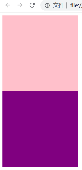
// 绝对定位
<!DOCTYPE html>
<html lang="en">
<head>
	<meta charset="UTF-8">
	<title>Demo</title>
	<style>
	body {
		height: 1000px;
	}
	div {
		width: 100px;
		height: 100px;
		background-color: pink;
	}
	.top {
		position: absolute;
		right: 0;
		bottom: 0;
	}
	.bottom {
		background-color: purple;
		width: 110px;
	}
	</style>
</head>
<body>
	<div class="top"></div>
	<div class="bottom"></div>
</body>
</html>
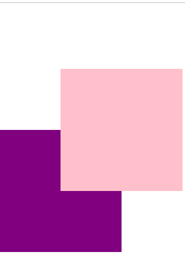
// 父元素没有定位
<!DOCTYPE html>
<html lang="en">
<head>
	<meta charset="UTF-8">
	<title>Demo</title>
	<style>
	.father {
		width: 400px;
		height: 400px;
		background-color: pink;
		margin: 50px;
	}
	.son {
		width: 100px;
		height: 100px;
		background-color: purple;
		position: absolute;
		top: 50px;
		left: 50px;
	}
	</style>
</head>
<body>
	<div class="father">
		<div class="son"></div>
	</div>
</body>
</html>
// 没有定位跟着浏览器
// 注意
<!DOCTYPE html>
<html lang="en">
<head>
	<meta charset="UTF-8">
	<title>Demo</title>
	<style>
	div {
		width: 200px;
		height: 200px;
		background-color: pink;
	}
	.top {
		float: left;
	}
	.bottom {
		background-color: purple;
	}
	</style>
</head>
<body>
	<div class="top">123</div>
	<div class="bottom">dashucoding</div>
</body>
</html>
// 例子
<!DOCTYPE html>
<html lang="en">
<head>
	<meta charset="UTF-8">
	<title>Demo</title>
	<style>
	div {
		width: 250px;
		height: 400px;
		border: 1px solid #ccc;
		float: left;
		margin-left: -1px;
		position: relative;
	}
	div:hover {
		border: 1px solid #f40;
		z-index: 1;
	}
	</style>
</head>
<body>
	<div></div>
	<div></div>
	<div></div>
	<div></div>
	<div></div>
</body>
</html>
// 居中
<!DOCTYPE html>
<html lang="en">
<head>
	<meta charset="UTF-8">
	<title>Demo</title>
	<style>
	div {
		width: 200px;
		height: 200px;
		background-color: pink;
		position: absolute;
		left: 50%;
		margin-left: -100px;
		top: 50%;
		margin-top: -100px;
	}
	</style>
</head>
<body>
	<div></div>
</body>
</html>
推荐
如果看了觉得不错
点赞!转发!
达叔小生:往后余生,唯独有你
You and me, we are family !
90后帅气小伙,良好的开发习惯;独立思考的能力;主动并且善于沟通
简书博客: 达叔小生
https://www.jianshu.com/u/c785ece603d1
结语
- 下面我将继续对 其他知识 深入讲解 ,有兴趣可以继续关注
- 小礼物走一走 or 点赞
相关文章
- 1.html5 学习要求,Html 5发展历程
- 网页基础:网页设计(我所知道的所有的html和css代码(含H5和CSS3)),如有错误请批评指正 wpf Listbox 实现按住ctrl键来取消选中 详解C#的协变和逆变 C#效率优化(1)-- 使用泛型时避免装箱
- 优化 html 标签 为何能用HTML/CSS解决的问题就不要使用JS?
- 技术分享 | web前端的HTML浅析
- HOWTO: Create native-looking iPhone/iPad applications from HTML, CSS and JavaScript
- JavaScript and html的关系
- 【前端学习之HTML&CSS】-- 视觉格式化模型之二 浮动 -- 练习
- Day9:html和css
- 第59节:Java中的html和css语言
- 保存 dom/html 为图片
- 《网页设计与前端开发 Dreamweaver+Flash+Photoshop+HTML+CSS+JavaScript 从入门到精通》——1.2 网页的基本构成元素
- 《网页设计与前端开发 Dreamweaver+Flash+Photoshop+HTML+CSS+JavaScript 从入门到精通》——1.3 网页设计的原则
- 《21天学通HTML+CSS+JavaScript Web开发(第7版)》——1.2 Web浏览器
- 《网页设计与前端开发 Dreamweaver+Flash+Photoshop+HTML+CSS+JavaScript 从入门到精通》—— 1.2 网页的基本构成元素
- 《HTML CSS JavaScript 网页制作从入门到精通 第3版》—— 1.3 使用浏览器浏览HTML文件
- 《HTML CSS JavaScript 网页制作从入门到精通 第3版》—— 导读
- 《HTML与CSS入门经典(第8版)》——1.5 用多种Web浏览器测试
- 5个前端练手项目(html css js canvas)
- html中radio,checkbox值的获取、赋值、注册事件
- Python 正则表达式解析HTML
- HTML中块元素和行内元素对比
- 两行css代码实现瀑布流:html,css最简单的瀑布流实现方式
- HTML+CSS,让div在屏幕中居中(水平居中+垂直居中)方法总结
- 十个炫丽的表白模板源码,整合成一个完整系统可修改文字,可统计人数,经典的爱情告白,万能告白模板,胜过鲜花表白,程序员的特殊表白方式说——我爱你(520)——html、js、css、jQuery