
React-Native 之 GD (二)自定义共用导航栏样式
React 自定义 样式 导航 native 共用 GD
2023-09-11 14:15:30 时间
1.自定义导航栏样式
步骤一:从效果图中可以看出,导航栏的样式都差不多,因为我们前面已经设置了 Navigator ,这边的话我们还需要自定义 Navigator 的样式,可以看到所有的 Navigator 样式都是相近的,所以这边我们就抽出来,让所有的 Navigator 共用一个组件就可以了。
步骤二:那么首先我们在 main 文件夹中创建 GDCommunalNavBar 文件并初始化一下里面基本的内容
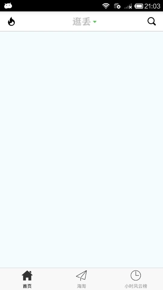
步骤三:接着,我们来看下首页的导航栏,首页导航栏分别有左中右三个按钮,左边为半小时热门,中间为点击下拉显示支持筛选的平台的列表,右边则是商品搜索,通常 Navigator 也只有这3个组件,为了使用者高度地自定义,这边我们只在 currencyNavBar 中设置3个组件的布局,然后提供接口,获取外部传入的值,并在内部判断是否需要创建相应的组件。
GDCommunalNavBar.js
/**
 * 自定义导航栏
 */
import React, { Component, PropTypes } from 'react';
import {
    StyleSheet,
    Text,
    View,
    Dimensions,
    Platform,
} from 'react-native';

// 获取屏幕宽高
const {width, height} = Dimensions.get('window');

export default class GDCommunalNavBar extends Component {
    // 创建成员属性 ES6统一用static管理
    static propTypes = {
        leftItem:PropTypes.func,  // 外部传入方法,内部接收
        titleItem:PropTypes.func,
        rightItem:PropTypes.func,
    };

    // 左边
    renderLeftItem() {
        // 判断是否传入值
        if (this.props.leftItem === undefined) return;
        // 有值,调用方法,进行初始化
        return this.props.leftItem();
    }

    // 中间
    renderTitleItem() {
        if (this.props.titleItem === undefined) return;
        return this.props.titleItem();
    }

    // 右边
    renderRightItem() {
        if (this.props.rightItem === undefined) return;
        return this.props.rightItem();
    }

    render() {
        return (
            <View style={styles.container}>
                {/* 左边 */}
                <View>
                    {this.renderLeftItem()}
                </View>
                {/* 中间 */}
                <View>
                    {this.renderTitleItem()}
                </View>
                {/* 右边 */}
                <View>
                    {this.renderRightItem()}
                </View>
            </View>
        );
    }
}

const styles = StyleSheet.create({
    container: {
        width:width,
        height:Platform.OS === 'ios' ? 64 : 44,
        backgroundColor:'white',
        flexDirection:'row', // 设置主轴的方向
        justifyContent:'space-between', // 设置主轴的对齐方式
        alignItems:'center', // 设置侧轴内容居中
        borderBottomWidth:0.5,
        borderBottomColor:'gray',
        paddingTop:Platform.OS === 'ios' ? 15 : 0,
    },
});
2.引用 自定义导航栏组件
GDHome.js
/**
 * 首页
 */
import React, { Component } from 'react';
import {
    StyleSheet,
    Text,
    View,
    TouchableOpacity,
    Image,
} from 'react-native';

// 引入自定义导航栏组件
import CommunalNavBar from '../main/GDCommunalNavBar';

export default class GDHome extends Component {

    // 返回左边按钮
    renderLeftItem() {
        // 将组件返回出去
        return(
            <TouchableOpacity>
                <Image source={{uri:'hot_icon_20x20'}} style={styles.navbarLeftItemStyle} />
            </TouchableOpacity>
        );
    }

    // 返回中间按钮
    renderTitleItem() {
        return(
            <TouchableOpacity>
                <Image source={{uri:'navtitle_home_down_66x20'}} style={styles.navbarTitleItemStyle} />
            </TouchableOpacity>
        );
    }

    // 返回右边按钮
    renderRightItem() {
        return(
            <TouchableOpacity>
                <Image source={{uri:'search_icon_20x20'}} style={styles.navbarRightItemStyle} />
            </TouchableOpacity>
        );
    }

    render() {
        return (
            <View style={styles.container}>
                {/* 导航栏样式 */}
                <CommunalNavBar
                    leftItem = {() => this.renderLeftItem()}
                    titleItem = {() => this.renderTitleItem()}
                    rightItem = {() => this.renderRightItem()}
                />
            </View>
        );
    }
}

const styles = StyleSheet.create({
    container: {
        flex: 1,
        alignItems: 'center',
        backgroundColor: '#F5FCFF',
    },
    navbarLeftItemStyle: {
        width:20,
        height:20,
        marginLeft:15,
    },
    navbarTitleItemStyle: {
        width:66,
        height:20,
    },
    navbarRightItemStyle: {
        width:20,
        height:20,
        marginRight:15,
    },
});
3.效果图
.
相关文章
- react开发教程(三)组件的构建
- react开发教程(六)React与DOM
- [React] Use react styled system with styled components
- [React] Using react-styleguidist for Component demo
- [React] Creating a Stateless Functional Component
- [React Testing] className with Shallow Rendering
- [React] Extracting Private React Components
- 使用react-app-rewired和customize-cra自定义项目配置
- [React Testing] Test Drive Mocking react-router’s Redirect Component on a Form Submission
- [React] Safely setState on a Mounted React Component through the useEffect Hook
- [React] Ensure all React useEffect Effects Run Synchronously in Tests with react-testing-library
- [React] Override webpack config for create-react-app without ejection
- [Parcel] Bundle a React App with Parcel
- [React Intl] Render Content with Placeholders using react-intl FormattedMessage
- [Preact] Integrate react-router with Preact
- [React] Extracting Private React Components
- 如何在 React Native 中写一个自定义模块
- SAP UI5 Web Component不同React页面的跳转实现
- atitit.React 优缺点 相比angular react是最靠谱的web ui组件化方案了
- atitit.React 优缺点 相比angular react是最靠谱的web ui组件化方案了
- create-react-app的template和assembed resource
- React的source code init时会自动检测Chrome dev tool的react extension装了没
- 2021前端面试题大全(html+css专题+js专题+vuejs专题+react专题+选择题+问答题+编程题+逻辑题)
- 【taro react hooks 错误解决】---- Warning: Can‘t perform a React state update on an unmounted component.