分类模型评估的实际编码与逻辑回归可视化
![]()
📢作者: 小小明-代码实体
📢博客主页:https://blog.csdn.net/as604049322
📢欢迎点赞 👍 收藏 ⭐留言 📝 欢迎讨论!
之前我在《机器学习之分类问题的评价指标》分享了评价指标相关的理论,今天我们从实际编码的角度出现看看如何用代码评价分类模型的好坏。
首先我们看看混淆矩阵:
混淆矩阵
其基本情况为:

表示分类样本存在Positive 和 Negative两类,TP、FN、FP、TN中第一个字母表示预测是否正确,第二个字母表示预测结果是什么。
假如类别只有0和1两类,往往认为0为Negative,1为Positive,sklearn库用于计算混淆矩阵的方法,却将列顺序从0到1排序,那么confusion_matrix产生的结果为:

比如如下样本真实值和预测值,得到的混淆矩阵为:
from sklearn.metrics import confusion_matrix

y_true = [1, 0, 1, 0, 0, 0, 0, 0, 1, 1, 0, 0, 0, 0, 0, 1, 1, 0, 0, 1, 0, 1]
y_pred = [1, 0, 0, 0, 0, 1, 0, 0, 1, 1, 0, 0, 0, 0, 0, 1, 1, 0, 0, 1, 0, 1]
matrix = confusion_matrix(y_true, y_pred)
print(matrix)
[[13  1]
 [ 1  7]]
对应的基本值为:
(tn, fp), (fn, tp) = matrix
我们可以用代码将其可视化方便查看:
import matplotlib.pyplot as plt

plt.rcParams["font.family"] = "SimHei"
plt.rcParams["axes.unicode_minus"] = False

plt.matshow(matrix, cmap=plt.cm.Blues, alpha=0.7)
# gca:Get the current Axes
ax = plt.gca()
label = ["负例(0)", "正例(1)"]
ax.set(xticks=[0, 1], yticks=[0, 1],
       xticklabels=label, yticklabels=label, title="混淆矩阵可视化",
       ylabel="真实值", xlabel="预测值")
for y in range(2):
    for x in range(2):
        plt.text(x, y, s=matrix[x, y], va="center", ha="center")
plt.show()
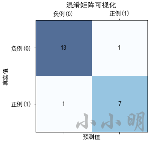
总之,混淆矩阵一行元素的和代表某个类别的实际数量,一列元素的和则代表某个类别的预测数量。
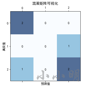
在多分类问题中,类别不止两个,confusion_matrix也支持生成混淆矩阵:
from sklearn.metrics import confusion_matrix
y_true = [2, 0, 2, 2, 0, 1]
y_pred = [0, 0, 2, 2, 0, 2]
matrix = confusion_matrix(y_true, y_pred)
# 可视化
plt.matshow(matrix, cmap=plt.cm.Blues, alpha=0.7)
ax = plt.gca()
label = list(map(str, range(3)))
ax.set(xticks=range(3), yticks=range(3),
       xticklabels=label, yticklabels=label, title="混淆矩阵可视化",
       ylabel="真实值", xlabel="预测值")
for y in range(3):
    for x in range(3):
        plt.text(x, y, s=matrix[y, x], va="center", ha="center")
plt.show()
基本的评价指标
分类模型基本的评估指标:
正确率
正确率(Accuracy)=预测正确的样本数/总样本数
Accuracy
=
T
P
+
T
N
T
P
+
F
P
+
F
N
+
T
N
\text { Accuracy }=\frac{\mathrm{TP}+\mathrm{TN}}{\mathrm{TP}+\mathrm{FP}+\mathrm{FN}+\mathrm{TN}}
Accuracy =TP+FP+FN+TNTP+TN
正确率(Accuracy)就是所有样本中预测正确的比例。
精准率
精准率(Precision)=预测正确的正例/预测为正例的样本数
Precision
=
T
P
T
P
+
F
P
\text { Precision }=\frac{\mathrm{TP}}{\mathrm{TP}+\mathrm{FP}}
Precision =TP+FPTP
精准率(Precision)从某个预测结果出发,其中预测正确的比例。
召回率
召回率(Recall)=预测正确的正例/样本真实值为正例的样本数
Recall
=
T
P
T
P
+
F
N
\text { Recall }=\frac{\mathrm{TP}}{\mathrm{TP}+\mathrm{FN}}
Recall =TP+FNTP
召回率(Recall)从某个类别的真实样本出发,其中被正确预测的比例。
F 值
F值=Precision和Recall的调和平均值
Freasure
=
2
⋅
Precision
⋅
Recall
Precision
+
Recall
\text { Freasure }=\frac{2 \cdot \text { Precision } \cdot \text { Recall }}{\text { Precision }+\text { Recall }}
Freasure = Precision + Recall 2⋅ Precision ⋅ Recall
F值是精确率和召回率的调和平均数。
口诀:正确率看全局,精准率看预测,召回率看样本。
正确率考察了全部样本预测正确的概率,精准率考虑了预测结果的精准度,召回率则考察某一类样本被正确找出的概率,F值取两者的调和平均数。
精准率和召回率的场景侧重
假如我们只考虑精准率和召回率其中一个指标,什么场景下我们应该更重视精准率,什么场景下应该更重视召回率呢?
显然,在股票的涨跌预测中,我们需要精准率越高越好,因为我们并不需要将所有的上涨情况都找出来,但是一旦预测出上涨,就尽可能都是预测正确的。
在现在流行的新冠肺炎中,我们需要尽可能的将感染者找出来,召回率越高越好。精准率稍微低点没关系,预测结果错几个仍然可以通过一段时间的隔离解除风险。当然完全只看召回率也不行,如果将所有人都认为是感染者,那么召回率达到了100%,但是预测结果却没有意义。
**那么正确率能否始终良好的评价一个分类模型的好坏呢?**在样本均衡的情况下,正确率是没有问题的,例如预测一个人是男生还是女生,男与女的占比几乎相等。但是在预测新冠肺炎感染者时,样本就是一个严重失衡的情况,未感染者的占比超过99%,那么只要将所有人都预测为未感染者,那么正确率就能高达99%以上。
所以对于样本不均衡的情况,正确率是无法评价这个分类模型的好坏的。相对来说,这四个指标中F值更适合作为样本不均衡情况的评价指标。
编码计算评价指标
我们试试计算这些指标:
accuracy = (tp+tn)/(tp+fp+fn+tn)
precision = tp/(tp+fp)
recall = tp/(tp+fn)
print("正确率:", accuracy)
print("精准率:", precision)
print("召回率:", recall)
print("F1调和平均值:", 2*precision*recall/(precision+recall))
其实sklearn自身提供了计算这些指标的api:
from sklearn.metrics import accuracy_score, precision_score, recall_score, f1_score

print("正确率:", accuracy_score(y_true, y_pred))
# 默认将1类别视为正例,可以通过pos_label参数指定。
print("精准率:", precision_score(y_true, y_pred))
print("召回率:", recall_score(y_true, y_pred))
print("F1调和平均值:", f1_score(y_true, y_pred))
结果一致均为:
正确率: 0.9090909090909091
精准率: 0.875
召回率: 0.875
F1调和平均值: 0.875
还可以一口气看到所有的类别的评价指标:
from sklearn.metrics import classification_report

print(classification_report(y_true, y_pred))
              precision    recall  f1-score   support

           0       0.93      0.93      0.93        14
           1       0.88      0.88      0.88         8

    accuracy                           0.91        22
   macro avg       0.90      0.90      0.90        22
weighted avg       0.91      0.91      0.91        22
即可以看到各个类别的精准率、召回率和F1值,也可以看到这些指标在各个类别的平均值和加权平均值,以及整体的F1值。
sklearn默认使用的评价指标是正确率:
from sklearn.datasets import load_iris
from sklearn.linear_model import LogisticRegression
from sklearn.model_selection import train_test_split

iris = load_iris()
X, y = iris.data, iris.target
X = X[y != 0, 2:]
y = y[y != 0]
y -= 1
X_train, X_test, y_train, y_test = train_test_split(
    X, y, test_size=0.25, random_state=2)
lr = LogisticRegression()
lr.fit(X_train, y_train)
print("模型评分:",lr.score(X_test, y_test))
结果:
模型评分: 0.92
查看模型的score方法说明可以得到:Return the mean accuracy on the given test data and labels.,表示模型使用的评价指标是正确率。
查看评分报告:
from sklearn.metrics import classification_report

y_hat = lr.predict(X_test)
print(classification_report(y_test, y_hat))
              precision    recall  f1-score   support

           0       0.94      0.94      0.94        16
           1       0.89      0.89      0.89         9

    accuracy                           0.92        25
   macro avg       0.91      0.91      0.91        25
weighted avg       0.92      0.92      0.92        25
ROC与AUC
ROC(Receiver Operating Characteristic) 描述的是FPR-TPR两个量之间的相对变化情况,纵轴是真正率(TPR-True Positive Rate),横轴是假正率(FPR-False Positive Rate),其定义为:
T
P
R
=
T
P
真实正例数量
=
T
P
T
P
+
F
N
TPR=\frac{TP}{真实正例数量}=\frac{TP}{TP+FN}
TPR=真实正例数量TP=TP+FNTP
F P R = F P 真实负例数量 = F P F P + T N FPR=\frac{FP}{真实负例数量}=\frac{FP}{FP+TN} FPR=真实负例数量FP=FP+TNFP
ROC反映了TPR随着FPR递增的情况下,谁增长得更快,快多少的问题。TPR增长得越快,曲线越往上屈,曲线越往上凸,反映了模型的分类性能就越好。
无论样本如何分布,TPR只关注正样本,FPR 只关注负样本,都不影响 TPR 和 FPR 的计算。所以数据样本不平衡,并不会影响 ROC 曲线的趋势。
AUC(Area Under Curve)被定义为ROC曲线下的面积,在ROC曲线不能清晰说明哪个分类器效果更好时,AUC作为数值可以直观的评价分类器的好坏,值越大越好。
对于参数固定的分类模型,TPR和FPR必然都是定值,我们一般通过调整分类模型的某个阈值达到获取不同的TPR和FPR的目的。例如,对于逻辑回归算法使用了sigmoid函数,默认阈值为0.5,调整该阈值即可得到不同的预测结果。默认阈值:
y
^
=
{
1
sigmoid
(
z
)
>
0.5
0
sigmoid
(
z
)
≤
0.5
\hat{y}= \begin{cases}1 & \operatorname{sigmoid}(z)>0.5 \\ 0 & \operatorname{sigmoid}(z) \leq 0.5\end{cases}
y^={10sigmoid(z)>0.5sigmoid(z)≤0.5
sigmoid函数公式:
sigmoid
(
z
)
=
1
1
+
e
−
z
\operatorname{sigmoid}(z)=\frac{1}{1+e^{-z}}
sigmoid(z)=1+e−z1
设想假如我们将阈值设置为大于1的值,那么将没有任何样本可以被预测为正例P,即TP和FP均为0,TPR和FPR均为0;假如我们将阈值设置为小于0的值,那么将没有任何样本可以被预测为负例N,即FN和TN均为0,TPR=TP/TP=1,FPR=FP/FP=1。所以ROC曲线必然会过(0,0)和(1,1)这两个点。
随着我们将阈值从1到0慢慢调低时,被预测为正例的样本(TP+FP)将越来越多,预测正确的正例(TP)和预测错误的正例(FP)也会越来越多。由于真实的正例和负例都是定值,所以TPR和FPR会同步增大。
ROC曲线如果为对角线,AUC = 0.5,模型相当于随机猜测。如果在对角线以上,AUC > 0.5,优于随机猜测;如果在对角线以下,AUC < 0.5,比随机猜测还差,但只要总是反预测而行,就优于随机猜测。
如果ROC曲线是由x=0和y=1的折线构成,表示模型总是预测正确,TPR恒等于1,FPR恒等于0,AUC = 1是完美分类器。
下面我们看看计算ROC曲线相关的函数:
roc_curve函数的参数
roc_curve(y_true, y_score, pos_label)的三个重要参数:
- y_true:真实样本值
- y_score:每个样本被判定为正例的概率,该值超过阈值时会被判定为正例
- pos_label:指定正例的标签值。
以一个非常简单的示例进行测试:
import numpy as np
from sklearn.metrics import roc_curve

y = np.array([0, 0, 1, 1])
scores = np.array([0.2, 0.4, 0.35, 0.8])
fpr, tpr, thresholds = roc_curve(y, scores, pos_label=1)
print(f"FPR:{fpr}")
print(f"TPR:{tpr}")
print(f"阈值:{thresholds}")
FPR:[0.  0.  0.5 0.5 1. ]
TPR:[0.  0.5 0.5 1.  1. ]
阈值:[1.8  0.8  0.4  0.35 0.2 ]
AUC面积值: 0.75
AUC面积得分: 0.75
可以看到sklearn自动设置了从大到小的阈值,第一个阈值大于1,没有被预测为正例的样本,所以TPR和FPR均为0;阈值设置为0.8,只有一个样本被预测为正例,TP=1,FP=0,真实的正例为2,所以TPR=0.5,FPR=0;阈值设置为0.4,两个样本被预测为正例,一个正确TP=1,一个错误FP=1,所以TPR=0.5,FPR=0.5;阈值设置为0.35,三个样本被预测为正例,二个正确TP=1,一个错误FP=1,所以TPR=1,FPR=0.5;最终阈值设置为全样本最小概率,所以样本被预测为正例,正例中全部预测正确,负例中全部预测错误,所以TPR=1,FPR=1。
auc面积的计算
sklearn提供了计算auc面积的方法,可以根据TPR和FPR构成的点计算,也可以根据样本真实值和预测概率直接计算:
from sklearn.metrics import auc, roc_auc_score
# 两种求解AUC面积值的方法
print("AUC面积值:", auc(fpr, tpr))
print("AUC面积得分:", roc_auc_score(y_true=y, y_score=scores))
绘制ROC曲线
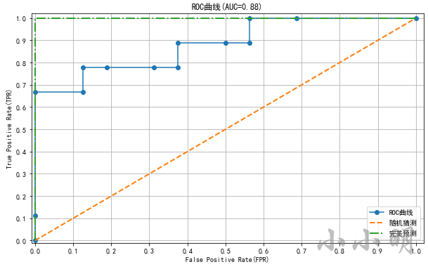
下面我们使用sklearn自带的鸢尾花数据集进行测试,对数据集简单处理一下:
from sklearn.datasets import load_iris

iris = load_iris()
X, y = iris.data, iris.target
# 只取后两个类别,最后两个特征
X = X[y != 0, -2:]
y = y[y != 0]
y -= 1
然后使用拆分训练集和测试集,对训练集使用逻辑回归算法训练模型:
from sklearn.linear_model import LogisticRegression
from sklearn.model_selection import train_test_split

X_train, X_test, y_train, y_test = train_test_split(X, y, test_size=0.25, random_state=2)
lr = LogisticRegression(multi_class="ovr", solver="liblinear")
lr.fit(X_train, y_train)
下面我们可以预测测试集每个样本为正例的概率:
scores = lr.predict_proba(X_test)[:, 1]
lr.predict_proba原本获取0类别和1类别的概率,我们需要1类别正例的概率,所以取第二列。
然后就可以计算TPR、FPR和AUC面积:
from sklearn.metrics import roc_curve, auc

fpr, tpr, thresholds = roc_curve(y_true=y_test, y_score=scores, pos_label=1)
auc_area = auc(fpr, tpr)
print("FPR:", fpr.round(2))
print("TPR:", tpr.round(2))
print("阈值:", thresholds.round(2))
print("AUC面积值:", auc_area)
FPR: [0.   0.   0.   0.12 0.12 0.19 0.31 0.38 0.38 0.5  0.56 0.56 0.69 1.  ]
TPR: [0.   0.11 0.67 0.67 0.78 0.78 0.78 0.78 0.89 0.89 0.89 1.   1.   1.  ]
阈值: [1.69 0.69 0.6  0.54 0.5  0.49 0.48 0.47 0.47 0.42 0.4  0.39 0.38 0.25]
AUC面积值: 0.8819444444444444
绘制ROC曲线:
import matplotlib.pyplot as plt
plt.rcParams['font.sans-serif'] = ['SimHei']
plt.rcParams['axes.unicode_minus'] = False

plt.figure(figsize=(10, 6))
plt.plot(fpr, tpr, marker="o", label="ROC曲线")
plt.plot([0, 1], [0, 1], lw=2, ls="--", label="随机猜测")
plt.plot([0, 0, 1], [0, 1, 1], lw=2, ls="-.", label="完美预测")
plt.xlim(-0.01, 1.02)
plt.ylim(-0.01, 1.02)
plt.xticks(np.arange(0, 1.1, 0.1))
plt.yticks(np.arange(0, 1.1, 0.1))
plt.xlabel("False Positive Rate(FPR)")
plt.ylabel("True Positive Rate(TPR)")
plt.grid()
plt.title(f"ROC曲线(AUC={auc_area:.2f})")
plt.legend()
plt.show()
样本不均衡处理
在实际的应用场景中,经常会出现样本不均衡的情况。例如,医院体检时,没病的人会远远多于生病的人。使用不均衡的数据训练模型时,样本数量多的类别会得到更多的训练。
在样本不均衡的情况,基本的评价指标往往都无法取得良好的效果。下面我们使用imbalanced-learn库对偏少的样本进行扩展。
imbalanced-learn库官方文档:https://imbalanced-learn.org/stable/user_guide.html
安装:
pip install imbalanced-learn==0.8.1
个人安装最新版0.9.0以上版本,报错 Could not find a version that satisfies the requirement scikit-learn>=1.1.0。
经测试0.8.1是目前最高可用版本。
生成样本不均衡情况的模拟数据
首先我们使用sklearn模拟生成测试数据:
from collections import Counter
from sklearn.datasets import make_classification
import matplotlib.pyplot as plt
plt.rcParams['font.sans-serif'] = ['SimHei']
plt.rcParams['axes.unicode_minus'] = False

X, y = make_classification(n_samples=2000, n_features=2, n_informative=1,
                           n_redundant=0, n_classes=2, n_clusters_per_class=1,
                           weights=[0.95, 0.05], random_state=0, flip_y=0.0, class_sep=0.3)
print(Counter(y))
plt.scatter(X[y == 0, 0], X[y == 0, 1], c="r", s=4, label="类别0")
plt.scatter(X[y == 1, 0], X[y == 1, 1], c="g", s=4, label="类别1")
plt.legend()
plt.show()
Counter({0: 1900, 1: 100})
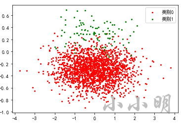
上面我们通过make_classification的weights参数设置了各类别出现的概率,最终生成1900个负例和100个正例,模拟出了正例明显偏少的情况。
逻辑回归训练模型并查看指标
如果此时我们使用逻辑回归训练模型:
from sklearn.model_selection import train_test_split
from sklearn.metrics import classification_report
from sklearn.linear_model import LogisticRegression

X_train, X_test, y_train, y_test = train_test_split(
    X, y, test_size=0.3, random_state=0)
lr = LogisticRegression(multi_class="ovr", solver="liblinear")
lr.fit(X_train, y_train)
y_hat = lr.predict(X_test)
print(classification_report(y_test, y_hat))
              precision    recall  f1-score   support

           0       0.97      1.00      0.98       565
           1       0.94      0.49      0.64        35

    accuracy                           0.97       600
   macro avg       0.96      0.74      0.81       600
weighted avg       0.97      0.97      0.96       600
可以看到类别1的召回率仅49%不到一半,显然不是一个好模型。
假如此时使用AUC作为评价指标:
from sklearn.metrics import roc_auc_score

scores = lr.predict_proba(X_test)[:, 1]
roc_auc_score(y_true=y_test, y_score=scores)
0.9936283185840707
AUC的值居然超过了99%,显然ROC曲线和AUC也不适合用来评论。
决策边界可视化
为了更清晰的看清楚模型的预测情况,我们将其可视化:
from matplotlib.colors import ListedColormap


def plot_decision_boundary(model, X, y, title='决策边界'):
    color = ["darkred", "darkgreen", "darkblue"]
    marker = ["o", "s", "x"]
    class_label = np.unique(y)
    cmap = ListedColormap(
        ['#f18262', '#549060', '#6168df'][: len(class_label)])
    x1_min, x2_min = np.min(X, axis=0)
    x1_max, x2_max = np.max(X, axis=0)
    x1 = np.linspace(x1_min - 0.2, x1_max + 0.2, 100)
    x2 = np.linspace(x2_min - 0.1, x2_max + 0.1, 100)
    X1, X2 = np.meshgrid(x1, x2)
    Z = model.predict(np.c_[X1.flat, X2.flat]).reshape(X1.shape)
    plt.contourf(X1, X2, Z, cmap=cmap)
    for i, class_ in enumerate(class_label):
        plt.scatter(x=X[y == class_, 0], y=X[y == class_, 1], s=10,
                    c=color[i], label=f"类别{class_}", marker=marker[i])
    plt.xlim(x1_min - 0.2, x1_max + 0.2)
    plt.ylim(x2_min - 0.1, x2_max + 0.1)
    plt.grid(True)
    plt.title(title, fontsize=18)
    plt.legend()


plot_decision_boundary(lr, X_test, y_test)
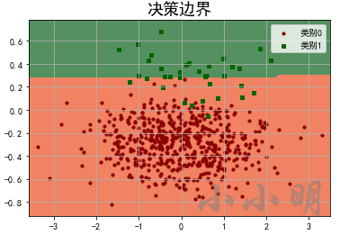
从决策边界可以看到,只要决策边界下移就会有更多的正例被找出来,但是也会导致更多的负例预测错误,所以模型不会下移决策边界。
所以我们可以使用imbalanced-learn库将偏少的1类别扩展的多一些,这样就消除了0类型预测错误的影响,使得模型可以将决策边界下移一些。
两种升采样方法
imbalanced-learn库提供了两种扩展样本的升采样方法:
- SMOTE(Synthetic Minority Oversampling Technique)合成少数过采样技术。
- ADASYN(Adaptive Synthetic)自适应合成。
两种采样方式生成新样本的算法相同,都是基于线性插值。步骤如下:
- 对于少数类别的任意一个样本 x i x_i xi,选择最近的K个该类别的样本。
- 从K个样本中随机选择一个样本 x z j x_{zj} xzj,然后在 x i x_i xi和 x z j x_{zj} xzj之间所在的直线上随机选一个位置生成新样本 x n e w x_{new} xnew
- 重复以上步骤,直到样本均衡。
SMOTE和ADASYN的区别在于SMOTE针对所有的少数类别进行扩展,ADASYN仅针对分错的少数样本进行扩展。
下面我们测试一下两种升采样方式的效果:
from imblearn.over_sampling import SMOTE, ADASYN

print("原始样本:", Counter(y_train))
models = [SMOTE(random_state=0, k_neighbors=8),
          ADASYN(random_state=0, n_neighbors=10)]
lrs = [LogisticRegression(), LogisticRegression()]
for model, lr in zip(models, lrs):
    print(model)
    X_resampled, y_resampled = model.fit_resample(X_train, y_train)
    print("扩展后:", Counter(y_resampled))
    lr.fit(X_resampled, y_resampled)
    y_hat = lr.predict(X_test)
    print(classification_report(y_test, y_hat))
原始样本: Counter({0: 1335, 1: 65})
SMOTE(k_neighbors=8, random_state=0)
扩展后: Counter({0: 1335, 1: 1335})
              precision    recall  f1-score   support

           0       1.00      0.97      0.98       565
           1       0.64      0.97      0.77        35

    accuracy                           0.97       600
   macro avg       0.82      0.97      0.88       600
weighted avg       0.98      0.97      0.97       600

ADASYN(n_neighbors=10, random_state=0)
扩展后: Counter({0: 1335, 1: 1333})
              precision    recall  f1-score   support

           0       1.00      0.94      0.97       565
           1       0.49      0.97      0.65        35

    accuracy                           0.94       600
   macro avg       0.74      0.95      0.81       600
weighted avg       0.97      0.94      0.95       600
可以看到针对样本1类别,SMOTE方式的F1值有相对之前的0.64有明显提升。
我们看看两种升采样方式样本的分布:
fig, ax = plt.subplots(1, 2)
fig.set_size_inches(15, 5)
for i, model in enumerate(models):
    X_resampled, y_resampled = model.fit_resample(X_train, y_train)
    ax[i].scatter(X_resampled[y_resampled == 0, 0], X_resampled[y_resampled == 0, 1],
                  c="r", s=4, label="类别0")
    ax[i].scatter(X_resampled[y_resampled == 1, 0], X_resampled[y_resampled == 1, 1],
                  c="g", s=4, label="类别1")
    ax[i].set_title(model.__class__.__name__)
    ax[i].legend()
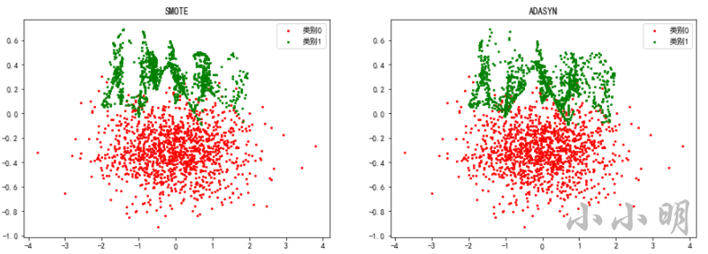
对比原始样本:
最后看看两种升采样方式之后模型的决策边界变化:
plt.figure(figsize=(18, 5))
for i, (lr, model) in enumerate(zip(lrs, models), 1):
    plt.subplot(1, 2, i)
    plot_decision_boundary(lr, X_test, y_test, model.__class__.__name__)
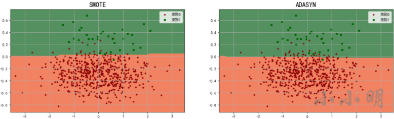
可以看到ADASYN只扩展分错的样本,导致决策边界进一步下降,导致更多的类别0被分错,所以针对此模型,SMOTE优于ADASYN。
补充:逻辑回归
逻辑回归简述
逻辑回归使用回归的方法处理分类问题,为线性回归输出的连续值设置阈值,超过阈值的为正例,低于阈值的为负例。
z
=
w
1
x
1
+
w
2
x
2
+
…
…
+
w
n
x
n
+
b
=
∑
j
=
1
n
w
j
x
j
+
b
=
∑
j
=
0
n
w
j
x
j
=
w
⃗
T
∗
x
⃗
\begin{aligned} &z=w_1 x_1+w_2 x_2+\ldots \ldots+w_n x_n+b \\ &=\sum_{j=1}^n w_j x_j+b \\ &=\sum_{j=0}^n w_j x_j \\ &=\vec{w}^T * \vec{x} \end{aligned}
z=w1x1+w2x2+……+wnxn+b=j=1∑nwjxj+b=j=0∑nwjxj=wT∗x
z值是取值范围为
(
−
∞
,
+
∞
)
(-\infty,+\infty)
(−∞,+∞)的连续值,在有些场景下不仅需要给出分类的结果,还需要该处样本属于该类别的概率,因为我们需要将z值转换成概率值,逻辑回归使用了sigmoid函数来实现转换,函数公式为:
sigmoid
(
z
)
=
1
1
+
e
−
z
\operatorname{sigmoid}(z)=\frac{1}{1+e^{-z}}
sigmoid(z)=1+e−z1
sigmoid函数可视化
import numpy as np
import matplotlib.pyplot as plt
plt.rcParams['font.sans-serif'] = ['SimHei']
plt.rcParams['axes.unicode_minus'] = False
plt.rcParams["font.size"] = 12


def sigmoid(z):
    "sigmoid函数"
    return 1 / (1 + np.exp(-z))


z = np.linspace(-10, 10, 200)
plt.plot(z, sigmoid(z))
# 绘制水平线与垂直线。
plt.axvline(x=0, ls="--", c="k")
plt.axhline(ls=":", c="k")
plt.axhline(y=0.5, ls=":", c="k")
plt.axhline(y=1, ls=":", c="k")
plt.xlabel("z值")
plt.ylabel("sigmoid(z)值")
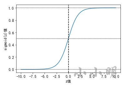
当z的值从
−
∞
-\infty
−∞ 向
+
∞
+\infty
+∞ 过渡时,sigmoid函数的取值范围为(0, 1),这正好是概率的取值范围,当z=0时,sigmoid(0)的值为0.5。因此逻辑回归模型一般将sigmoid的输出值p作为正例的概率,1-p作为负例
的概率。以阈值0.5作为两个分类的阈值,以p与1-p的较大者作为预测结果。
可以将类别y(1与0)的概率表示如下:
p
(
y
=
1
∣
x
;
w
)
=
s
(
z
)
p
(
y
=
0
∣
x
;
w
)
=
1
−
s
(
z
)
\begin{aligned} &p(y=1 \mid x ; w)=s(z) \\ &p(y=0 \mid x ; w)=1-s(z) \end{aligned}
p(y=1∣x;w)=s(z)p(y=0∣x;w)=1−s(z)
将以上两个式子综合表示为:
p
(
y
∣
x
;
w
)
=
s
(
z
)
y
(
1
−
s
(
z
)
)
1
−
y
p(y \mid x ; w)=s(z)^y(1-s(z))^{1-y}
p(y∣x;w)=s(z)y(1−s(z))1−y
以上公式表示单个样本是某个分类的概率,要让所有样本的联合概率最大,只需要所有样本的概率相乘。似然函数,联合概率密度函数为:
L
(
w
)
=
∏
i
=
1
m
p
(
y
(
i
)
∣
x
(
i
)
;
w
)
=
∏
i
=
1
m
s
(
z
(
i
)
)
y
(
i
)
(
1
−
s
(
z
(
i
)
)
)
1
−
y
(
i
)
\begin{aligned} &L(w)=\prod_{i=1}^m p\left(y^{(i)} \mid x^{(i)} ; w\right) \\ &=\prod_{i=1}^m s\left(z^{(i)}\right)^{y^{(i)}}\left(1-s\left(z^{(i)}\right)\right)^{1-y^{(i)}} \end{aligned}
L(w)=i=1∏mp(y(i)∣x(i);w)=i=1∏ms(z(i))y(i)(1−s(z(i)))1−y(i)
为了方便求解,我们取对数似然函数,让累计乘积变成累计求和:
ln
L
(
w
)
=
ln
(
∏
i
=
1
m
s
(
z
(
i
)
)
y
(
i
)
(
1
−
s
(
z
(
i
)
)
1
−
y
(
i
)
)
)
=
∑
i
=
1
m
(
y
(
i
)
ln
s
(
z
(
i
)
)
+
(
1
−
y
(
i
)
)
ln
(
1
−
s
(
z
(
i
)
)
)
)
\begin{aligned} &\ln L(w)=\ln \left(\prod_{i=1}^m s\left(z^{(i)}\right)^{y^{(i)}}\left(1-s\left(z^{(i)}\right)^{1-y^{(i)}}\right)\right) \\ &=\sum_{i=1}^m\left(y^{(i)} \ln s\left(z^{(i)}\right)+\left(1-y^{(i)}\right) \ln \left(1-s\left(z^{(i)}\right)\right)\right) \end{aligned}
lnL(w)=ln(i=1∏ms(z(i))y(i)(1−s(z(i))1−y(i)))=i=1∑m(y(i)lns(z(i))+(1−y(i))ln(1−s(z(i))))
我们可以将上式的相反数作为逻辑回归的损失函数(对数损失函数):
J
(
w
)
=
−
∑
i
=
1
m
(
y
(
i
)
ln
s
(
z
(
i
)
)
+
(
1
−
y
(
i
)
)
ln
(
1
−
s
(
z
(
i
)
)
)
)
J(w)=-\sum_{i=1}^m\left(y^{(i)} \ln s\left(z^{(i)}\right)+\left(1-y^{(i)}\right) \ln \left(1-s\left(z^{(i)}\right)\right)\right)
J(w)=−i=1∑m(y(i)lns(z(i))+(1−y(i))ln(1−s(z(i))))
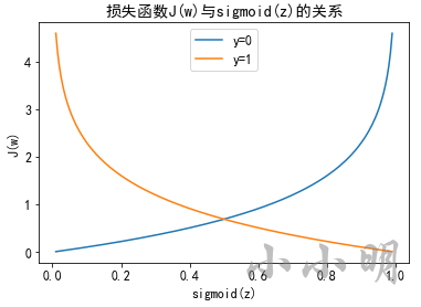
逻辑回归损失函数可视化
模型拟合训练数据,其目标就是:当数据为类别1时,让sigmoid(z) 的值尽可能大,反之,当
数据为类别0时,让sigmoid(z)的值尽可能小,即1-sigmoid(z)的值尽可能大。
s = np.linspace(0.01, 0.99, 200)
for y in [0, 1]:
    loss = -y * np.log(s)-(1 - y) * np.log(1 - s)
    plt.plot(s, loss, label=f"y={y}")
plt.legend()
plt.xlabel("sigmoid(z)")
plt.ylabel("J(w)")
plt.title("损失函数J(w)与sigmoid(z)的关系")
plt.show()
逻辑回归分类可视化
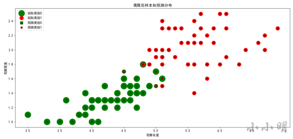
以鸢尾花数据集为例,演示通过逻辑回归算法实现二分类。
from sklearn.linear_model import LogisticRegression
from sklearn.model_selection import train_test_split
from sklearn.datasets import load_iris

iris = load_iris()
X, y = iris.data, iris.target
# 因为鸢尾花具有三个类别,4个特征,此处仅使用其中两个特征,并且移除一个类别(类别0)。
X = X[y != 0, 2:]
y = y[y != 0]
# 此时,y的标签为1与2,我们这里将其改成0与1。
y -= 1
X_train, X_test, y_train, y_test = train_test_split(
    X, y, test_size=0.25, random_state=2)
lr = LogisticRegression()
lr.fit(X_train, y_train)
y_hat = lr.predict(X_test)
print("权重:", lr.coef_)
print("偏置:", lr.intercept_)
print("真实值:", y_test)
print("预测值:", y_hat)
权重: [[2.54536368 2.15257324]]
偏置: [-16.08741502]
真实值: [1 0 1 0 0 0 0 0 0 0 1 1 1 0 0 0 0 0 1 1 0 0 1 0 1]
预测值: [1 0 0 0 0 0 0 1 0 0 1 1 1 0 0 0 0 0 1 1 0 0 1 0 1]
对样本分布进行可视化显示:
plt.figure(figsize=(18, 8))
c1 = X[y == 0]
c2 = X[y == 1]
plt.scatter(x=c1[:, 0], y=c1[:, 1], s=500,
            marker="o", c="green", label="实际类别0")
plt.scatter(x=c2[:, 0],  y=c2[:, 1], s=200,
            marker="o", c="red", label="实际类别1")
y2 = lr.predict(X)
c1 = X[y2 == 0]
c2 = X[y2 == 1]
plt.scatter(x=c1[:, 0], y=c1[:, 1],
            marker="s", s=100, c="darkgreen", label="预测类别0")
plt.scatter(x=c2[:, 0], y=c2[:, 1],
            marker="s", s=30, c="darkred", label="预测类别1")
plt.xlabel("花瓣长度")
plt.ylabel("花瓣宽度")
plt.title("鸢尾花样本和预测分布")
plt.legend()
下面绘制在测试集中,样本的真实类别与预测类别:
plt.figure(figsize=(10, 2))
plt.plot(y_test, marker="o", ls="", ms=15, c="r", label="真实类别")
plt.plot(y_hat, marker="X", ls="", ms=15, c="g", label="预测类别")
plt.yticks([0, 1], ["负例", "正例"])
plt.ylim([-0.5, 2.5])
plt.legend()
plt.xlabel("样本序号")
plt.ylabel("类别")
plt.title("逻辑回归分类预测结果")
plt.show()

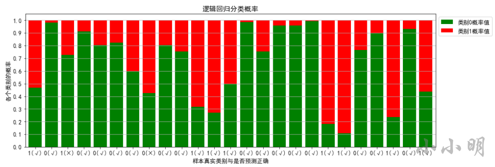
逻辑回归预测的概率值可视化:
import pandas as pd

# 获取测试集各个样本属于每个类别的概率值
probability = lr.predict_proba(X_test)
print("前五个样本的概率分布:")
print(probability[:5])
print("预测的类别:")
print(np.argmax(probability, axis=1))
# 产生序号,用于可视化的横坐标。
index = np.arange(X_test.shape[0])
pro_0 = probability[:, 0]
pro_1 = probability[:, 1]
plt.figure(figsize=(15, 5))
# 绘制堆叠图
plt.bar(index, height=pro_0, color="g", label="类别0概率值")
# bottom=x,表示从x的值开始堆叠上去。
tick_label = np.where(y_test == y_hat, "(√)", "(×)")
plt.bar(index, height=pro_1, color='r', bottom=pro_0,
        label="类别1概率值", tick_label=pd.Series(y_test).astype("str")+tick_label)
plt.legend(loc="best", bbox_to_anchor=(1, 1))
plt.xlabel("样本真实类别与是否预测正确")
plt.ylabel("各个类别的概率")
plt.yticks(np.linspace(0, 1, 11))
plt.grid(axis="y")
plt.title("逻辑回归分类概率")
plt.xlim(index.min()-0.6, index.max()+0.6)
plt.show()
前五个样本的概率分布:
[[0.46933862 0.53066138]
 [0.98282882 0.01717118]
 [0.72589695 0.27410305]
 [0.91245661 0.08754339]
 [0.80288412 0.19711588]]
预测的类别:
[1 0 0 0 0 0 0 1 0 0 1 1 1 0 0 0 0 0 1 1 0 0 1 0 1]
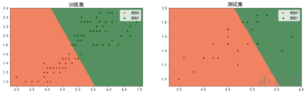
绘制决策边界
定义绘制决策边界的函数:
from matplotlib.colors import ListedColormap


def plot_decision_boundary(model, X, y, title='决策边界'):
    color = ["darkred", "darkgreen", "darkblue"]
    marker = ["o", "s", "x"]
    class_label = np.unique(y)
    cmap = ListedColormap(
        ['#f18262', '#549060', '#6168df'][: len(class_label)])
    x1_min, x2_min = np.min(X, axis=0)
    x1_max, x2_max = np.max(X, axis=0)
    x1 = np.linspace(x1_min - 0.2, x1_max + 0.2, 100)
    x2 = np.linspace(x2_min - 0.1, x2_max + 0.1, 100)
    X1, X2 = np.meshgrid(x1, x2)
    Z = model.predict(np.c_[X1.flat, X2.flat]).reshape(X1.shape)
    plt.contourf(X1, X2, Z, cmap=cmap)
    for i, class_ in enumerate(class_label):
        plt.scatter(x=X[y == class_, 0], y=X[y == class_, 1], s=10,
                    c=color[i], label=f"类别{class_}", marker=marker[i])
    plt.xlim(x1_min - 0.2, x1_max + 0.2)
    plt.ylim(x2_min - 0.1, x2_max + 0.1)
    plt.title(title, fontsize=18)
    plt.legend()
对比一下在训练集和测试集上的划分效果:
plt.figure(figsize=(18, 5))
plt.subplot(1, 2, 1)
plot_decision_boundary(lr, X_train, y_train, "训练集")
plt.subplot(1, 2, 2)
plot_decision_boundary(lr, X_test, y_test, "测试集")
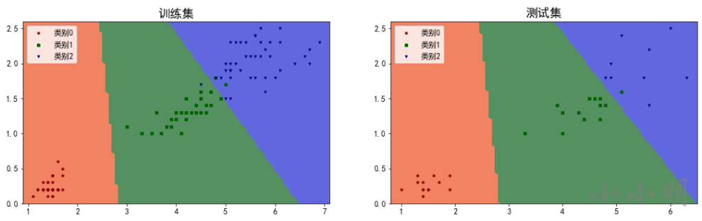
下面绘制多分类的的决策边界,首先准备数据:
iris = load_iris()
X, y = iris.data, iris.target
# 仅使用其中的两个特征。
X = X[:, 2:]
X_train, X_test, y_train, y_test = train_test_split(X, y, test_size=0.25, random_state=0)
lr = LogisticRegression()
lr.fit(X_train, y_train)
y_hat = lr.predict(X_test)
print("分类正确率:", np.sum(y_test == y_hat) / len(y_test))
分类正确率: 0.9736842105263158
绘制结果:
plt.figure(figsize=(18, 5))
plt.subplot(1, 2, 1)
plot_decision_boundary(lr, X_train, y_train, "训练集")
plt.subplot(1, 2, 2)
plot_decision_boundary(lr, X_test, y_test, "测试集")