
【Web开发】纯前端实现科技企业官网首页
2023-09-14 09:15:10 时间
前言
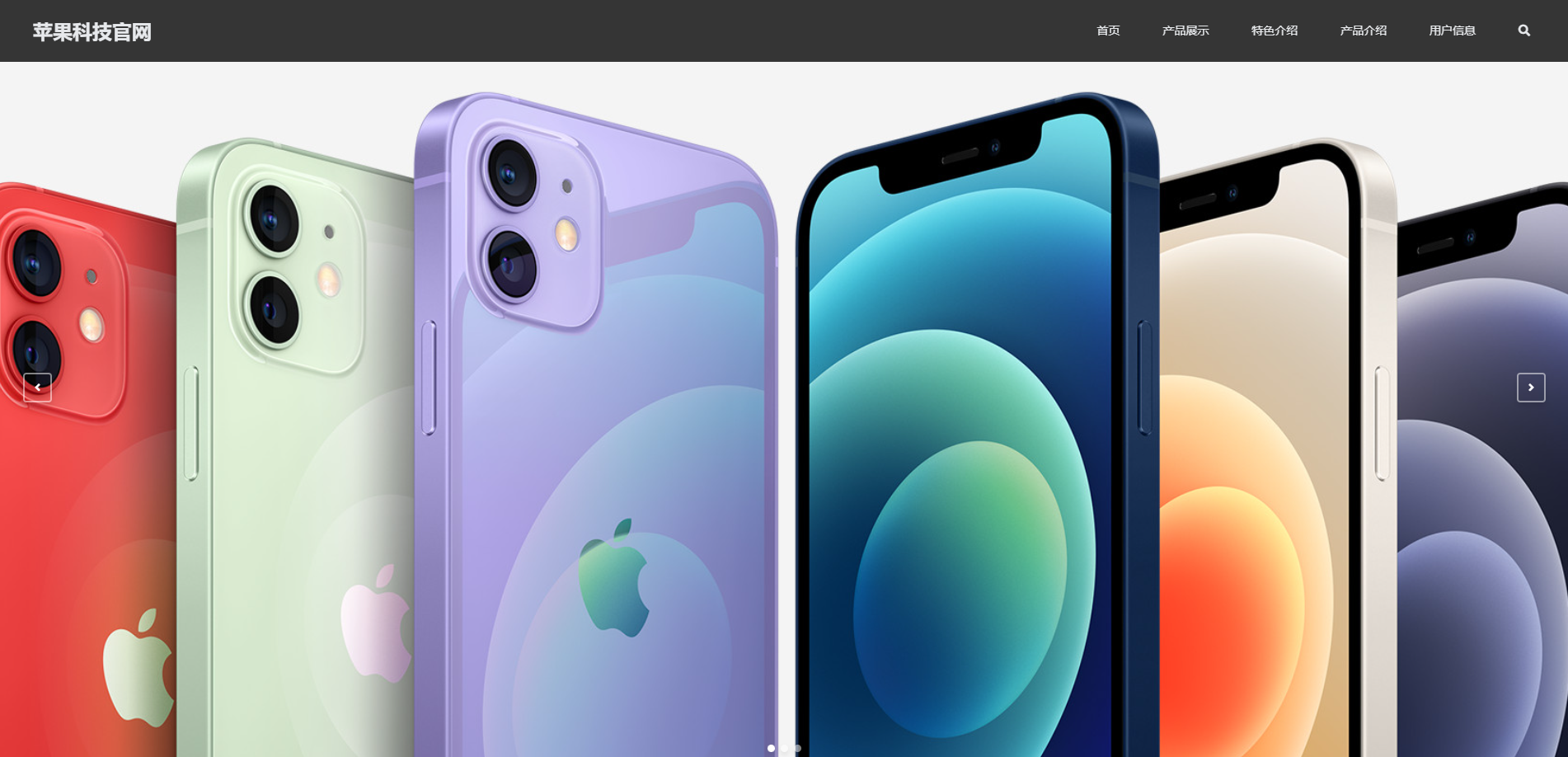
本篇博文简单实现一个科技类产品官网的主页,图片素材来自于苹果官网。
相关教程参考自https://www.bilibili.com/video/BV117411n7R1
源代码下载:https://download.csdn.net/download/qq1198768105/85630862
功能概述
1、 在首页中,包含导航、轮播图、产品展示、特色介绍、产品介绍、用户信息获取和尾部等模块
2、 页面使用伪类实现交互效果
3、 在产品介绍中,有transition过渡效果
4、 使用网格布局(Grid)布局完成页面的自适应
用到的组件库
- Anime:用来实现动画效果
- Glide:实现轮播图效果
- Isotope:实现产品展示中动态展示图片的效果
- scrollReveal:实现滚动下拉时各元素渐入动画效果
- smooth-scroll:实现点击菜单栏平滑滚动到相应模块的效果
视频演示效果
视频中未演示页面自适应效果。
苹果科技官网演示视频
核心代码
Html
<!DOCTYPE html>
<html lang="en">
<head>
<meta charset="UTF-8" />
<meta name="viewport" content="width=device-width, initial-scale=1.0" />
<script src="./static/libs/scrollReveal/scrollreveal.min.js"></script>
<!-- 设置图标 -->
<link rel="icon" href="./static/images/icon.jpg" type="image/x-icon">
<!-- 引入font-awesome依赖 -->
<link href="https://cdn.bootcss.com/font-awesome/5.13.0/css/all.css" rel="stylesheet" />
<link rel="stylesheet" href="./static/libs/glide/glide.core.min.css" />
<link rel="stylesheet" href="./static/libs/glide/glide.theme.min.css" />
<link rel="stylesheet" href="./style.css" />
<title>Apple官网</title>
</head>
<body>
<!-- 网页头部 -->
<header>
<div class="logo">苹果科技官网</div>
<nav>
<a href="#home">首页</a>
<!-- <a href="#about-us">关于我们</a> -->
<a href="#showcases">产品展示</a>
<a href="#service">特色介绍</a>
<a href="#team-intro">产品介绍</a>
<a href="#company-activities">用户信息</a>
<a href="#"><i class="fas fa-search"></i></a>
</nav>
<div class="burger">
<div class="burger-line1"></div>
<div class="burger-line2"></div>
<div class="burger-line3"></div>
</div>
</header>
<div id="home" class="glide">
<!-- 轮播图区域 -->
<div class="glide__track" data-glide-el="track">
<div class="glide__slides">
<!-- 轮播图一 -->
<div class="glide__slide">
<div class="slide-caption left"></div>
<!-- 轮播图阴影遮罩 -->
<div class="backdrop"></div>
<img src="./static/images/phone1.jpg" />
</div>
<!-- 轮播图二 -->
<div class="glide__slide">
<div class="slide-caption left"></div>
<!-- 轮播图阴影遮罩 -->
<div class="backdrop"></div>
<img src="./static/images/phone2.jpg" />
</div>
<!-- 轮播图三 -->
<div class="glide__slide">
<div class="slide-caption left"></div>
<!-- 轮播图阴影遮罩 -->
<div class="backdrop"></div>
<img src="./static/images/phone3.jpg" />
</div>
</div>
<div class="glide__arrows" data-glide-el="controls">
<!-- 轮播图左侧按钮 -->
<button class="glide__arrow glide__arrow--left" data-glide-dir="<">
<i class="fa fa-angle-left"></i>
</button>
<!-- 轮播图右侧按钮 -->
<button class="glide__arrow glide__arrow--right" data-glide-dir=">">
<i class="fa fa-angle-right"></i>
</button>
<!-- 轮播图圆点 -->
<div class="glide__bullets" data-glide-el="controls[nav]">
<button class="glide__bullet" data-glide-dir="=0"></button>
<button class="glide__bullet" data-glide-dir="=1"></button>
<button class="glide__bullet" data-glide-dir="=2"></button>
</div>
</div>
</div>
</div>
<div class="content-wrapper">
<!-- 产品展示 -->
<!-- 根据不同的类别进行分组展示 -->
<section id="showcases" class="showcases section-bg">
<h2 class="title1">产品展示</h2>
<div class="filter-btns">
<button class="filter-btn active" data-filter="*">全部</button>
<button class="filter-btn" data-filter=".web">iPhone</button>
<button class="filter-btn" data-filter=".mobile">iPad</button>
<button class="filter-btn" data-filter=".science">mac</button>
</div>
<div class="cases">
<div class="case-item web">
<img src="./static/images/img1.jpg" alt="">
</div>
<div class="case-item web">
<img src="./static/images/img2.jpg" alt="">
</div>
<div class="case-item web">
<img src="./static/images/img3.jpg" alt="">
</div>
<div class="case-item web">
<img src="./static/images/img4.jpg" alt="">
</div>
<div class="case-item mobile">
<img src="./static/images/img6.jpg" alt="">
</div>
<div class="case-item science">
<img src="./static/images/img8.jpg" alt="">
</div>
<div class="case-item web">
<img src="./static/images/img5.jpg" alt="">
</div>
<div class="case-item mobile">
<img src="./static/images/img7.jpg" alt="">
</div>
</div>
</section>
<!-- 特色介绍 -->
<!-- 图标网站 https://www.thinkcmf.com/font/font_awesome/icons.html -->
<section id="service" class="service">
<h2 class="title1">特色介绍</h2>
<p class="intro">
苹果公司是美国的一家电子科技公司
</p>
<div class="services">
<div class="service-item">
<i class="fas fa-star"></i>
<h4 class="service-title">公司规模</h4>
<p class="service-content">
总市值达5600亿美元,位居全球第一。
</p>
</div>
<div class="service-item">
<i class="fas fa-chart-line"></i>
<h4 class="service-title">整合营销</h4>
<p class="service-content">
根据客户提出的需求进行评估,估算出相应的时间与费用。
</p>
</div>
<div class="service-item">
<i class="fas fa-shopping-cart"></i>
<h4 class="service-title">电子商务</h4>
<p class="service-content">
根据企业需求,开发不同的销售渠道,通过网上直销。
</p>
</div>
<div class="service-item">
<i class="fas fa-desktop"></i>
<h4 class="service-title">产品研发</h4>
<p class="service-content">
根据用户需求,完成软硬件产品开发。
</p>
</div>
<div class="service-item">
<i class="fas fa-anchor"></i>
<h4 class="service-title">创新能力</h4>
<p class="service-content">
把握时代的风口,不断打造现象级产品。
</p>
</div>
<div class="service-item">
<i class="fas fa-user-check"></i>
<h4 class="service-title">团队人数</h4>
<p class="service-content">
公司所有全职员工人数累积达240万。
</p>
</div>
</div>
</section>
<!--产品介绍 -->
<section id="team-intro" class="team-intro section-bg">
<h2 class="title1">产品介绍</h2>
<p class="intro">最新产品简介</p>
<div class="activities">
<div class="activity">
<div class="act-image-wrapper">
<img src="./static/images/product1.jpg" alt="">
</div>
<div class="meta">
<p class="data-published">
<i class="far fa-calendar"></i> 2022年6月8日
</p>
<p class="comments">
<i class="far fa-comments"></i> 133
<span>条评论</span>
</p>
</div>
<h2 class="act-title">MacBook Air</h2>
<article>
M2 是新一代 Apple 芯片的开篇之作。它配备 8 核中央处理器,各种日常工作,比如创建文档或演示文稿,都能干脆利落搞定。即使是处理繁重任务,比如用 Xcode 进行开发、在 Logic Pro 中混音,也都不在话下。 M2 配备最多达 10 核图形处理器,图形性能大幅跃升;它的媒体处理引擎,让你可播放和剪辑多达 11 条 4K 视频流和 2 条 8K ProRes 视频流。
</article>
<button class="read-more-btn">阅读更多</button>
</div>
<div class="activity">
<div class="act-image-wrapper">
<img src="./static/images/product2.jpg" alt="">
</div>
<div class="meta">
<p class="data-published">
<i class="far fa-calendar"></i> 2022年6月8日
</p>
<p class="comments">
<i class="far fa-comments"></i> 63
<span>条评论</span>
</p>
</div>
<h2 class="act-title">iPad Air</h2>
<article>
Apple M1 芯片 8 核中央处理器 8 核图形处理器 Apple 神经网络引擎 8GB 内存1200 万像素广角摄像头,ƒ/1.8 光圈 最高可达 5 倍数码变焦 五镜式镜头 Focus Pixels 自动对焦 全景模式 (最高可达 6300 万像素) 智能 HDR 3 拍摄广色域的照片和实况照片 照片地理标记功能 自动图像防抖功能 连拍快照模式 图像拍摄格式:HEIF 和 JPEG。
</article>
<button class="read-more-btn">阅读更多</button>
</div>
<div class="activity">
<div class="act-image-wrapper">
<img src="./static/images/product3.jpg" alt="">
</div>
<div class="meta">
<p class="data-published">
<i class="far fa-calendar"></i> 2022年6月8日
</p>
<p class="comments">
<i class="far fa-comments"></i> 233
<span>条评论</span>
</p>
</div>
<h2 class="act-title">iPhone 13 Pro</h2>
<article>
ProMotion 自适应刷新率技术,最高可达 120Hz HDR 显示 原彩显示 广色域 (P3) 触感触控 2000000:1 对比度 (典型) 1000 尼特最大亮度 (典型); 1200 尼特最大亮度 (HDR) 采用防油渍防指纹涂层 支持多种语言文字同时显示 A15 仿生芯片 全新 6 核中央处理器,具有 2 个性能核心和 4 个能效核心 全新 5 核图形处理器 全新 16 核神经网络引擎。
</article>
<button class="read-more-btn">阅读更多</button>
</div>
</div>
</section>
<!-- 用户信息获取 -->
<section id="company-activities" class="company-activities">
<h2 class="title1">用户信息获取</h2>
<p class="intro">正在寻求帮助?</p>
<div class="form-box">
<form action="#company-activities" id="form">
<p class="form-p">姓名:<input class="form-input1" type="text"><label class="name_trip"></label></p>
<p class="form-p">联系方式: <input class="form-input2" type="text"><label class="name_trip"></label></p>
<div class="form-button">
<button class="read-more-btn">提交</button>
</div>
</form>
</div>
</section>
</div>
<!-- 底部信息 -->
<footer>
<div class="footer-menus">
<div class="contact-us">
<p class="menu-title">联系我们</p>
<p>地址:CSDN </p>
<p>邮编:312000</p>
<p>传真:0575-88054011</p>
<p>电子邮件:1198768105@qq.com</p>
</div>
<div class="service-menu footer-menu">
<p class="menu-title">产品概览</p>
<ul class="menu-items">
<li><a href="#">iPhone</a></li>
<li><a href="#">iPad</a></li>
<li><a href="#">Mac</a></li>
<li><a href="#">iPods</a></li>
</ul>
</div>
<div class="service-menu footer-menu">
<p class="menu-title">特色介绍</p>
<ul class="menu-items">
<li><a href="#">公司规模</a></li>
<li><a href="#">整合营销</a></li>
<li><a href="#">电子商务</a></li>
<li><a href="#">产品研发</a></li>
</ul>
</div>
<div class="service-menu footer-menu">
<p class="menu-title">产品介绍</p>
<ul class="menu-items">
<li><a href="#">MacBook Air</a></li>
<li><a href="#">iPad Air</a></li>
<li><a href="#">iPhone 13 Pro</a></li>
</ul>
</div>
<div class="service-menu footer-menu">
<p class="menu-title">帮助与支持</p>
<ul class="menu-items">
<li><a href="#">帮助中心</a></li>
<li><a href="#">联系客服</a></li>
<li><a href="#">文档资源</a></li>
</ul>
</div>
<p class="icp-info">浙ICP备XXXXXXX号</p>
<p class="rights">© zstar</p>
<div class="scroll-to-top">
<a href="#"><i class="fas fa-chevron-up"></i></a>
</div>
</div>
</footer>
<!-- 引入JS文件 -->
<script src="./static/libs/anime/anime.min.js"></script>
<script src="./static/libs/glide/glide.min.js"></script>
<script src="./static/libs/isotope/isotope.pkgd.min.js"></script>
<script src="./static/libs/smooth-scroll/smooth-scroll.polyfills.min.js"></script>
<script src="./index.js"></script>
</body>
</html>
Js
const headerEl = document.querySelector("header"); //获取导航栏实例
const scrollToTop = document.querySelector(".scroll-to-top"); // 获取返回顶部按钮实例

// 导航栏固定监听
window.addEventListener("scroll", () => {
    // 获取导航栏高度
    let height = headerEl.getBoundingClientRect().height;
    // 如果向下滑动距离超过800,就将其滑下
    if (window.pageYOffset - height > 800) {
        if (!headerEl.classList.contains("sticky")) {
            headerEl.classList.add("sticky");
        }
    } else {
        headerEl.classList.remove("sticky");
    }
    // 如果向下滑动距离超过1000,显示返回顶部按钮
    if (window.pageYOffset > 1000) {
        scrollToTop.style.display = "block";
    } else {
        scrollToTop.style.display = "none";
    }
});

const glide = new Glide(".glide", {
    type: "carousel",
    startAt: 0,
    autoplay: 3500,
});


glide.mount();

// 产品展示 js
const isotope = new Isotope(".cases", {
    layoutMode: "fitRows",
    itemSelector: ".case-item",
});

const filterBtns = document.querySelector(".filter-btns");

filterBtns.addEventListener("click", (e) => {
    let { target } = e;
    const filterOption = target.getAttribute("data-filter");
    if (filterOption) {
        document
            .querySelectorAll(".filter-btn.active")
            .forEach((btn) => btn.classList.remove("active"));
        target.classList.add("active");

        isotope.arrange({ filter: filterOption });
    }
});

// 通用滑动出现动画配置项
const staggeringOption = {
    delay: 300,
    distance: "50px",
    duration: 500,
    easing: "ease-in-out",
    origin: "bottom",
};

// 设置特色介绍滑动动画效果,interval设置等待时间
ScrollReveal().reveal(".service-item", {...staggeringOption, interval: 300 });

// 设置产品介绍滑动动画效果,interval设置等待时间
ScrollReveal().reveal(".activity", {...staggeringOption, interval: 300 });

// 设置用户信息获取滑动动画效果,interval设置等待时间
ScrollReveal().reveal(".form-box", {...staggeringOption, interval: 300 });

// 设置点击导航栏区域流畅滚动效果
const scroll = new SmoothScroll(
    'nav a[href*="#"] , .scroll-to-top a[href*="#"]', {
        header: "header",
        offset: 50,
    }
);

// 监听窗口缩小时全局导航的开启状态
document.addEventListener("scrollStart", () => {
    if (headerEl.classList.contains("open")) {
        headerEl.classList.remove("open");
    }
})


// 折叠按钮事件
const burgerEl = document.querySelector(".burger");
burgerEl.addEventListener("click", () => {
    headerEl.classList.toggle("open");
})
CSS
/* 初始化所有样式 */

* {
    margin: 0;
    padding: 0;
    box-sizing: border-box;
    font-family: Helvetica, "PingFang SC", "Microsoft Yahei", sans-serif;
    font-size: 14px;
}

img {
    width: 100%;
}

:root {
    --primary-color: #ff434f;
    --secondary-color: #e3e3e3;
    --text-color-lightest: #e7e9ec;
    --text-color-darker: #2e2e2e;
    --text-color-dark: #494949;
    --text-color-gray: #8b8b8b;
    --text-color-dark-gray: #727272;
    --text-color-light-gray: #c6c6c6;
    --backdrop-color: rgba(42, 42, 42, 0.7);
}


/* 栅格布局 */

header {
    width: 100vw;
    height: 80px;
    display: grid;
    padding: 0 40px;
    grid-template-columns: 1fr 2fr;
    align-content: center;
    position: relative;
    z-index: 100;
}

.logo {
    margin-top: -5px;
    font-size: 24px;
    font-weight: 600;
    color: var(--text-color-lightest);
}

header nav {
    justify-self: end;
}

header nav i {
    color: var(--text-color-lightest);
}

header nav a {
    color: var(--text-color-lightest);
    text-decoration: none;
    margin: 0 24px;
}

header.burger {
    display: none;
}


/* 固定导航栏 */

header.sticky {
    position: fixed;
    background-color: white;
    box-shadow: 0 0 18px rgba(0, 0, 0, 0.2);
    animation: dropDown 0.5s ease-in-out forwards;
}

header.sticky .logo,
header.sticky nav a,
header.sticky nav i {
    color: var(--text-color-darker);
}


/* 从上到下动画效果 */

@keyframes dropDown {
    from {
        transform: translateY(-100px);
    }
    to {
        transform: translateY(0);
    }
}


/* 轮播图 */

.glide {
    position: relative;
    top: -80px;
    z-index: 50;
}

.glide__slide img {
    width: 100vw;
    height: 100vh;
    /* 自动等比例缩放 */
    object-fit: cover;
}

.backdrop {
    background: var(--backdrop-color);
    z-index: 60;
    position: absolute;
    width: 100%;
    height: 8%;
    left: 0;
    top: 0;
    /* 遮罩透明度 */
    opacity: 0.5;
}


/* 内容区域 */


/* 通用样式 */

.content-wrapper {
    /* 一维排版 */
    display: flex;
    align-items: center;
    justify-content: center;
    flex-direction: column;
}

section {
    /* 二维 */
    display: grid;
    /* 每个列的对齐方式 */
    justify-items: center;
    max-width: 1280px;
    padding: 0 80px;
}

.section-bg {
    position: relative;
}

.section-bg::before {
    content: "";
    display: block;
    position: absolute;
    background-color: #f9fbfb;
    width: 100vw;
    height: 100%;
    z-index: -1;
}

.title1 {
    font-size: 34px;
    color: var(--text-color-darker);
}

.title1::after {
    content: "";
    display: block;
    width: 80%;
    height: 4px;
    background-color: var(--primary-color);
    margin-top: 14px;
    transform: translateX(10%);
}

.intro {
    margin: 28px 0 60px 0;
    /* text-indent: 2em; */
    font-size: 18px;
    color: var(--text-color-dark-gray);
}


/* 成功案例 */

.showcases {
    padding-bottom: 10px;
    max-width: unset;
    padding: 0px;
}

.filter-btns {
    margin-top: 54px;
    margin-bottom: 38px;
}

.filter-btn {
    margin: 0 7px;
    background-color: var(--secondary-color);
    border: 0;
    color: var(--text-color-dark-gray);
    padding: 8px 18px;
    border-radius: 4px;
    cursor: pointer;
    transition: 0.4s;
}

.filter-btn:focus,
.filter-btn:active {
    outline: none;
}

.filter-btn.active,
.filter-btn:hover {
    background-color: var(--primary-color);
    color: white;
}

.showcases .cases {
    width: 100vw;
}

.showcases .case-item {
    width: 25vw;
    height: 20vw;
    overflow: hidden;
}

.case-item img {
    height: 100%;
    object-fit: cover;
}


/* 特色介绍 */

.service {
    padding-top: 80px;
}

.services {
    display: grid;
    grid-template-columns: repeat(3, 1fr);
    grid-template-rows: 1fr 1fr;
    column-gap: 38px;
    row-gap: 34px;
}

.service-item {
    display: grid;
    grid-template-areas: "icon title" "icon content";
    grid-template-columns: 70px 1fr;
    grid-template-rows: 1fr 3fr;
    padding: 24px;
    box-shadow: 0px 0px 18px rgba(0, 0, 0, 0.06);
}

.service-item i.fas {
    grid-area: icon;
    font-size: 42px;
    color: var(--primary-color);
    padding-top: 6px;
}

.service-item .service-title {
    grid-area: title;
    color: var(--text-color-darker);
    font-size: 24px;
}

.service-item .service-content {
    grid-area: content;
    color: var(--text-color-gray);
    line-height: 30px;
    font-size: 16px;
    margin-top: 8px;
}


/* 产品介绍 */

.company-activities {
    margin-top: 80px;
}

.activities {
    display: grid;
    grid-template-columns: repeat(3, 1fr);
    column-gap: 24px;
}

.activity {
    box-shadow: 0px 0px 24px rgba(0, 0, 0, 0.1);
    padding: 24px;
    transition: 0.4s;
}

.act-image-wrapper {
    height: 255px;
    overflow: hidden;
    margin: -24px;
    margin-bottom: 0;
}

.act-image-wrapper img {
    min-height: 300px;
    object-fit: cover;
}

.activity .meta {
    margin-top: 20px;
    margin-bottom: 12px;
    color: var(--text-color-light-gray);
    font-size: 12px;
    display: flex;
}

.activity .meta>p:last-child {
    margin-left: 36px;
}

.act-title {
    color: var(--text-color-dark);
    font-size: 18px;
    margin-bottom: 16px;
}

.activity article {
    color: var(--text-color-gray);
    letter-spacing: 0.54px;
    line-height: 24px;
}

.read-more-btn {
    border: 0;
    color: white;
    background-color: var(--primary-color);
    padding: 6px 14px;
    margin-top: 24px;
    border-radius: 4px;
}

.activity:hover {
    transform: translateY(-20px) scale(1.05);
    box-shadow: 0px 0px 36px rgba(0, 0, 0, 0.1);
}


/* 用户信息获取 */

.name_trip {
    margin-left: 50px;
    color: red;
}

.form-box {
    box-shadow: 0px 0px 24px rgba(0, 0, 0, 0.1);
    padding: 20px;
}

.form-p {
    margin-top: 30px;
    margin-left: 20px;
    color: black;
}

.form-input1 {
    margin-left: 40px;
    border-radius: 5px;
    border-style: hidden;
    height: 30px;
    width: 150px;
    background-color: var(--text-color-lightest);
    outline: none;
    color: black;
    padding-left: 5px;
}

.form-input2 {
    margin-left: 10px;
    border-radius: 5px;
    border-style: hidden;
    height: 30px;
    width: 150px;
    background-color: var(--text-color-lightest);
    outline: none;
    color: black;
    padding-left: 5px;
}

.form-button {
    text-align: center;
    margin-top: 20px;
}


/* 底部信息 */

footer {
    margin-top: 124px;
    background-color: #181818;
    display: grid;
    justify-items: center;
    padding-top: 72px;
    padding-bottom: 24px;
}

.footer-menus {
    width: 100%;
    max-width: 1280px;
    display: grid;
    grid-template-columns: 2fr repeat(4, 1fr);
    padding: 0 80px;
    position: relative;
}

.menu-title {
    font-size: 16px;
    color: white;
    font-weight: 500;
    margin-bottom: 20px;
}

.contact-us {
    justify-self: start;
    color: var(--text-color-lightest);
}

.contact-us p:not(:first-child) {
    padding-bottom: 16px;
}

.menu-items li {
    list-style: none;
    padding-bottom: 8px;
}

.menu-items li a {
    text-decoration: none;
    font-weight: 300;
    color: var(--text-color-lightest);
}

.icp-info {
    margin-top: 24px;
    margin-bottom: 16px;
}

.icp-info,
.rights {
    grid-column: 1 / -1;
    justify-self: center;
    color: white;
}

.scroll-to-top {
    display: none;
    position: relative;
    z-index: 300;
}

.scroll-to-top a {
    width: 32px;
    height: 32px;
    border-radius: 4px;
    display: flex;
    align-items: center;
    justify-content: center;
    background-color: var(--primary-color);
    color: white;
    text-decoration: none;
    position: fixed;
    bottom: 60px;
    right: 30px;
}


/* 设置响应式布局 */

@media (max-width: 1100px) {
    header nav {
        display: none;
    }
    /* burger为折叠图标 */
    header .burger {
        display: block;
        position: relative;
        width: 20px;
        height: 6px;
        justify-self: end;
        cursor: pointer;
    }
    .burger-line1,
    .burger-line2,
    .burger-line3 {
        width: 20px;
        height: 2px;
        background-color: var(--text-color-lightest);
    }
    .burger-line1 {
        position: absolute;
        top: -6px;
    }
    .burger-line3 {
        position: absolute;
        top: 6px;
    }
    /* 导航栏展开样式 */
    header.open nav {
        display: grid;
        position: absolute;
        left: 0;
        top: 0;
        width: 100vw;
        height: 100vh;
        background-color: white;
        grid-auto-rows: max-content;
        justify-items: end;
        padding: 0 40px;
        opacity: 0;
        animation: slideDown 0.6s ease-out forwards;
    }
    header.open nav>* {
        font-size: 18px;
        margin: 4px 0;
        opacity: 0;
        color: var(--text-color-darker);
        animation: showMenu 0.5s linear forwards 0.4s;
    }
    header.opem nav>i.fas {
        margin-top: 10px;
    }
    header.open .burger-line1,
    header.open .burger-line2,
    header.open .burger-line3,
    header.sticky .burger-line1,
    header.sticky .burger-line2,
    header.sticky .burger-line3 {
        background-color: var(--text-color-darker);
        transform: 0.4s ease;
    }
    header.open .burger-line1 {
        transform: rotate(45deg) translate(3px, 5px);
    }
    header.open .burger-line2 {
        transform: translateX(5px);
        opacity: 0;
    }
    header.open .burger-line3 {
        transform: rotate(-45deg) translate(3px, -5px);
    }
    header.open .logo {
        z-index: 40;
        color: var(--text-color-darker);
    }
    @keyframes slideDown {
        from {
            height: 0;
            opacity: 0;
        }
        to {
            height: 100vh;
            padding-top: 80px;
            opacity: 1;
        }
    }
    @keyframes showMenu {
        from {
            opacity: 0;
            transform: translateY(-1vh);
        }
        to {
            opacity: 1;
            transform: translateY(0);
        }
    }
    .service-item .service-title {
        font-size: 20px;
    }
    .service-item .service-content {
        font-size: 14px;
        line-height: 24px;
    }
    .activities {
        grid-template-columns: repeat(2, 1fr);
        row-gap: 36px;
    }
}

@media(max-width: 992px) {
    .slide-caption h1 {
        font-size: 48px;
    }
    .slide-caption h3 {
        font-size: 18px;
    }
    .features,
    .services {
        grid-template-columns: repeat(2, 1fr);
        grid-template-rows: unset;
    }
    .showcases .case-item {
        width: calc(100vw/3);
    }
}

@media(max-width: 768px) {
    section,
    .footer-menus {
        padding: 0 40px;
    }
    .footer-menus {
        grid-template-columns: 2fr repeat(2, 1fr);
        row-gap: 24px;
    }
    .contact-us {
        grid-row: 1 / 3;
    }
    .footer-menus {
        text-align: right;
    }
    .activities {
        grid-template-columns: 1fr;
        row-gap: 36px;
    }
    .features,
    .services {
        grid-template-columns: 1fr;
    }
    .showcases .case-item {
        width: calc(100vw /2);
        height: 30vw;
    }
}

@media(max-width: 576px) {
    .slide-caption h1 {
        font-size: 28px;
    }
    .slide-caption h3 {
        font-size: 14px;
    }
    .explore-btn {
        font-size: 14px;
        padding: 8px 18px;
    }
    .showcases .case-item {
        width: 100vw;
        height: 60vw;
    }
    .footer-menus {
        grid-template-columns: 1fr;
    }
    .footer-menus {
        justify-self: start;
        text-align: left;
    }
}
相关文章
- CDGA|企业大数据治理包括哪几个方面?
- 云集,让 web app 像 native app 那样运行(雄起吧,Web 开发者)
- DT企业新闻也叫公司新闻简介调取方案
- 企业如何从大数据中获取价值
- [Web component] Using Custom Events as a web component API
- 【云栖大会】用技术驱动企业提效
- Atitit.跨语言标准化 web cgi api v2 saa CGI (通用网关接口) 编辑 CGI 是Web 服务器运行时外部程序的规范,按CGI 编写的程序可以扩展服务器功能。CG
- Atitit 招人之道 招不到人怎么办 attilax著 1. 适当降低要求 水至清则无鱼 太严格了就没有人了2 1.1. 学历可以提升 可以开个企业内部学院快速提升学历2 1.2. ,能力可以
- 企业官网小程序实战教程-数据源创建
- 003-读书笔记-企业IT架构转型之道-阿里巴巴中台战略思想与架构实战-分布式服务框架的选择
- 移动OA,颠覆企业传统助力办公更高效
- 转:企业想要走得远,这三种领导者必不可少
- 企业信息化战略与实施系列
- 推荐一款YYDS的低代码开源项目:1小时创建企业专属ERP