
【数据分析】python带你分析122万人的生活工作和死亡数据
2023-09-14 09:14:31 时间
前言
嗨喽~大家好呀,这里是魔王呐 !

闲的无聊的得我又来倒腾代码了~
今天给大家分享得是——122万人的生活工作和死亡数据分析
准备好了嘛~现在开始发车喽!!
所需素材


获取素材点击
代码
import pandas as pd

df = pd.read_csv('.\data\AgeDatasetV1.csv')
df.info()

df.describe().to_excel(r'.\result\describe.xlsx')
df.isnull().sum().to_excel(r'.\result\nullsum.xlsx')
df[df.duplicated()].to_excel(r'.\result\duplicated.xlsx')

df.rename(columns=lambda x: x.replace(' ', '_').replace('-', '_'), inplace=True)
print(df.columns)
print(df[df['Birth_year'] < 0].to_excel(r'.\result\biryear0.xlsx'))  # 出生负数表示公元前
import pandas as pd
import matplotlib.pyplot as plt
import seaborn as sns
plt.rcParams['font.sans-serif'] = ['SimHei']  # 显示中文标签
plt.rcParams['axes.unicode_minus'] = False

df1 = pd.read_csv('./data/AgeDatasetV1.csv')
# 列名规范化 重命名
df1.rename(columns=lambda x: x.replace(' ', '_').replace('-', '_'), inplace=True)
print(df1.columns)

# print(Data.corr()) # 相关性
# print(df1['Gender'].unique())  # 性别
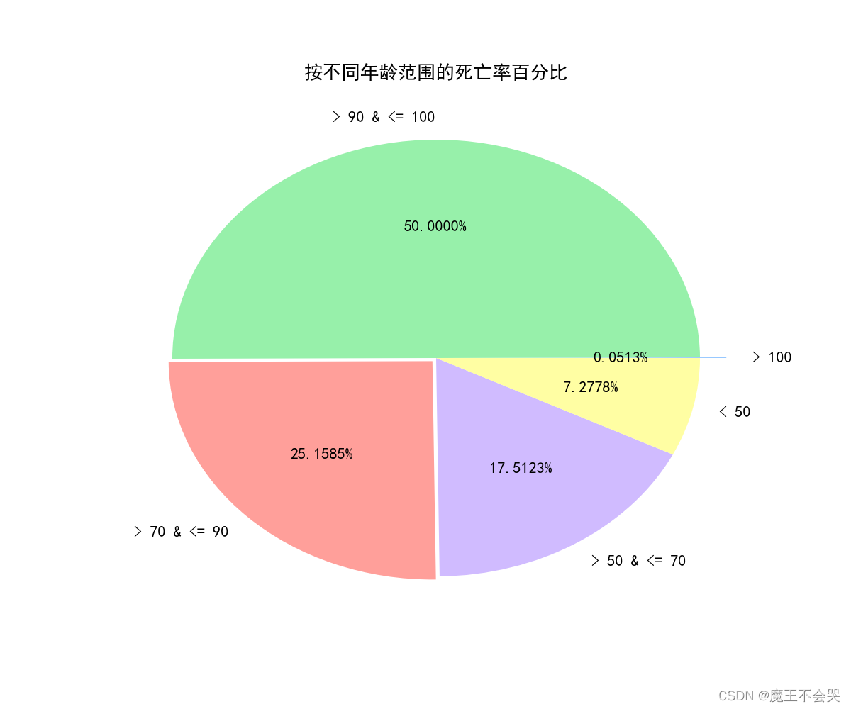
# # 按不同年龄范围的死亡率百分比
plt.figure(figsize=(12, 10))
count = [df1[df1['Age_of_death'] > 100].shape[0],
         df1.shape[0] - df1[(df1['Age_of_death'] <= 100) & (df1['Age_of_death'] > 90)].shape[0],
         df1[(df1['Age_of_death'] <= 90) & (df1['Age_of_death'] > 70)].shape[0],
         df1[(df1['Age_of_death'] <= 70) & (df1['Age_of_death'] > 50)].shape[0],
         df1.shape[0] - (df1[df1['Age_of_death'] > 100].shape[0] +
                         df1[(df1['Age_of_death'] <= 100) & (df1['Age_of_death'] > 90)].shape[0]
                         + df1[(df1['Age_of_death'] <= 70) & (df1['Age_of_death'] > 50)].shape[0]
                         + df1[(df1['Age_of_death'] <= 90) & (df1['Age_of_death'] > 70)].shape[0])
         ]

age = ['> 100', '> 90 & <= 100', '> 70 & <= 90', '> 50 & <= 70', '< 50']
explode = [0.1, 0, 0.02, 0, 0]  # 设置各部分突出

palette_color = sns.color_palette('pastel')

plt.rc('font', family='SimHei', size=16)
plt.pie(count, labels=age, colors=palette_color,
        explode=explode, autopct='%.4f%%')
plt.title("按不同年龄范围的死亡率百分比")
plt.savefig(r'.\result\不同年龄范围的死亡率百分比.png')
plt.show()
# 死亡人数前20的职业
Occupation = list(df1['Occupation'].value_counts()[:20].keys())
Occupation_count = list(df1['Occupation'].value_counts()[:20].values)
plt.rc('font', family='SimHei', size=16)
plt.figure(figsize=(14, 8))
# sns.set_theme(style="darkgrid")
p = sns.barplot(x=Occupation_count, y=Occupation)
p.set_xlabel("人数", fontsize=20)
p.set_ylabel("职业", fontsize=20)
plt.title("前20的职业", fontsize=20)
plt.subplots_adjust(left=0.18)
plt.savefig(r'.\result\死亡人数前20的职业.png')
plt.show()

# 死亡人数前10的死亡方式
top_causes = df1.groupby('Manner_of_death').size().reset_index(name='count')
top_causes = top_causes.sort_values(by='count', ascending=False).iloc[:10]
fig = plt.figure(figsize=(10, 6))
plt.barh(top_causes['Manner_of_death'], top_causes['count'], edgecolor='black')
plt.title('死亡人数前10的死因.png')
plt.xlabel('人数')
plt.ylabel('死因')
plt.tight_layout()  # 自动调整子图参数,使之填充整个图像区域
plt.savefig(r'.\result\死亡人数前10的死因.png')
plt.show()

# 死亡人数前20的出生年份
birth_year = df1.groupby('Birth_year').size().reset_index(name='count')
birth_year = birth_year.sort_values(by='count', ascending=False).iloc[:20]
fig = plt.figure(figsize=(10, 6))
plt.barh(birth_year['Birth_year'], birth_year['count'])
plt.title('死亡人数前20的出生年份')
plt.xlabel('人数')
plt.ylabel('出生年份')
plt.tight_layout()  # 自动调整子图参数,使之填充整个图像区域
plt.savefig(r'.\result\死亡人数前20的出生年份.png')
plt.show()
请添加图片描述
# 死亡人数前20的去世年份
death_year = df1.groupby('Death_year').size().reset_index(name='count')
# print(death_year)
death_year = death_year.sort_values(by='count', ascending=False).iloc[:20]
fig = plt.figure(figsize=(10, 10))
plt.barh(death_year['Death_year'], death_year['count'])
plt.title('死亡人数前20的去世年份')
plt.xlabel('人数')
plt.ylabel('去世年份')
plt.tight_layout()
plt.savefig(r'.\result\死亡人数前20的去世年份.png')
plt.show()

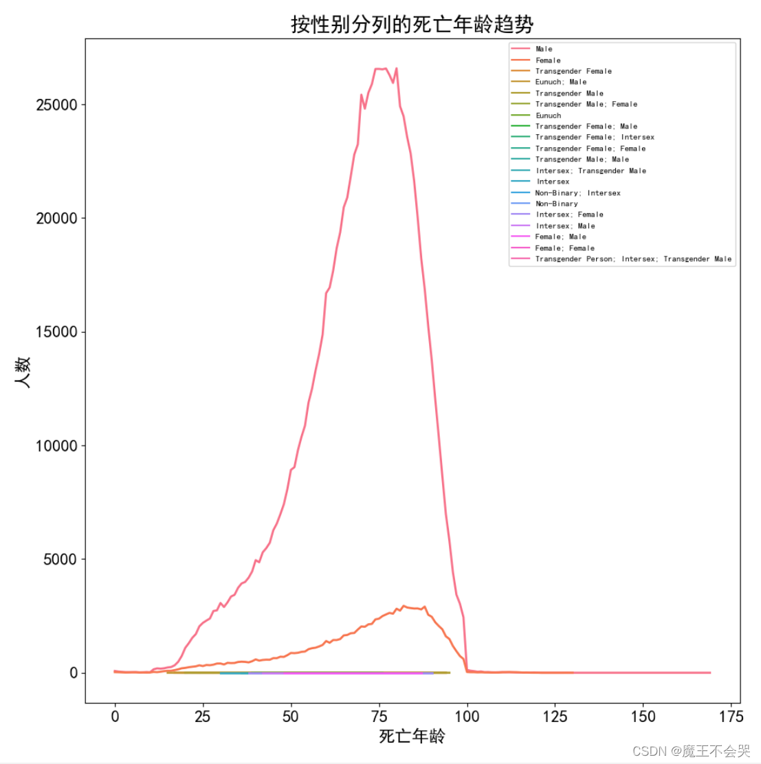
# 按性别分列的死亡年龄趋势
data = pd.DataFrame(
    df1.groupby(['Gender', 'Age_of_death']).size().reset_index(name='count').sort_values(by='count', ascending=False))

fig = plt.figure(figsize=(10, 10))
sns.lineplot(data=data, x='Age_of_death', y='count', hue='Gender', linewidth=2)
plt.legend(fontsize=8)
plt.title('按性别分列的死亡年龄趋势')
plt.xlabel('死亡年龄')
plt.ylabel('人数')
plt.tight_layout()
plt.savefig(r'.\result\死亡人数前20的去世年份.png')
plt.show()
# 前10的职业中 男性与女性的人数
occupation = pd.DataFrame(df1['Occupation'].value_counts())
top10_occupation = occupation.head(10)
top_index = [i for i in top10_occupation.index]
age_data = df1[df1['Occupation'].isin(top_index)]
age_data = age_data[age_data['Gender'].isin(['Male', 'Female'])]
sns.catplot(data=age_data, x='Occupation', kind='count', hue='Gender', height=10)
plt.xticks(rotation=20)
plt.xlabel('职业')
plt.ylabel('人数')
plt.tight_layout()
plt.savefig(r'.\result\前10的职业中男女性人数.png')
plt.show()

尾语
读书多了,容颜自然改变,许多时候,
自己可能以为许多看过的书籍都成了过眼云烟,不复记忆,其实他们仍是潜在的。
在气质里,在谈吐上,在胸襟的无涯,当然也可能显露在生活和文字里。
——三毛《送你一匹马》
本文章到这里就结束啦~感兴趣的小伙伴可以复制代码去试试哦 😝

相关文章
- 第三百六十七节,Python分布式爬虫打造搜索引擎Scrapy精讲—elasticsearch(搜索引擎)scrapy写入数据到elasticsearch中
- python数据持久存储:pickle模块的基本使用
- python通过post提交数据的方法
- 小白学 Python 数据分析(15):数据可视化概述
- 小白学 Python 数据分析(11):Pandas (十)数据分组
- 小白学 Python 数据分析(6):Pandas (五)基础操作(2)数据选择
- [LINK]Python服务器开发一:python基础
- Atitit nlp自然语言处理类库(java python nodejs c#net) 目录 1.1. Python snownlp1 1.2. NLP.js一个nodejs/javascri
- 100天精通Python(数据分析篇)——第76天:Pandas数据类型转换函数pd.to_numeric(参数说明+实战案例)
- Python每日一练(数据分析篇)——第37天:数据清洗
- python数据分析小案例:把招聘数据做可视化处理~
- Python数据分析入门:数据清洗和准备(没基础的你还不看嘛)
- 【阶段二】Python数据分析数据可视化工具使用04篇:核密度估计图
- 【阶段二】Python数据分析数据可视化工具使用03篇:词云图与相关性热力图
- 【阶段二】Python数据分析Pandas工具使用02篇:数据读取:文本文件读取、电子表格读取与数据预处理:数据概览与清洗
- Python编程:pyenv管理多个python版本环境
- 用Python做数据分析之数据处理及数据提取
- 用Python做数据分析之数据筛选及分类汇总
- 【2021 高校大数据挑战赛-智能运维中的异常检测与趋势预测】2 方案设计与实现-Python
- Python常用内置函数(python 3.x)