
美化WPF中TextBox的Style样式
WPF 样式 美化 Style textbox
2023-09-14 09:10:46 时间
<ResourceDictionary xmlns="http://schemas.microsoft.com/winfx/2006/xaml/presentation"
                    xmlns:x="http://schemas.microsoft.com/winfx/2006/xaml"
                    xmlns:converter="clr-namespace:IVF.Converter">
    <!--for TextboxDictionary.xaml Border CornerRadius-->
    <converter:HeightToCornerConverter x:Key="HeightToCornerConverter" />

    <SolidColorBrush x:Key="TextBox.Static.Border" Color="#FFABAdB3"/>
    <SolidColorBrush x:Key="TextBox.MouseOver.Border" Color="#FF7EB4EA"/>
    <SolidColorBrush x:Key="TextBox.Focus.Border" Color="#7278FB"/>
    <Style x:Key="TextBoxStyle" TargetType="{x:Type TextBox}">
        <Setter Property="Background" Value="{DynamicResource {x:Static SystemColors.WindowBrushKey}}"/>
        <Setter Property="BorderBrush" Value="{StaticResource TextBox.Static.Border}"/>
        <Setter Property="Foreground" Value="{DynamicResource {x:Static SystemColors.ControlTextBrushKey}}"/>
        <Setter Property="BorderThickness" Value="1"/>
        <Setter Property="KeyboardNavigation.TabNavigation" Value="None"/>
        <Setter Property="HorizontalContentAlignment" Value="Left"/>
        <Setter Property="FocusVisualStyle" Value="{x:Null}"/>
        <Setter Property="AllowDrop" Value="true"/>
        <Setter Property="ScrollViewer.PanningMode" Value="VerticalFirst"/>
        <Setter Property="Stylus.IsFlicksEnabled" Value="False"/>
        <Setter Property="Template">
            <Setter.Value>
                <ControlTemplate TargetType="{x:Type TextBox}">
                    <Border CornerRadius="{TemplateBinding Height,Converter={StaticResource HeightToCornerConverter}}" x:Name="border" BorderBrush="{TemplateBinding BorderBrush}" BorderThickness="{TemplateBinding BorderThickness}" Background="{TemplateBinding Background}" SnapsToDevicePixels="True">
                        <ScrollViewer x:Name="PART_ContentHost" Focusable="false" HorizontalScrollBarVisibility="Hidden" VerticalScrollBarVisibility="Hidden" Template="{DynamicResource ScrollViewerControlTemplate}"/>
                    </Border>
                    <ControlTemplate.Triggers>
                        <Trigger Property="IsEnabled" Value="false">
                            <Setter Property="Opacity" TargetName="border" Value="0.56"/>
                        </Trigger>
                        <Trigger Property="IsMouseOver" Value="true">
                            <Setter Property="BorderBrush" TargetName="border" Value="{StaticResource TextBox.MouseOver.Border}"/>
                        </Trigger>
                        <Trigger Property="IsKeyboardFocused" Value="true">
                            <Setter Property="BorderBrush" TargetName="border" Value="{StaticResource TextBox.Focus.Border}"/>
                            <Setter Property="BorderThickness" TargetName="border" Value="4"/>
                        </Trigger>
                    </ControlTemplate.Triggers>
                </ControlTemplate>
            </Setter.Value>
        </Setter>
        <Style.Triggers>
            <MultiTrigger>
                <MultiTrigger.Conditions>
                    <Condition Property="IsInactiveSelectionHighlightEnabled" Value="true"/>
                    <Condition Property="IsSelectionActive" Value="false"/>
                </MultiTrigger.Conditions>
                <Setter Property="SelectionBrush" Value="{DynamicResource {x:Static SystemColors.InactiveSelectionHighlightBrushKey}}"/>
            </MultiTrigger>
        </Style.Triggers>
    </Style>
    <ControlTemplate x:Key="ScrollViewerControlTemplate" TargetType="{x:Type ScrollViewer}">
        <Grid x:Name="Grid" Background="{TemplateBinding Background}">
            <Grid.ColumnDefinitions>
                <ColumnDefinition Width="*"/>
                <ColumnDefinition Width="Auto"/>
            </Grid.ColumnDefinitions>
            <Grid.RowDefinitions>
                <RowDefinition Height="*"/>
                <RowDefinition Height="Auto"/>
            </Grid.RowDefinitions>
            <Rectangle x:Name="Corner" Grid.Column="1" Fill="{DynamicResource {x:Static SystemColors.ControlBrushKey}}" Grid.Row="1"/>
            <ScrollContentPresenter HorizontalAlignment="Center" VerticalAlignment="Center" x:Name="PART_ScrollContentPresenter" CanContentScroll="{TemplateBinding CanContentScroll}" CanHorizontallyScroll="False" CanVerticallyScroll="False" ContentTemplate="{TemplateBinding ContentTemplate}" Content="{TemplateBinding Content}" Grid.Column="0" Margin="{TemplateBinding Padding}" Grid.Row="0"/>
            <ScrollBar x:Name="PART_VerticalScrollBar" AutomationProperties.AutomationId="VerticalScrollBar" Cursor="Arrow" Grid.Column="1" Maximum="{TemplateBinding ScrollableHeight}" Minimum="0" Grid.Row="0" Visibility="{TemplateBinding ComputedVerticalScrollBarVisibility}" Value="{Binding VerticalOffset, Mode=OneWay, RelativeSource={RelativeSource TemplatedParent}}" ViewportSize="{TemplateBinding ViewportHeight}"/>
            <ScrollBar x:Name="PART_HorizontalScrollBar" AutomationProperties.AutomationId="HorizontalScrollBar" Cursor="Arrow" Grid.Column="0" Maximum="{TemplateBinding ScrollableWidth}" Minimum="0" Orientation="Horizontal" Grid.Row="1" Visibility="{TemplateBinding ComputedHorizontalScrollBarVisibility}" Value="{Binding HorizontalOffset, Mode=OneWay, RelativeSource={RelativeSource TemplatedParent}}" ViewportSize="{TemplateBinding ViewportWidth}"/>
        </Grid>
    </ControlTemplate>

    <Style TargetType="{x:Type TextBox}" BasedOn="{StaticResource TextBoxStyle}"/>
</ResourceDictionary>
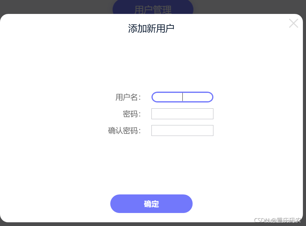
注意这里有一个HeightToCornerConverter转换器,因为border的圆角和textbox的height成2倍的关系,需要自适应转换,所有在用的时候要注意实例化这个类。
最后的效果如下
相关文章
- 【NEW】WPF MVVM 模式下自写自用的窗口样式
- WPF-visifire Charts 控件去掉水印
- WPF 布局控件 之 WrapPanel[通俗易懂]
- WPF布局之WrapPanel与StackPanel
- WPF 触屏事件后触发鼠标事件的问题及 DataGrid 误触问题
- [翻译] WPF 中用户控件 DataContext/Binding 和依赖属性的问题
- 推荐一个IT老鸟肝了2月有余的免费开源WPF企业级开发框架
- 使用通用附加属性来减少 WPF 元素自定义样式的多余代码
- 聊一聊 WPF 程序的键盘是如何被窃听的?
- C# WPF DataGrid下面 使用CheckBox 选中事件
- WPF效果第二百零九篇之下载加密的m3u8
- 【愚公系列】2023年02月 .NET CORE工具案例-MahApps.Metro基于WPF的UI控件库
- WPF 通过 RawInput 获取触摸消息
- WPF 性能测试
- WPF Path微语言
- Linux下极致体验WPF编程之旅(linuxwpf)