
SAP 电商云 Spartacus UI 的响应式 UI 实现细节
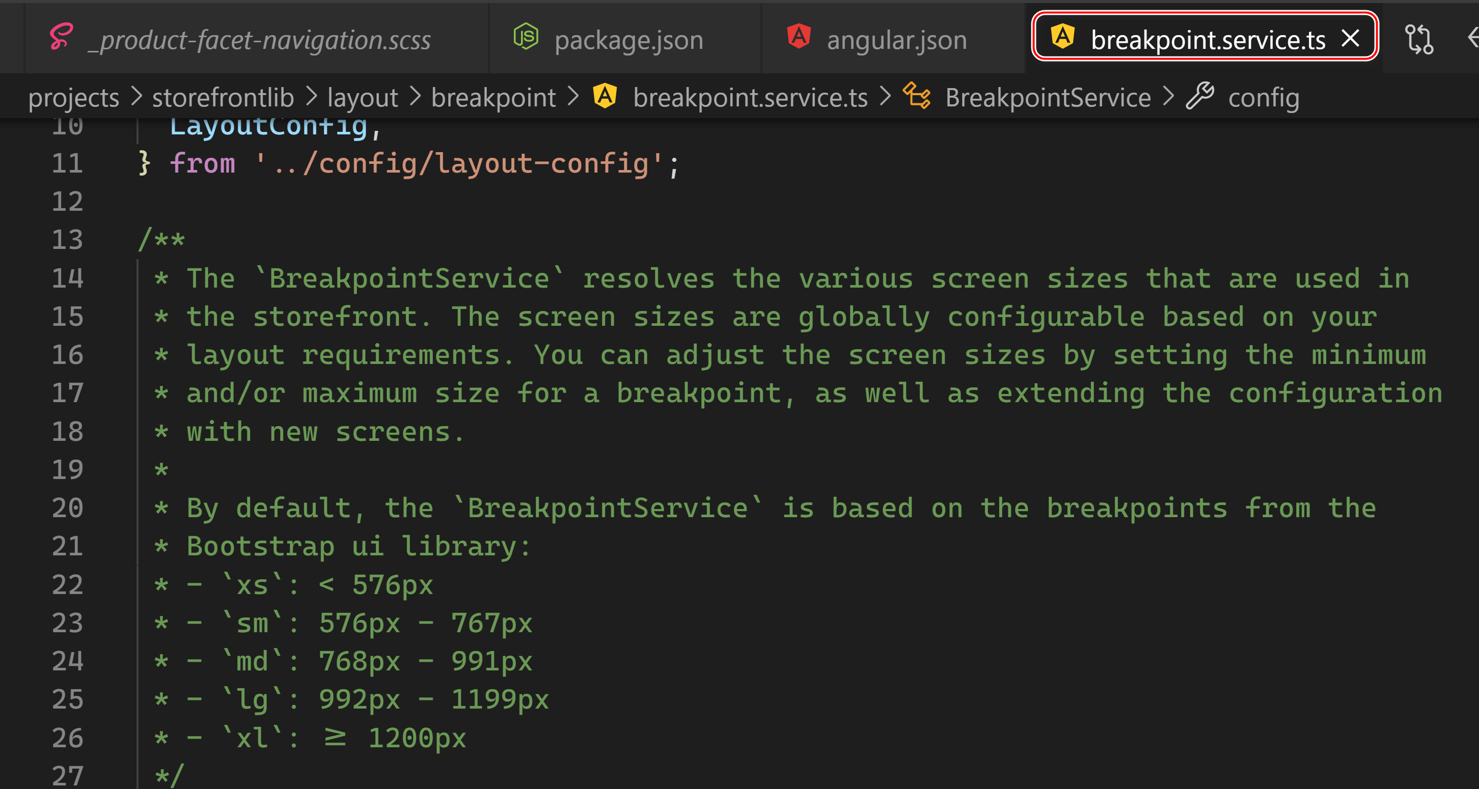
在文件 projects\storefrontlib\layout\config\default-layout.config.ts 里,定义了各个屏幕尺寸所对应的 breakpoint:
export const defaultLayoutConfig: LayoutConfig = {
  breakpoints: {
    xs: 576,
    sm: 768,
    md: 992,
    lg: 1200,
    xl: {
      min: 1200,
    },
  },
};
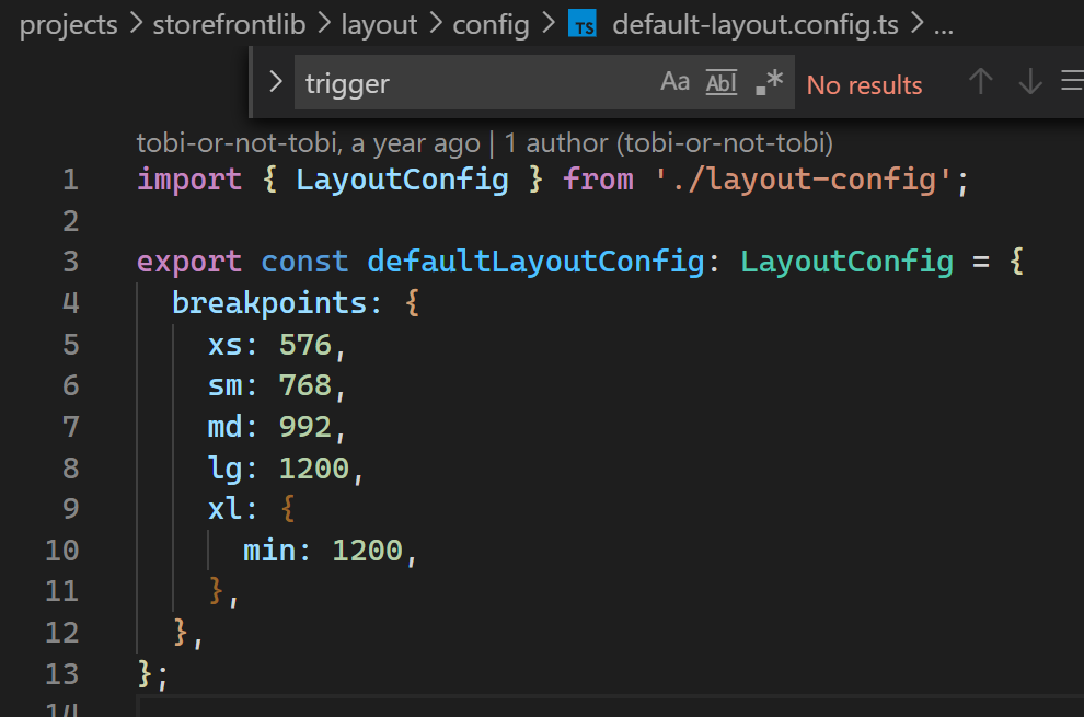
注意这个 breakpoint 和编程语言里的断点没有关系。
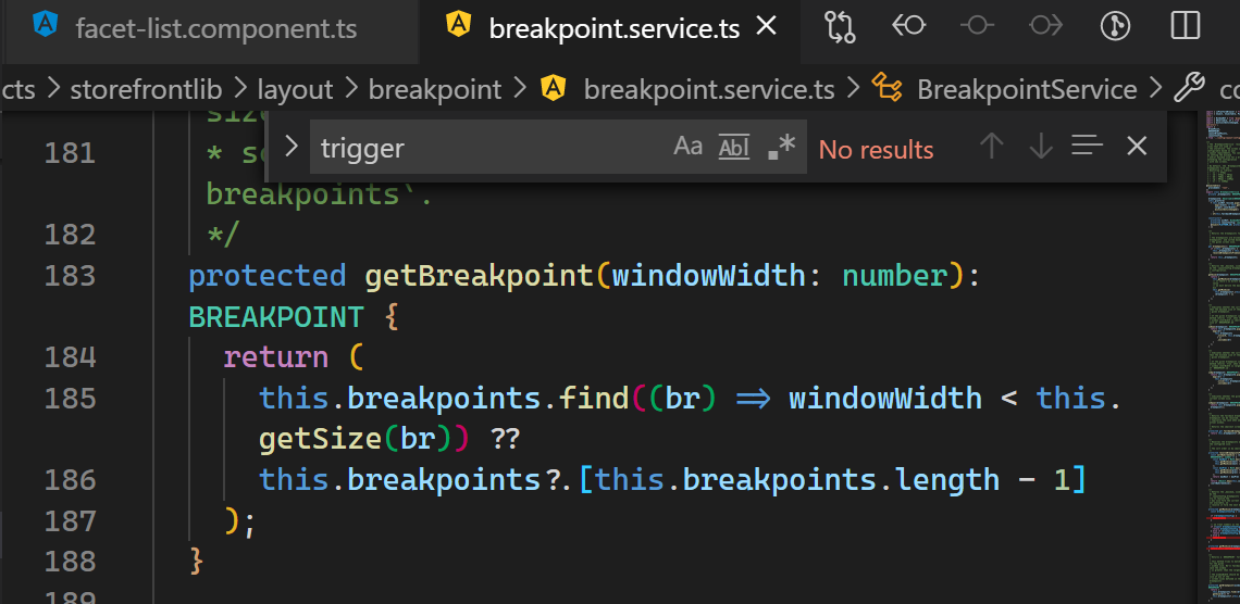
breakpoint.service.ts 的 getBreakpoint 方法,提供了根据当前屏幕宽度返回最合适的 breakpoint:
以这个 id 为 trigger 的按钮为例,它是完全 css 驱动的:
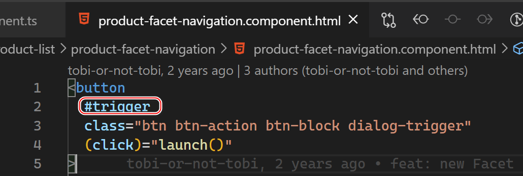
这个按钮的 css:
btn btn-action btn-block dialog-trigger
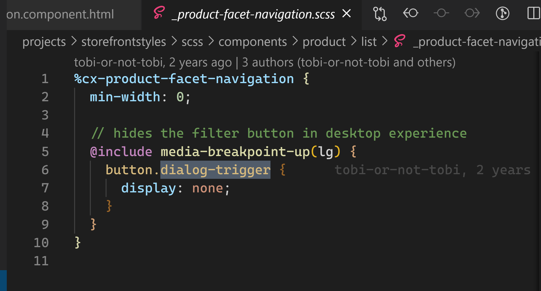
该按钮在 lg 这个 breakpoint 情况下,会被设置为 display:none:
而 Spartacus 应用代码怎么知道当前的屏幕尺寸对应的 break point 呢?
答案是我们自己实现的 breakpoint.service.ts.
首先定义枚举类型 BREAKPOINT:
export enum BREAKPOINT {
  xs = 'xs',
  sm = 'sm',
  md = 'md',
  lg = 'lg',
  xl = 'xl',
}
然后根据当前代码的运行环境进行计算:
breakpoint$: Observable<BREAKPOINT> = isPlatformBrowser(this.platform)
    ? this.winRef.resize$.pipe(
        map((event) => this.getBreakpoint((<Window>event.target).innerWidth)),
        distinctUntilChanged()
      )
    : of(this.fallbackBreakpoint);

  constructor(
    protected winRef: WindowRef,
    protected layoutConfig: LayoutConfig,
    @Inject(PLATFORM_ID) protected platform: any
  ) {}
如果当前运行在浏览器环境下,isPlatformBrowser(this.platform) 返回 true,那么进入三元表达式前面的分支,调用 this.getBreakpoint 根据当前屏幕的 innerWidth,获取对应的 breakpoint.
同时,一旦有 resize 事件发生,会自动重新计算新的 breakpoint. 每次 resize 事件发生时,产生的 event 对象 event.target 指向 Window 对象,该对象的 innerWidth 即是新的屏幕宽度。
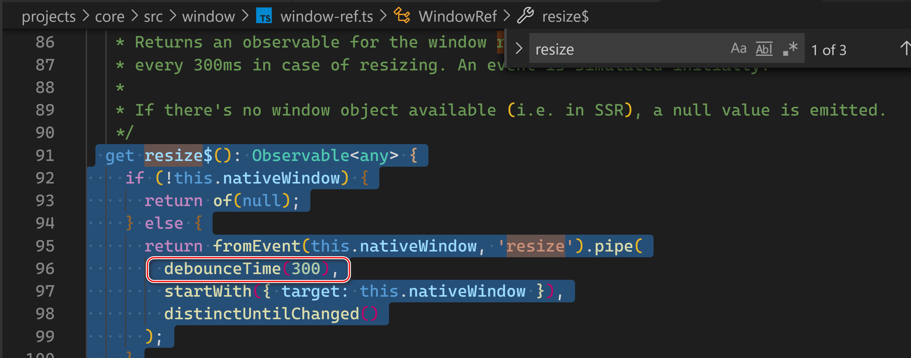
如何捕捉屏幕的 resize 事件?
 get resize$(): Observable<any> {
    if (!this.nativeWindow) {
      return of(null);
    } else {
      return fromEvent(this.nativeWindow, 'resize').pipe(
        debounceTime(300),
        startWith({ target: this.nativeWindow }),
        distinctUntilChanged()
      );
    }
  }
这里我们使用了 rxJs 的 fromEvent 和 debounce, 将 window 对象产生的 resize 事件,做了一个 300 毫秒的限流,意思是当 resize 事件触发后,如果300毫秒之内并没有新的 resize 事件发生时,再把这个 resize 事件,交给 Observable 执行链的下游处理,即重新获取 breakpoint.
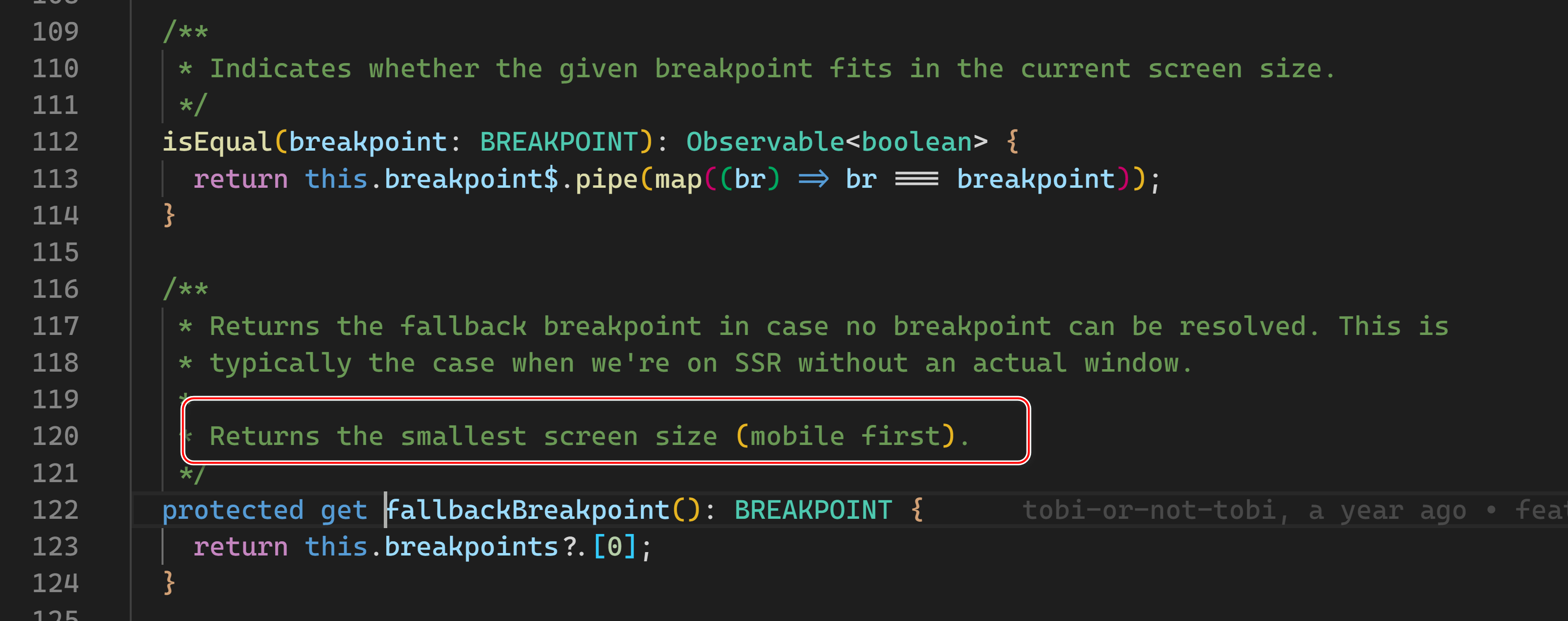
如果当前代码在服务器端 Node.js 环境中运行,进入三元表达式问号后面的分支:of(this.fallbackBreakpoint);
返回最小屏幕尺寸对应的 breakpoint,这也体现了 mobile first 的设计思路。
更多Jerry的原创文章,尽在:“汪子熙”:

相关文章
- SAP UI5 sap.ui.layout.Grid 控件宽度百分比的设置原理
- SAP UI5 sap.ui.export.Spreadsheet API 介绍
- SAP UI5 sap.ui.Device.media.RANGESETS 的使用介绍
- SAP UI5 sap.ui.Device.media 公有方法介绍
- 关于 SAP Spartacus 重定向部分外部 url 到后台系统的问题
- SAP MM事务代码S_P00_07000139可以用于跟踪物料移动细节
- 关于 SAP UI5 接口 sap.ui.core.IAsyncContentCreation 的问题讨论
- SAP ABAP Gateway 系统里 HTTP 请求响应头部字段 DataServiceVersion 的可能取值范围
- Oracle购买SAP: 开启新数据时代(oracle收购sap)
- SAP 生产模块常用BAPI详解编程语言
- SAP 《MM学习指南》操作记录—- 计划协议及交货计划详解编程语言
- 数据库解决方案如何使用SAP创建Redis数据库(sap怎么创建redis)
- 深入比较Oracle与SAP的选择之路(oracle与SAP选择)
- Oracle和SAP技术比较优势和劣势(oracle与sap比照)
- 跨界合作新模式 Oracle与SAP实现合并(oracle与sap合并)
- 对比Oracle和SAP价格比较哪个是更值得投入的选择(oracle与sap价格)
- Oracle与SAP金蝶谁更具竞争力(oracle sap金蝶)
- Oracle 与 SAP深度对比分析(oracle sap对比)