
SAP Spartacus里定义的breakpoint
按照惯例,不同尺寸的屏幕对应的breakpoint:

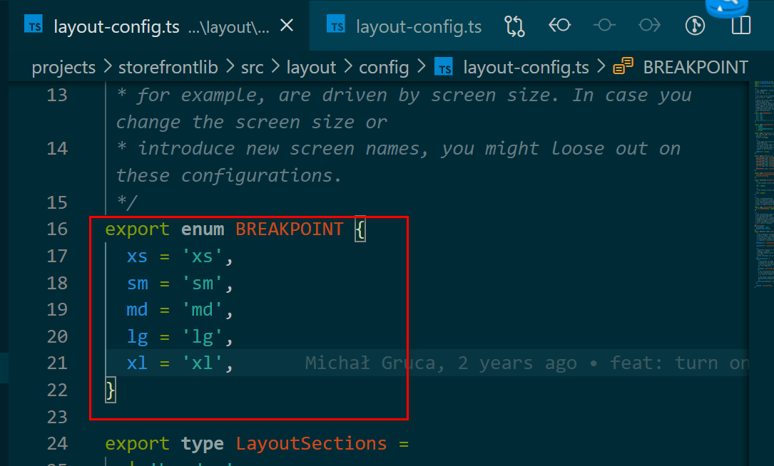
Spartacus layout-config.ts文件:
export enum BREAKPOINT {
  xs = 'xs',
  sm = 'sm',
  md = 'md',
  lg = 'lg',
  xl = 'xl',
}
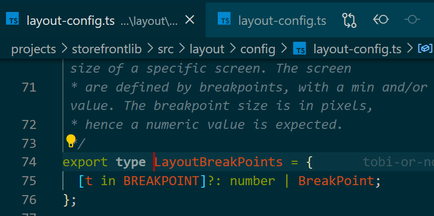
这些枚举值被用于LayoutBreakPoints的类型定义:
默认的breakpoints定义:
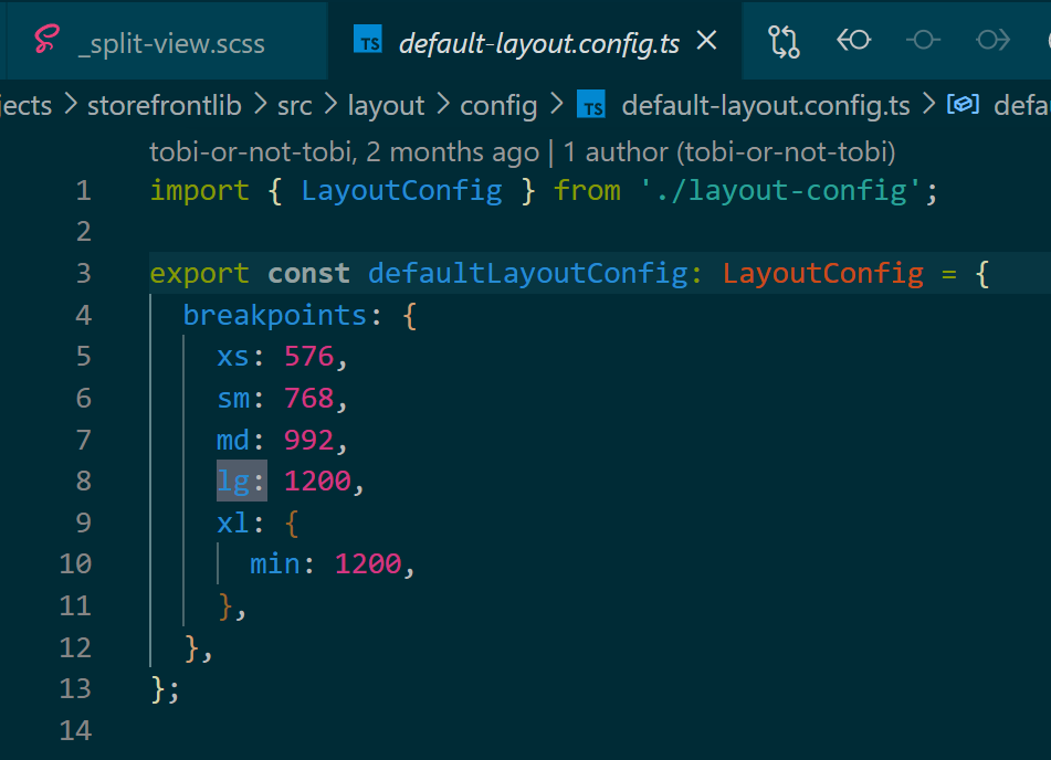
export const defaultLayoutConfig: LayoutConfig = {
  breakpoints: {
    xs: 576,
    sm: 768,
    md: 992,
    lg: 1200,
    xl: {
      min: 1200,
    },
  },
};
In our repo we tend to use the reusable mixin with the already defined breakpoints (i.e. sm, sx), i.e. @include media-breakpoint-down(xs) (or …-up()) instead of using native @media queries.

The screen layout of the Storefront is driven by configurable breakpoints.
The breakpoints have a configurable screen size (i.e. < 576px), and associated screen name can be used to further define the layout.
A good example is the page template slot configuration, which can be adjusted per screen name, so that the layout differs per screen size (i.e. mobile vs desktop).
Other features can however also use the screen names to further enhance rendering of the feature. A good example is the table component, which has a configurable list of headers, based on the screen.
The creation of screen specific DOM is what we call adaptive design. This design is optimized for small screens, but is also optimized for accessibility.
更多Jerry的
原创文章,尽在:“汪子熙”:

相关文章
- [SAA + SAP] 09. DynamoDB
- 54. 如何将本地 SAP UI5 应用配置到本地 Fiori Launchpad
- SAP UI5 应用 index.html 里定义的 data-sap-ui-theme 值的加载原理
- how SAP UI5 Manifest.json is loaded
- 用SAP BSP应用实现图片灰度效果
- 快速找到SAP CRM WebClient UI thtmlbUtil的定义位置
- SAP CRM产品主数据搜索的Max hit配置点介绍
- SAP CDS view里如何定义association
- SAP Spartacus UI 服务器端渲染的调试启动方式 - debug 模式
- SAP Spartacus 定义在app.module.ts里的providers依赖注入元数据何时得到处理
- SAP Cloud for Customer(C4C)里如何定义跨BO间的association
- 在SAP BSP view里显示outlook inbox里的邮件
- SAP UI5 如何通过 manifest.json 文件定义第三方库依赖关系
- SAP Fiori Elements 源代码实现里一些常量定义
- 如何处理SAP Fiori Launchpad KPI tile点击后出现的错误消息
- SAP Spartacus 定义在app.module.ts里的providers依赖注入元数据何时得到处理
- user.config.ts文件里定义的配置是如何合并到SAP Spartacus的标准配置里去的