
[Mobile Web] LEVEL 5 RESPONSIVE MEDIA
Responsive Images:
Responsive image means images which display on our website will adjust its width and height automaticlly according to different screen size.
For achieve this,
1. we save the image larger than we need. Because save larger we can size it differently without affect the resolution.
2. Use Max-width: use max-width in general
img{
   max-width: 100%;
}
Size image in different case:
about img{
    width: 29.6875%;
}
Responsive Media:
Level 5
img,
embed,
object,
video {
  max-width: 100%;
}
embed: The <embed> tag defines a container for an external application or interactive content (a plug-in).
<embed src="helloworld.swf">
object:
The <object> tag defines an embedded object within an HTML document. Use this element to embed multimedia (like audio, video, Java applets, ActiveX, PDF, and Flash) in your web pages.
You can also use the <object> tag to embed another webpage into your HTML document.
<object width="400" height="400" data="helloworld.swf"></object>
FitText to make font-sizing flexible: [http://fittextjs.com/]
Lettering.js for more robust control over your typography:[http://letteringjs.com/]
FitVids.js for flexible, responsive videos: [http://fitvidsjs.com/]
Retina Images:
Retina Images = 1.5x - 2x the pixel density
@media
only screen and (-webkit-min-device-pixel-ratio: 1.5),
only screen and (-moz-min-device-pixel-ratio: 1.5),
only screen and (-o-min-device-pixel-ratio: 1.5),
only screen and (min-device-pixel-ratio: 1.5){
  /*Style*/
}
Usually, ratina image is double size:
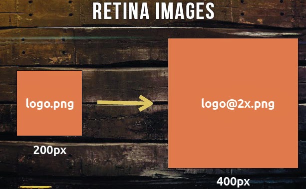
@media
only screen and (-webkit-min-device-pixel-ratio: 1.5),
only screen and (min-device-pixel-ratio: 1.5) {
.logo {
  background-image: url(logo@2x.png);
  -webkit-background-size: 12px 16px;
     background-size: 12px 16px;
  }
}
Background-size
Here the background-size is the origln size, not double size.
Image size
We can use PictureFill lib. http://scottjehl.com/picturefill/
<picture alt="Our Alternate Text">
   <!-- Smallest size first - no @media qualifier -->
   <source src="content-image.jpeg" />
       <!-- Large size - send to viewports 800px wide and up -->
   <source src="content-image-lrg.jpeg" media="(min-width: 800px)" />
   <!-- Fallback content for non-JS or non-media-querysupporting- browsers -->
   <noscript>
      <img src="content-image.jpeg" alt="Our Alternate Text" />
    </noscript>
</picture>
noscript to handle if the broswer doesn't support picture tag, we set oringal img.
相关文章
- 使用Ubuntu搭建Web服务器
- 一文搞懂JS-Web-API——DOM
- web安全扫描器组件-HTTP请求参数处理py脚本
- web自动化之selenium的特殊用法汇总篇
- DApp 优于 WEB 2.0 应用程序的 5 个原因
- go语言快速入门:Web开发框架(10)详解大数据
- 数据库基于MVC5和MySQL数据库的Web应用程序开发(mvc5mysql)
- 极速搭建:使用Linux快速搭建Web服务器(linux搭建web服务器)
- Linux上搭建Web浏览器的模拟技术(linux模拟浏览器)
- 给你一个美观、安全的Web连接MySQL指南(web连接mysql)
- 服务Linux下访问Web服务的指南(linux访问web)
- 快速构建功能强大的Web应用:PHPMySQL数据库(phpmysqldb)
- Linux轻松搭建个人Web服务器(linux架设web服务器)
- 与web技术基于MySQL Redis与Web技术的一体化应用(mysqlredis)
- 管理MSSQL的好帮手:在线Web管理器来帮忙!(在线web管理mssql)
- MSSQL管理Web,让您轻松上手(mssql管理web)
- 新技术Web环境下Redis配置实战分享(web配置redis)
- 基于Web与Redis的安全认证技术(web redis 认证)
- Web端Redis工具操作简易,畅享快速体验(web redis 工具)
- 初学web标准的几个误区
- 三种Web开发主流技术的性价评价