
如何美化 Matplotlib 的工具栏和绘图风格
前言
matplotlib 功能十分强大,就是工具栏丑了点。忍了一个学期之后,还是决定自己动手,魔改一波 matplotlib 的工具栏样式。同时给大家分享一下自己按照 MATLAB 写的 matplotlib 样式文件。注意:代码中 matplotlib 版本为 3.3.4,其他版本效果会不一样。
工具栏的美化
matplotlib 工具栏有三种模式:None 、toolbar2 和 toolmanager,默认 toolbar2, 我们可以通过 plt.rcParams['toolbar'] 来更换模式。在 None 模式下,图窗中不存在工具栏;toolbar2 和 toolmanager 长得很像,就是后者多了一个帮助按钮。先来看一下 matplotlib 工具栏本来的样子(后端使用的是Qt5Agg):
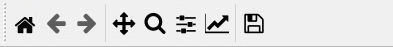
可以看到又黑又粗的图标搭配上灰色的背景,效果十分感人。上面也已经提到了,工具栏有三种模式,抛开 None 不看,如果我们想要修改工具栏的样式,就需要分别修改 toolbar2 和 toolmanager 这两种模式下的样式。从 matplotlib.backends.backend_qt5 的第600行开始有:
def _get_toolbar(self, canvas, parent):
    # must be inited after the window, drawingArea and figure
    # attrs are set
    if matplotlib.rcParams['toolbar'] == 'toolbar2':
        toolbar = NavigationToolbar2QT(canvas, parent, True)
    elif matplotlib.rcParams['toolbar'] == 'toolmanager':
        toolbar = ToolbarQt(self.toolmanager, self.window)
    else:
        toolbar = None
    return toolbar
从源码中可以得知两种模式下的工具栏分别是 NavigationToolbar2QT 和 ToolbarQt 的实例。既然是用 QT 写的,那要美化工具栏岂不是易如反掌?代码撸起来 []~( ̄▽ ̄)~*。分别在 NavigationToolbar2QT 和 ToolbarQt 的构造函数的最后一行加上:
self.setStyleSheet("""QToolBar{background:white}
                      QLabel{font:11pt 'Consolas'}""")
QToolBar{background:white} 设置工具栏的背景色为白色,QLabel{font:11pt 'Consolas'} 设置的工具栏的字体为 11pt 的 Consolas 。修改完层叠样式之后,我们来换一波图标,图标、字体以及mplstyle文件放在了百度网盘(提取码:nlnv),用这些图标替换掉 Lib\site-packages\matplotlib\mpl-data\images 中的自带图标,工具栏的美化就大功告成了( ̄︶ ̄)↗ 。
绘图样式的美化
matplotlib 可以自定义绘图风格,这是它强大之处的体现。打开C盘用户文件夹的.matplotlib\stylelib(没有的话可以新建一个),我们可以看到一些 .mplstyle 文件,这些文件就是某种绘图风格的具体配置。我们在这个目录下创建一个matlab.mplstye 文件,往里面写入:
## ***************************************************************************
## * AXES                                                                    *
## ***************************************************************************
axes.grid :       True
axes.axisbelow :  True
axes.facecolor :  white
axes.prop_cycle : cycler('color', ['0072BD', 'D95319', 'EDB120', '7E2F8E', '77AC30', '4DBEEE', 'A2142F'])


## ***************************************************************************
## * FIGURE                                                                  *
## ***************************************************************************
figure.dpi :        140
figure.figsize :    8, 6


## ***************************************************************************
## * TICKS                                                                   *
## ***************************************************************************
xtick.direction :       in
xtick.major.size :      6
xtick.major.width :     0.5
xtick.minor.size :      1.5
xtick.minor.width :     0.5
# xtick.minor.visible :   True
xtick.top : True

ytick.direction :       in
ytick.major.size :      6
ytick.major.width :     0.5
ytick.minor.size :      1.5
ytick.minor.width :     0.5
# ytick.minor.visible :   True
ytick.right :           True


## ***************************************************************************
## * LINES                                                                   *
## ***************************************************************************
axes.linewidth :  0.5
lines.linewidth : 1


## ***************************************************************************
## * SAVING FIGURES                                                          *
## ***************************************************************************
savefig.dpi : 	     300
savefig.bbox :       tight
savefig.pad_inches : 0.05


## ***************************************************************************
## * FONT                                                                    *
## ***************************************************************************
font.size :        11
font.family :      serif
font.serif :       Latin Modern Roman, Times New Roman
font.sans-serif :  Helvetica
mathtext.default:  it
mathtext.fallback: cm
mathtext.fontset : cm


## ***************************************************************************
## * GRIDS                                                                   *
## ***************************************************************************
grid.color :     0.8
grid.alpha :     0.64
grid.linewidth : 0.5
grid.linestyle : -


## ***************************************************************************
## * LEGEND                                                                  *
## ***************************************************************************
legend.loc:         best
legend.shadow :     False
legend.frameon :    True
legend.fancybox :   False
legend.numpoints :  1
legend.edgecolor:   0
legend.framealpha : 1
在绘图之前,调用一下 plt.style.use('matlab'),就可以将默认绘图风格换成上面定义的风格。
测试
import numpy as np
import matplotlib.pyplot as plt


x = np.arange(0, 2 * np.pi, 0.01)
y = np.sin(x)
z = 0.5 * np.sin(x)

# 更换工具栏模式
# plt.rcParams['toolbar'] = 'toolmanager'
# 设置绘图样式
plt.style.use('matlab')

fig = plt.figure(num='sine wave')  #type:plt.Figure
plt.plot(x, y, x, z)
plt.axis((0, 2 * np.pi, -1, 1))

plt.xlabel(r'$x$')
plt.ylabel(r'$y$')
plt.title(r'$Sine\ Wave$')
plt.legend([r'${\rm sin}(x)$', r'$0.5\cdot {\rm sin}(x)$'])
plt.show()
运行代码后效果如下:
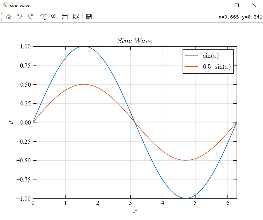
可以看到图窗中的字体在数学模式下变成了好康的 Computer Modern,最重要的是工具栏也被成功美化。如果对工具栏不满意的话,可以自己改下 style sheet。以上*( •̀ ω •́ )✧
相关文章
- redis系列之初识Redis
- Redis系列之如何高效使用
- NLP: Text Neural Network (Part1: textRNN, textCNN)
- [NetWork] 局域网基本原理
- Redis实现朋友圈,微博等Feed流功能,实现Feed流微服务(代码实现)
- 下载速率提升40% ,《斗罗大陆:魂师对决》是如何做到的?
- 华为Awareness kit,您旅途路上的超智能管家
- Discovery直播 | 移动应用“通行证”——钥匙环,解锁管家式安全出行服务
- 教你在“狼人杀”中实现变声效果
- 技术与艺术的结合,HMS Core让手机主题趣味丛生
- 受众同步管理功能上线,让你的活动礼包发对人
- 分析服务助力产品运营
- 租房买房行业报告上线,为房产服务数字化转型添砖加瓦
- 放码来战!HMS Core线上Codelabs挑战赛正式开始
- 一图读懂DCI版权服务
- 【HMS Core 6.0全球上线】Toolkit,您的智能辅助编程好帮手
- 眼镜选款新方法,用AR+Scene技术实现3D虚拟试戴
- HDD成都站:HMS Core 6.0带来新可能,多元服务驱动产品价值提升
- Insights直播预告 | 多媒体管线服务,助您轻松进入“技术流”创新阵地
- 华为音频编辑服务带你一键伴奏分离!